My Favorite Project
https://pixabay.com/vectors/wheelchair-parking-disabled-43799/
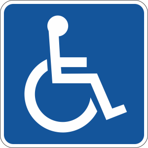
Since the last time I wrote, I have been assigned a new project. This project requires that I illustrate specific words in a similar visual aesthetic. Out of all the projects, I have worked on so far, this must be one of my favorite projects. Though I am not focusing on Illustration for my degree, I have always loved to sketch. Today, as I was working on my assignment, I was reminded of an article that I read in my Communication Design Theory class. In the article, “Politics of Design”, author Ruben Pater gives various examples on how our current-day iconography tends to limit us from progressing as a society. For instance, look at the handicap symbol. For years, this symbol portrayed an image lacking motion, as if these people are limited to the confinements of their chair when in fact, less than 1% of disabled people use a wheelchair. Furthermore, many organizations targeted this icon because it failed to represent the other types of disabilities. Pater went on discussing the Wien sieht’s anders (Vienna sees it differently campaign) launched in 2007. The campaign aimed to get rid of “gender related” icons and tried replacing them with gender neutral symbols. Instead of a mother changing her baby, the campaign portrayed a father changing his child’s diaper. In another case, a woman construction worker is portrayed instead of the infamous man at work icon. This all got me thinking. How can I make my illustrations more appealing to the different age groups presented in my project? How can I make my illustrations understandable without the use of words and color? I believe that it is important for me to use what I have previously learned, like the information provided in this article, and apply it to my work for this internship.

