http://youtu.be/tQ2yfYp-nxA
Author Archives: Ahmad Woods
Ahmad Woods Final Project
Services where people are encourage sharing images of post disaster areas.
The reason behind doing this is that people eyewitness accounts are very important in disaster situations especially when the local news is incapacitated. This will help people by informing them and empowering them.
It’s a website that gives you the map of a city the users are able to see which areas or districts were affected by a particular disaster or event.
A computer and working Internet
Ahmad Woods, Phillip Zak, Michael Perez Game Project: Initialize!
Title of game
We don’t have a named settled but what were going to be working with is Trigger-nometry.
Game Concept
A third person action game with an over the top western motif.
Core Mechanic
You engage enemies primarily by shooting them with the main character’s revolver. The player can take cover behind constructs suitable for such throughout the environment to keep put of the line of fire. However enemy AI is very aggressive; they too can hide behind cover, they outnumber and outgun the player, and they consistently flank the player which makes hiding behind cover long periods of time a detriment. Thus dealing with enemies in a straight forward manner, how you would typically approach them in other games, can spell the player’s doom. To turn the tides in the players favor they’re gifted with a grappling hook that traverses the environment vertically allowing the player to reach high places quickly (within a limited range) which literally gives the player an upper hand on enemies. Taking advantage of angles that render enemies choice of cover useless is generally how the player will take out enemies and this can be achieved consistently through using the grappling hook to latch on to high places.
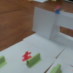
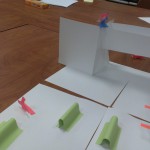
Paper Prototyping
Blog Post 8 – Survey
Group Name: Disco Ninjas
Group Members: Ahmad Woods, Michael Perez, Philip Zak
Survery Questions:
Answers:
Survery 1
1. Yes 2. Yes, 3. Back Buttons, 4. It’s fine, 5. Next Class feature, 6. Its Style, 7. Back Button, 8. Clicking the menu to navigate, 9. It’s fine, 10. no
Survey 2
1. Yes, 2. Yes 3. Yes, 4. Yes, 5. Straight forward, 6. Great interface but uses little space, 7. Avatar on all pages, 8. The colors and theme, 9. It works, 10. Good app
The people we surveyed liked our interface for the most part but would add small changes to it like a back button. The tests were essentially great to test it’s functionality.
We would add the back button.
Blog Post 4 – Graphical Excellence (Late)
I chooses the image that’s a data map of America and it shows the rate of cancer deaths regionally. What’s working about the image for me is that its a good map of the country what isn’t working is the colors and the overall clutter. It becomes really hard to read. Maybe the colors are on the fault that these images were scanned and printed with out color but I do think the map is still cluttered. I’m not sure if there’s info missing since I can’t even really examine the info present. There have been some designs where I pay attention to the aesthetics more than the info and it’s usually the pie charts with lots of variables and therefore lots of colors.
Blog Post 6 – Group Project Update
Group Name: Disco Ninjas
Group Members: Ahmad Woods, Phillip Zak, Micheal Perez
Project Name: Learning Pad “Epad”
We went a head with emulating the operating software of our learning pad through webpages. We went on to create a bare bones website so far just to see how our ideas would work in practice and to see what features we need to add. We now need to work on beautifying it and add some small features such as a settings tab.
Blog Post 5 – Ahmad Woods
How can we shrink time when a user interacts with an interface? We can shrink the time a user interacts with an interface by making the entire experience seamless. That means cutting out loading and organizing everything so the user can find things they want easily
What do you think about letting a machine make choices for you? What is one way you’ve figured out how to save time? I personally don’t like machines making choice for me because I don’t want them to figure out how to kill me. All jokes aside I have a big problem with google search putting you in a information bubble. To save time I usually anticipate things in advance and do them ahead of time.
Blog Post #3 – Ahmad Woods
John Madea excerpt of his book Laws of Simplicity titled emotions spends a lot of time talking about how emotions affect context and how our designs should trigger emotions. I find this read a very good one personally. He starts with the popular phrase of “form follows function” a quote from Louis Sullivan that has been taught to death in our curriculum (but for good reason) and spins with “feeling follows form.” The phrase (I think) means that feelings or emotions are conveyed through a certain form. For example the author describes an email his daughter sends him; the email reads “I love you” but the message is not interpreted as simple as that because of the way it’s written. Writing I love you all caps with and a pink font still says I love but for the person reading it bears more of an impact and it’s more genuine than the typing in in the browsers standard type face. Maybe even humorous provided the context and the relationship between the folk communicating. It attempts to capture the nuances in spoken communication. Thus feeling follows form as demonstrated in this example.
I have to say though that this created some cognitive dissonance for me. Minimalism has been a way of life for me. Forms follow functions is just as good as a quote from the bible to a Christian for me. I may have been mistaken but it seems John Madea was telling me to embrace the opposite. Instead of stripping something down to the bear necessities we should now decorate it’s design with the hope of triggering emotions? I read on. He further explains that modernist design led to objects looking clean which he claims is similar too to the design principles traditional Japanese design. But object of Japan design essentially have a “soul” which forces a natural connection between itself and the user. That’s a powerful message because as a designer you want everything you create to make a difference in the life of the user and that’s what Madea is saying about emotion in design. It gives the artefact a soul which people will feel and care for over a lifetime.
I really like the design in the dark stalkers series specifically the promotional art done by Kinu Nishiura. It’s sort of a comedic spin on classic hollywood monsters which normally frighten me but I find these very charming
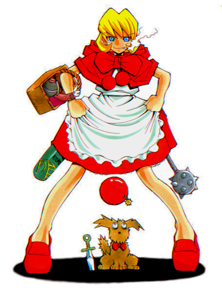
My favorite character in the DS series. She’s clearly inspired by little red riding hood but she definitely won’t let herself get eaten by a wolf.
When I see this character I feel two emotions. At first she seems to be a harmless little girl, very adorable too. Then when she pulls out grenades from her dress and grins with madness you’re like “oh damn! This character is hilariously awesome!” I’m very attached to this character.
Week 3 Blog Post – Ahmad Woods
The excerpt of Bill Moggridge’s “People” lists a couple of methods for figuring out how to extract information from folk from the purpose of interaction design. In the Learn section it details a couple of methods for doing such and I choose to write about the method titled Flow Analysis. From my understanding flow analysis is something I should be familiar with as I have a back ground with programming so I’m used to seeing things such as flowcharts and hierarchy charts to help me write programs and such. What these things come in handy with as I alluded too is writing programs or designing websites. A flowchart maps out how a program logically progresses step by step which really comes in handy since it helps you write a better code or even figure out how to start writing. I do believe flowcharts is related to flow analysis since it represents the flow information or activity through all phases of a system or process. So essentially I would use a flow chart for flow analysis purposes when writing a program.
Week 2 – Paper Prototype
Group of Ahmad, Remy and Justin
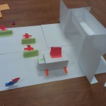
The project is a devices that exposes structural vulnerabilities with sound. It emits vibrations with maps out the building and exposes faults.
What you interact with is the device interface; once you emit the vibration the device visually maps out the building on it’s screen.
