Package file link:
https://drive.google.com/file/d/1xZIGJyYA0cz5R0HqYXkAduCD8GoPZC8m/view?usp=sharing
PDF link:
https://drive.google.com/file/d/1HSWZBoKCO6RI_kEMnnb5UaURbXxJkBK-/view?usp=sharing
Eva Machauf | COMD 3501 OL26 | Fall 2020


According to How to design an enduring logo: Lessons from IBM and Paul Rand, Paul Rand was a very serious and talented graphic designer. This is not surprise to me, but at the same time I did not know how much time he had put into one single project which was the IBM logo. It’s amazing how he spent ten years trying to perfect it. I kind of related a bit to him when in the video, they said that he wasn’t so convinced about the letters because they were not the same width, which i have once had trouble with when i was creating a poster. Even though the IBM stripe logo is pretty iconic, the one with the bee and eye is even more eye catching in my opinion. This is because of how playful it is compared to the other one. Some will think that because it’s so obvious and simple, that it might not have taken as long as it did, but they are wrong, because designs like these often take a lot of time and thought.
This reminded me of Paula Scher when it comes to the outcome of their work and how effective it is. The main difference would be the amount of time spent on the projects. For example, I remember from last week’s assignment, Paula Scher spent less than a minute creating the Highline logo, but it is one of the most known logos in NYC because it’s a well known tourist spot. Both designers won’t take no for an answer. For example when they asked Paula to change the logo to look like an “F”, she was apposed to it. She did not believe it would have been this popular now a day, but she did know that the “F” was not going to work, which is why she kept insisting on the “H”. Same like Paul Rand, he did not accept a no for an answer. Once he did something, that was it, it had to be that logo because he believed in it since the beginning.
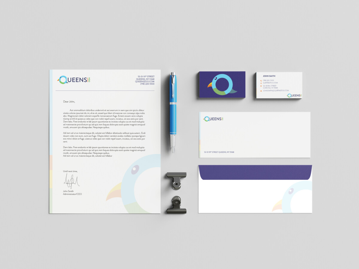
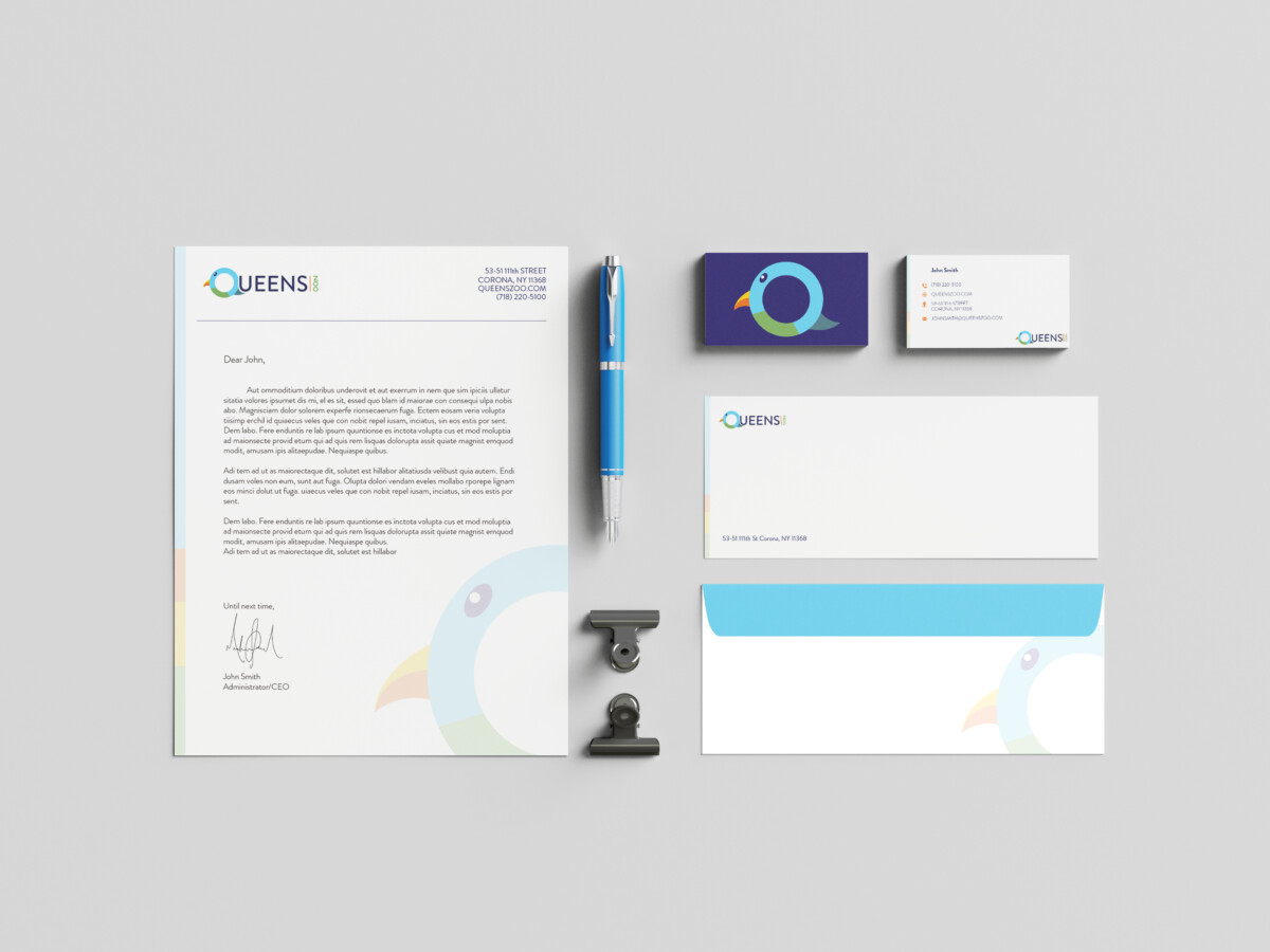
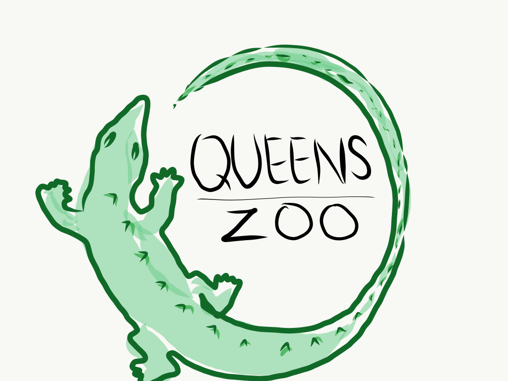
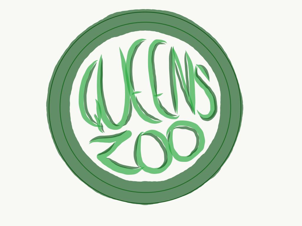
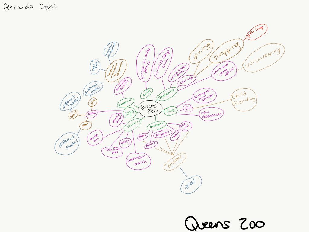
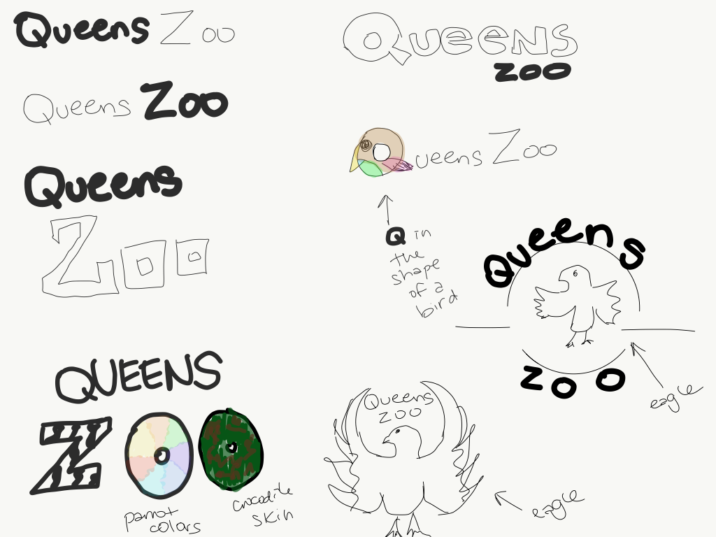
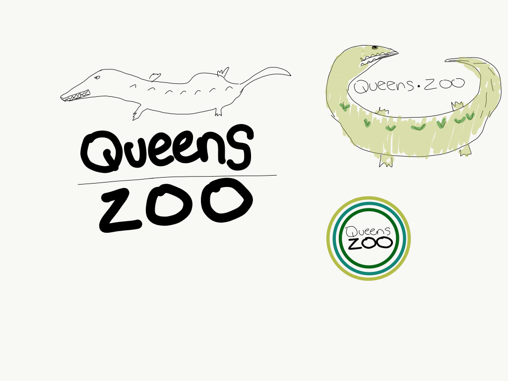
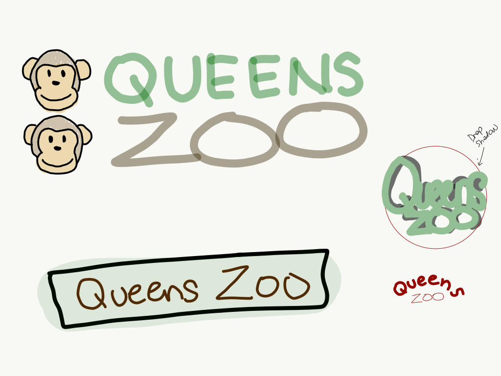
![]()
After watching “Paula Scher: Do What You’ve Never Done Before”, I personally had no idea that there was a show in Grand Central that included ideas from different people on how the Highline was made. It’s interesting how an idea which nobody really thought would happen, actually became something so big for New York City. This just makes me see that one should never give up or doubt their designs because you never know, your ideas or designs might become the next big thing. I really enjoyed seeing her painting of the boroughs of New York on the walls. From a far it looks like graffiti, which I enjoy, but from up close you realize there are words that all of us living in New York, are familiar with. The technique of projecting her original painting on the walls to later paint, was very smart so that everything was placed exactly where it needed to be. I also found it funny how the second work of art she presented was not proofread before being put up. Honestly, I would not have proofread it either. There were way too many languages and would’ve taken up too much unnecessary time.
According to “Artist Series: Paula Scher”, what should be reflected in a logo is that it should be syncopated. I, too, did not know what this word meant until she explained it. What I enjoyed about the video is when they started talking about adding movement to text. I personally enjoy seeing posters that have text going in all different directions. It adds more of a personality to the posters in my opinion. There are times where it is needed to add movement into text to attract the viewers’ attention, especially if the information on it is something such as a theater Ad where there is entertainment. I found it interesting that the Citibank logo was made in such a short amount of time, considering how well it works. I would’ve imagined a lot of thought and process and especially time, went into it.
According to the article, The Age of the Anti-Logo: Why Museums Are Shedding Their Identities, I agree with the statement, “developing a museum brand is a complicated chore.” I agree with this because a museum consists of a lot of artwork and the logo will have to one way or another connect to each and every one of them, in my opinion. It’s better if a logo such as the Whitney museums, can change depending in what context it is found, without changing the overall aspect of it. One way logos are successful are if they can be used in different shapes and sizes but keeping its identity such as the MIT Media Lab, which includes the same colors, but pointing in different directions. Another great point the article states is, as the institution evolves, the logo should go along with it.
The video “The Art of Logo Design”, talks about logos and how their main focus is to be able to express who the company is and what they do. It is meant to be simple, but at the same time capture the viewer’s attention. The simplicity of logos is meant to be able to look the same throughout different platforms such as digitally and in print. What I found interesting was the reference made to hieroglyphics. I had not thought about the relationship they had with logos, but now that I think about it, they do correlate with each other. Hieroglyphics were symbols drawn to represent a story, and logos are meant to represent a company. Something else that caught my attention was the comment that referred to logos as math. If you add “square + blue, what will you get?” You truly won’t know until you try it. I believe logos are trial and error for the most part, because until you don’t try it out and see it on paper or on a screen, you really won’t know if it will work as a logo.
© 2025 IDENTITY DESIGN – COMD 3501
Theme by Anders Noren — Up ↑
The OpenLab is an open-source, digital platform designed to support teaching and learning at City Tech (New York City College of Technology), and to promote student and faculty engagement in the intellectual and social life of the college community.


Recent Comments