Red Cup Cafe

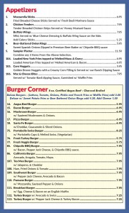
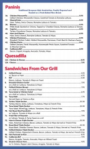
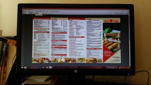
A previous client wanted a delivery menu to be designed. We based the menu from their previous menu. My supervisor started designing the menu, but then told me to continue the menu design. I had to type every dish on to the menu. There were no files of the text. After designing the 5 panel menu, my supervisor sent the files to the client. My supervisor said the client wanted to add several things on to the menu. One of the sandwich names was missing. A few of the categories needed to be reordered. At first, I could not fit the create your own quinoa & rice bowl on to the panel. In order to fit the quinoa bowl and the chef designed salad, the side order category had to be moved. The usual problems for designing menus are the spacing. The text has to be big enough to see and have enough room so it does not look cluttered.

Red Cup Cafe Menu

Red Cup Cafe Menu

Red Cup Cafe Menu

Red Cup Cafe Menu

Through designing this menu, I learned that it is important to communicate with your clients. My supervisor uses email to send files to her clients for approval and changes. When she has specific questions, she would call her clients and ask. It is important to communicate to your clients because there will be certain things clients want. If I have any questions, I should ask my supervisor. If she is not sure about it, she will call the client and ask. This keeps the projects from having any delays.

I learn from my supervisor how to communicate with clients. While working on projects, I can hear my supervisor talking on the phone to her clients. I take note of how she talks and how her tone is. My supervisor takes time to explain to her clients. This is a an important skill to have no matter which working environment one is placed into.

My Mentor

During my internship, I consider my supervisor as my mentor. I get to learn how she manages her company. We also review the projects and how it can be improved on. I have gotten better at menu design. Before starting this internship, I have never designed with so much text. Even in magazines, I can just cut off the text. In menu design, you cannot just take out an item. The client wants all of the items to fit on the menu. Menu design helped me with type.

Graphic design is not only about the visuals, but also about the type. Through this internship, I learnt how to design with large amounts of copy. I learned how to design using hierarchy. In menu design, fonts are usually limited because clients want to have a certain feeling in the menu. I used more variations of the fonts instead of picking new fonts.  I also used color to differentiate the categories.

Igloo Menu-page-004

Igloo Menu-page-004

Igloo Menu-page-005

Igloo Menu-page-005

My supervisor said that my designing skilled improved. I am able to design more efficiently compared to before. I have gained invaluable experience from my supervisor. Not only did I improve on graphic design skills, but I learned about communication. I learned how my supervisor managed her business. With these experiences, I will become a better graphic designer.

Bagel Cafe Project

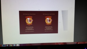
Today my supervisor gave me a new project from a new customer. The customer has a new logo, so they want the logo to be printed on some of their products. The customer gave 3 photos of their current products and has their logo. I used Photoshop and added their new logo to give the clients an idea of how the design would look like. After designing the mock up, the client asked for changes to be made. The changes were made and files were sent to the client again.

Bagel Cafe Cup

Bagel Cafe Cup

Bagel Cafe Cup

Bagel Cafe Cup

A few days later, the client sends the templates for those 3 products. The problem I came upon was that I designed the cup according to the photos. The template was slightly different from the photos taken. I had to reposition the text and logo into the template. Everything had to be resized into the given template in order to print. The 3 templates already had the logo and could not be ungrouped. There were background colors for the cups, so that was solved very easily. I had to cover the logo on the template for the lid. I had difficulty with the bag because the bag was orange. In the picture, the bag was white. I could not ungroup the logo from the template. I also could not take out the orange background color. I kept the logo position and added the text.

The next day, I informed my supervisor about the template problem. She emailed the client and asked about the template. The client sent the template without the color and the logo. I learned that designing in mock ups are different from templates. The designs are restricted into the margins on the template. I thought the client should have given the template first because it would be easier to design within the template first.

Bagel Cafe Mock Up Bag

Bagel Cafe Mock Up Bag

Bagel Cafe Template Bag

Bagel Cafe Template Bag

Utopia Menu Boards

Previously in the self evaluation post, a project from Utopia Bagel was mentioned. After I designed the board, my supervisor told me that there was suppose to be an inch border around the board. She forgot to mention it, but she said it would be fine because we can just scale it down. After my supervisor made the changes to the board, she was notified that the measurements of the board would be changed. The board will be 3 feet tall instead of 2 feet tall. My supervisor decided she would fix the board and told me to work on the other boards. I worked on the coffee board and pastry board. Both of these boards are much emptier compared to the 10 feet wide board. There was much more white space and the font size could be bigger.

Pastry Board 40 x 30

Pastry Board

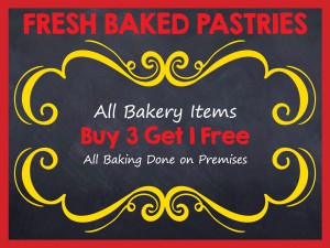
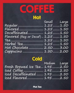
One of the difficulties I encountered was the pastry board. The pastry board only included a line of text. I tried to keep the font size similar to the other menu boards. If the font sizes were the same, there would be too much empty space. With just the line of text, the board looked very boring. My supervisor looked for chalk drawings and said she wanted something similar on the board. Besides searching for chalk drawings, I looked for borders. The client had chosen the pastry board with yellow border.

Coffee Board 24 x 30 outlines-page-001

Coffee Board

After this project, I learned that the designs for projects will keep changing until it is ready for print. The client will always ask for changes whether it is the color of type or the prices of the items. As of right now, the menu board design is completely different from what it first looked like. The board will continue to change until the client gives the ok to print.

Utopia Menu Board Current

Utopia Menu Board Current


Self-Evaluation


Utopia Bagel menu board before

Utopia Bagel menu board before


For the past week I have been working on a few projects. I was assigned a series of menu board for a place called Utopia Bagel. I have also been working on dish cards, half page advertisements and t-shirts. The menu boards Utopia Bagel requested we design are very large. They are all 2 feet tall. One of them is 10 feet wide, while the other two are 4 feet wide. While designing these menu boards, I had to make the font size as big as possible. This made the text very close and jammed packed. It felt like there were too many words on the menu boards.

I had a difficult time keeping the font size big and legible while having all the copy fit. My supervisor said to make the copy either 60 point or 72 point. I felt challenged when I designed the board for the cold cuts. A few of the words were too long and would not fit into the column. I could not change the point size to be smaller. I tried to make the font skinnier, but it looked awkward.


Utopia Bagel menu board after

Utopia Bagel menu board after


After attempting to design the cold cuts menu board, I was not satisfied by how it looked. I asked my supervisor to take a look at the menu board. My supervisor said that if she was the professor, she would give me an A. She said I was learning about how to design menu boards and that it was a good experience. We went over the menu board and she made changes. After making the changes the cold cut menu board looked much better. It was not as crowded as before. Some words were taken out to create more room.

After designing a 10 feet by 2 feet board, I gained much more experience in menu board design. The initial board was not designed well enough, but I learned how to make changes to make it legible. It is great that my supervisor goes over the projects because this way I am able to get immediate feedback. Overall, I felt that designing the menu board was something we do not always design for. So this was something new and challenging for me to experience.

Every Door Direct Mail

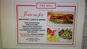
One client requests an EDDM, which is every door direct mail. What I learned was that the dimensions are different. The document I worked on was 9W x 6.5H. Usually USPS requests the right hand side to be empty. On this postcard mailing, the design is one the whole page. The only area without design is the postage area. I also learned that my supervisor uses an online website for EDDM. The company does the printing and mailing as well.

The previous company that my supervisor uses did not provide mailing. She would have to go to the local office and mail them. With the online company, all that needs to be done is to upload the front and back side. My supervisor picks the areas according to the zip code. All business and residents in the zip code would receive a postcard.

20151009_115610[1]

The Mill Postcard Mailing

The Mill Postcard Mailing

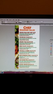
Pure & Fresh Chef Designed Salad


This particular client wants clean designs. So I used the three colors the client usually uses which were black, red and white. The client asked to have 3 paragraphs of text to include into the postcard mailing. I organized the text and images in a clean way. The postcard was straight forward and not busy. I am really fond of the overall layout of this postcard mailing.

Collaborative Project

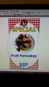
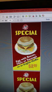
There are not many collaborative projects during my internship. Usually each client requests for one print job. For clients that have multiple jobs, my supervisor lets one employee work on it. This way there are no confusions and duplicates. There was one collaborative project for a deli. They requested us to redesign their outside menu boards. I worked on the breakfast and my co-worker worked on the lunch. We both created multiple layouts and proposed it to the client. The client chose one that they liked. My co-worker’s design was chosen, so I asked her to send me the indd files to me through dropbox. I also asked which fonts were used because everything was outlined. After receiving the files, I started substituting the images and text in to the respective sections. After completing the job, my supervisor examined the files and made modifications accordingly. The files were made into PDF and sent to the client for approval.

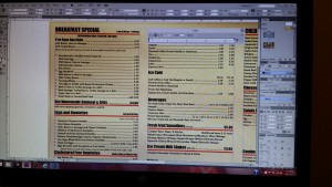
Al's Deli Breakfast Special

Al’s Deli Fruit Pancakes

Ali’s Deli Fruit Pancakes


Ali's Deli Special

Ali’s Deli Breakfast Special

While working on this job, we encountered a slight confusion. My co-worker had the background pasted on the individual pages. The background was also on the master page as well. My supervisor could not understand why the background did not appear after deleting it on the individual page. She asked me if I knew what was wrong. So I explained that the master page was not applied to the individual page. After applying it to the page, only then will the individual page have the background. I thought that I would be learning from my supervisor only, but my supervisor learns from the interns as well. We exchange ideas about how we use Adobe Creative Suite and Creative Cloud.


Culture of the Company

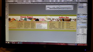
Pure & Fresh Chef Designed Salad Board

Pure & Fresh Chef Designed Salad Board

The company is located inside a house. The attire of the company is informal. I wanted to leave a good impression, so I dressed business casual for the first week. Afterwards, I dressed informally, but only wearing solid color clothing. The work station for the employees and supervisor is a small open work area. We can communicate to one another very easily. There are three computers in total. We keep our work in a dropbox that is synced with my supervisor’s computer. This way she can access the finished files and add more work into my folder.

Pure & Fresh Chef Designed Salad

Pure & Fresh Chef Designed Salad

The ordinary work hours are 9:30 am – 1:30 pm. On some days we work extra 30 minutes to complete the projects on hand. There are no lunch breaks since we work short hours. We can take small breaks whenever we feel we need one. The deadlines for our projects are more flexible. Some projects, we have more than a week to complete. Usually we complete the projects ahead of time if adjustments need to be made. The overall work environment is very relaxing.

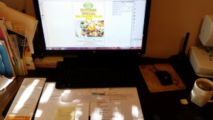
Pure & Fresh October Special

Pure & Fresh October Special

Role in the Company

Before settling down on an internship, I emailed a couple of places requesting an intern position. Calling All Graphics was one choice I decided because it is close to where I live. My supervisor is also the president of Calling All Graphics, her name is Marla Gotay. I emailed Ms. Gotay my cover letter and resume along with a link to my Behance portfolio. I did not have an in-person interview, but she called me the next day about the position. She explained the variety of work she does and her clients. After the phone call, I began working that week. My role in the company is the graphic design intern. Ms. Gotay calls her clients about the jobs and she clarifies to me what the client wants.

Nature's Grill Menu Board

Nature’s Grill Menu Board

Lane Deli and Catering Menu

Lane Deli and Catering Menu

My job is to design the requested materials. Some of the jobs includes, redesigning menus, menu boards and postcards. There are times clients requests to add additional food on to the menu or change prices of food. Following the preliminary designs, Ms. Gotay looks over and requests changes to be made. After everything is completed, Ms. Gotay sends pdf files to the clients for approval.


Introduction to the Company

Calling All Graphics is a private company located inside a house in Brooklyn. This company was founded in 2000. Marla Gotay is the president of the company. The company has 3 employees. The primary business of this company is creating print materials. Print materials include menus, flyers, menu boards, outdoor signs, brochures, business cards and many more. Many of the clients are owners of restaurants or delicatessens. Many clients want to change the look of their menus and to add on more dishes. Our tasks are to satisfy the clients’ needs by redesigning the menus. My job in this company is to redesign the print materials. The supervisor assigns jobs to the employees with notes written. The notes would specify changes that needed to be made or tasks to complete. The supervisor will look over the files and request additional changes if necessary.

Nature's Grill Menu Board

Nature’s Grill Menu Board

I learned that most menus are usually text heavy and have little room for designing. I have to utilize the little amounts of space to design. When I am working on the design in InDesign, I have to constantly change the font size. For menu boards, the fonts have to be big and visible because they are seen from far away. For menus, they can be small because it is meant to be viewed in the customer’s hands.

20150911_124616[1]

Lane Deli & Catering