Department of Photography and Imaging Extra Credit

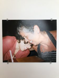
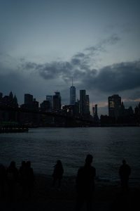
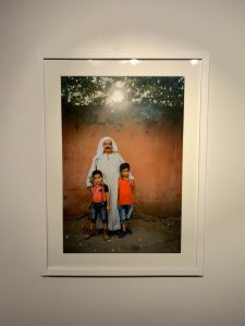
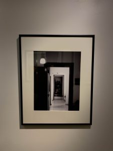
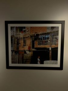
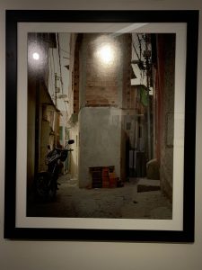
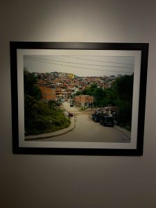
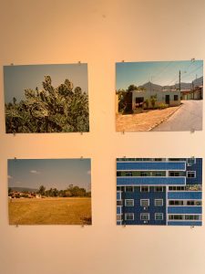
Exploring the NYU Tish building i viewed several works of art from other students. I will say i am very impressed by most of these works from the exhibition but the ones that stood ot to me the most wold have to be “Cachaça é Café” by Danielle Braga Jones. the photos below stood out to me the most with how organically composed these are. i will address that the focusing on these images are a little blurry, but that seems to add to the more organic feeling of the photo especially since she is focussing on family relations and nothing is ever perfect with family but its always loving and that is what im feeling from these photo peace and tranquility.

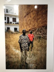
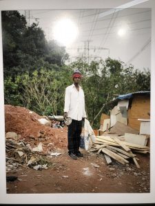
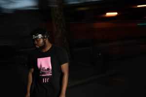
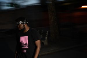
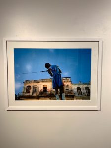
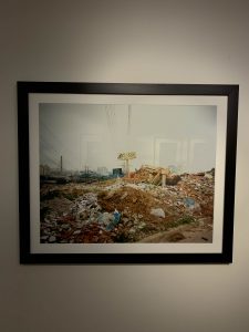
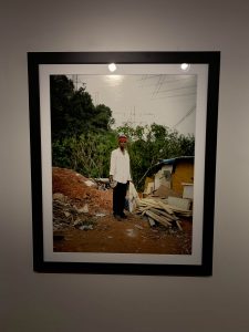
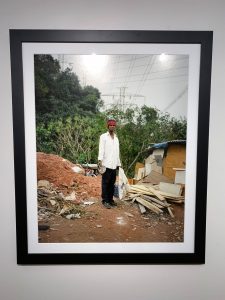
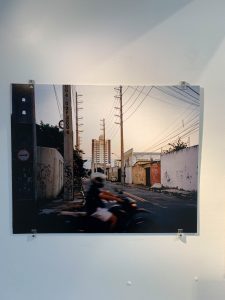
the other student that i loved work from would be “A Man’s Work” by Sky Algosaibi-Jones. The composition of both of these phots were astethically pleasing seeing ass how the subject is centered frame alongside the contrast of colors. the only thing i can even critque would be the noise in the phtotos seems to bother my eye a little when view the collection. the man picking up garbage was my favorite with how the depth of fiels stands out and rings the subject forward

.

extr credit at nyu tisch

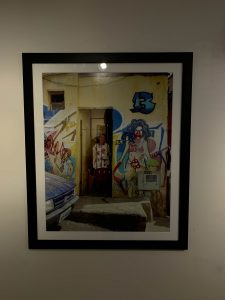
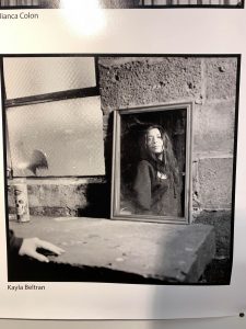
My experience at the exhibit at NYU was interesting as I was able to see the works from other students. I was inspired by many of the photographs that I have seen. There were few that were my favorites and others that I felt missed a mark in becoming a really great picture. One of the pictures that I liked was by Kayla Beltran and it looks like a self portrait of the subject. What I liked about it is that the subject is standing in front of a mirror and the photographer caught her reflection instead of taking a straight forward picture. The use of diagonal lines in this picture creates movement and the overall composition looks like a story is being told.
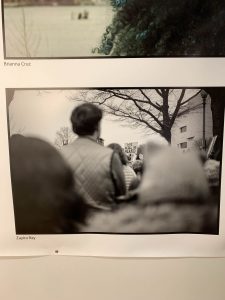

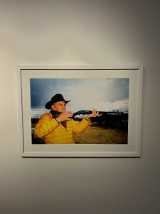
There was another photo that caught my attention but I feel as though the photographer did a poor job on it. The picture with the man in a yellow coat, cowboy hat and a shotgun in his hands is my least favorite. The photographer did not use the rule of thirds in the picture. There is no sense of contrast and there are no lines leading anywhere in the photo so it doesn’t give the photo motion or any depth. I also think that the picture is too warm and the clouds seem overexposed and makes it look unnatural. If these things were changed then the photo would look better.


Homework #1


Joey Lawrence has a fantastic composition of lighting and portrait skills. He focuses lighting contrast around the subject and allowing the shadows to define the models structures. The model Robert Deniro is present a state of confidence. The image displays sharply and focuses on the eyes as they should when taking portraits. Joey Lawrence has the skills I hope to acquire someday as I study photography more.