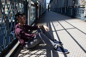
These are my 3 best photographs. When I first took this phots, the background was too bright because of the sun. I have to lower my iso to 100 and use ambient light. The first two photograph I use the flash without the umbrella and creates a interesting light and shadow from the gate. The last photo is when I use the umbrella and see if the soft light will create something good and it didn’t. The photo was dark and it didn’t create the light and shadow that I wanted like the other two.
Author Archives: Yari Zhiliang
Homework #3: Photoville
My experience walking through all the photographs in Photoville was interesting. I was learning about world problems from some of the gallery such as Water is a woman problem, Jalila: Surviving War and famine in Yemen, One day, I will, etc. I chose this photograph because when I saw this I can feel the cold breeze and the blue sky when I went out at night. The blue sky and the black silhouette gave me a heavy nostalgic when I went on a trip to Pennsylvania. There’s a framing composition on the bottom left of the door with the yellow light. It makes me look at that part at first and the rest of the photos.
Learning Log #3 Street Photography
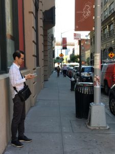
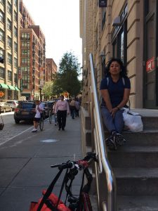
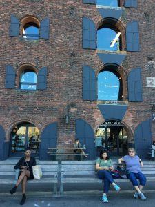
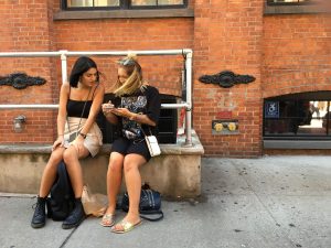
These are my 5 favorite photographs. It was hard to take these pictures because of tourists people walking all over the place and trying not to get caught. The four top of the photos, I wanted to capture the city and different type of people walking around, but also keep the people in front to be the main focus. Then the last photo i wanted to capture people’s relationship. All my compositions are mostly following the grids.
Learning Log #2
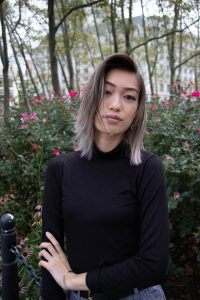
These are the best 3 photos from today field trip. It was very cloudy and hardly any good light from the sun. However, I do like the depress mood lighting because of the weather. The first photo I was experimenting with the setting on the camera and try a different composition. The only thing I could improved on this is that I should move closer and have a depth from the gate. The two photos are just basic, straight forward portraits. I follow the eye in the middle composition and the only thing I could improved on this is maybe make the background flowers more blurry.
Learning Log #1 Light & Shadows
These photos are hard to take because I don’t have good ideas for taking interesting photos with the items provided in the city. I was looking around for shadows and finding branches and leaf with holes to create a unique shadow effect. In the first photo, I used leading lines and accidentally made the person from the center a focal point. I should have framed it better to make my model the main focus with the same shadow from the fences. The second photo I fill in the frame and make the background blurry. I noticed that the long shadow from his right shoulder looks like a shoulder strap. The third photo I also did fill the frame composition. I wanted the face to be the focus and have the shadow and background be darker.
HW 1
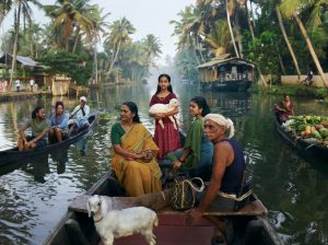
This photograph is by Joey L. He is from Brooklyn, New York and he started doing photography when he was a teenager. Him doing a film project has started him to take interest in doing photography. His style is mostly focus on portraits from different cultures. I choose this photograph because of the framing and the use of leading lines. Joey uses the boat’s perspective to make the little girl from the middle as the focal point. The white fog covering the small part of the palm tree help focus our eyes to the little girl.
Homework #1 Photographer Blog Post

99 Cents
By: Andreas Gursky
1999
This photograph caught my attention because of the vibrant colors and the organization of the manufacture stocks in each aisles. It is satisfying to see the stocks to be very organized, even-though it’s not organized by color. It is also different from other type of photography styles for using different colors, rather than dull and muted colors. The photographer use the store’s architecture to create a beautiful and colorful shot. The colorful stocks contrast with the white background of the store’s building. Also, he uses simple straight horizontal composition to show all the different stocks in each aisles.


