Category Archives: Homework Assignments

MoMa Extra Credit

Being: New Photography 2018

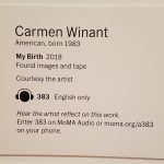
Out of the entire photography exhibit, one set of photographs that had caught my eye was My Birth by Carmen Winant. This specific set of photography caught my eye because of the two walls, top to bottom, lined with photos pf varying sized of women giving birth which is something that is seen as taboo to many people. I thought out of the different collections of work, this had really stuck out to me. Birth is something spoken about yet at the same time, considered nasty to many people, and to see two whole walls filled from top to bottom of countless experiences of new and old moms was something very unique to me.

The photos were a collection of shots ripped or cut from larger images and old albums. They ranged from close ups of the baby, the mother, and the process of giving birth. Many of the photos are gray scale and grainy while others are old with fading colors. A lot of the photos are also fill the frame types where the focus is the baby leaving the womb. There were also some rule of thirds photos, mainly featuring women giving birth in water or the infant fresh out of the womb with the cord still attached. I did not add the photos to this extra credit assignment due to their graphic nature, involving blood and nudity not being allowed on this website.

Greenary

I chose Alex Noriega and the one photo that caught my attention was a beautiful one of nature. First thing that caught my eye was the very sharp greenery surrounding a quiet small, but contrasting daisy.  Figure to Ground plays a great part in making your eye move around but truly know the focus of the subject and background. Patterns and Repetition also played a good part in this, the layers of greenery really seems to surround the subject in a circular motion. If the middle was split in half and one side was duplicated to the other I can see this image easily fall into symmetry thanks to is similar patterns.  This aesthetic brings a great atmosphere, with its interesting contrasting lighting, and cohesive patterns, truly making it an excellence piece.


Jim Richardson: Landscape Photography

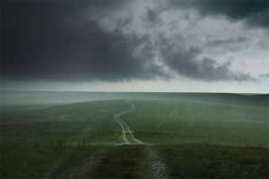
I choose this image because of how it spoke to me. The colors present in the image  have an intensity but also a calm that comes with the rain. I feel the most noticeable part of the image is the path that goes straight down the middle. The way it looks in this photo almost make it seem like it is stretching out into the sky. Its not a symmetrical image but you aren’t going to get a symmetrical image in nature without a boy of water and the fact that it won me over with my bias towards symmetrical things speaks about the dull but vibrant (yes that is a weird statement) colors.

Yvonne Zemke

Yvonne Zemke is a photographer that focuses on wedding photography. In many of her photos, I noticed that she uses the rule of thirds to great effect. Her subjects usually fall upon the 1st or last 3rd (vertically) in the photograph. Faces usually occupy the horizontal third. When present there are floor tiles function as leading lines like the above picture. There is a feeling of elegance in the work that Yvonne Zemke creates which works perfectly for wedding photography.

Micheal Muller: Portrait Photography of Rihanna

The artist that I’ve chosen is Michael Muller, He is an Portrait Photographer that also does work in advertising and entertainment. His work gives off a vibe that there’s a meaning that whoever is in front of the camera has a story to them and that’s what I like. It seem he’s the reason behind great photos of my favorite celebrities and movies. The photo that stood out the most for me is the Rihanna portrait. The background is mostly bright but the outskirts of it are dark but you’re still drawn to her face. Her face isn’t in the middle of the photo, it’s on the right which to me gives me an vibe that she’s standing out more than the brightness in the photo.This image requires alt text, but the alt text is currently blank. Either add alt text or mark the image as decorative.

Alex Noriega

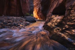
Alex Noriega is a landscape photographer that I chose. According to his website, most of his work focuses on the American Southwest. One of the photographs that stood out to me was the one titled Serenade of Water. This photo was taken with a longer exposure period and as a result the rushing water of the canyon is blurred and almost resembles brush strokes. As a result the photograph reminds me of an impressionist painting.Photo by Alex NoriegaThis image requires alt text, but the alt text is currently blank. Either add alt text or mark the image as decorative.