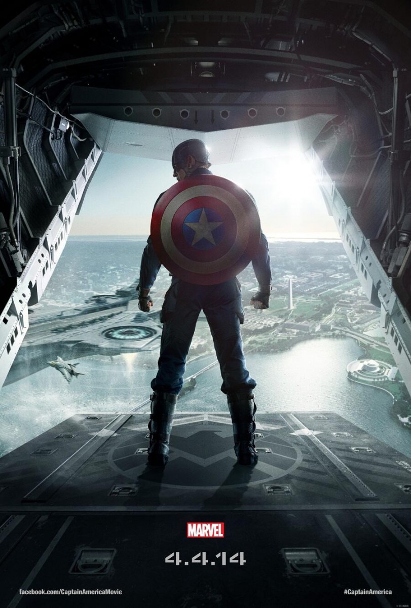
Monthly Archives: February 2018

Homework 1

I was drawn to this photo because of its symmetry. The subject is framed by the the staircase on both sides of the picture. The focus is on the center where the subject is located. Although the subject is not perfectly centered, the size difference between the subject and the rest of the photo is what makes the subject the focal point.

HW#1: Michael Muller: Entertainment Photography

I choseĀ Michael Muller as the photographer who’s photography caught my attention. His website has a large selection of various types of photography and because I’m really drawn into the entertainment industry, I was amazed to see how many of my favorite movie posters were shot by him. After going through his many photographs i noticed how intense the images tend to be, especially the portraits. The photo, or poster, that caught my attention was the poster of ‘Captain America: The Winter Soldier’. This was my favorite Marvel movie of all time which is probably the main reason I chose to speak about it. In this image Muller uses many different photography rules. There’s clear framing,Ā contrast in theĀ foregroundĀ andĀ background.Ā Instead of using the rule of thirds,Ā Muller centers the body which ends up making the image look symmetrical. TheĀ diagonal lines lead your eyes to the direction of Captain America. Overall the poster looks perfect for the epic movie that it is!

Poster of Marvel's 'Captain America: The Winter Soldier'. Photographed by Michael Muller.

Greenary

I choseĀ Alex Noriega and the one photo that caught my attention was a beautiful one of nature. First thing that caught my eye was the very sharp greenery surrounding a quiet small, but contrasting daisy.Ā Ā Figure to GroundĀ plays a great part in making your eye move around but truly know the focus of the subject and background. Patterns and RepetitionĀ also played a good part in this, the layers of greenery really seems to surround the subject in a circular motion. If the middle was split in half and one side was duplicated to the other I can see this image easily fall into symmetry thanks to is similar patterns.Ā  This aesthetic brings a great atmosphere, with its interesting contrasting lighting, and cohesive patterns, truly making it an excellence piece.


Hw 1 – mkc609 Street photographer

I chose this photograph because it captures the moment very well. It shows how the city really will never stop no matter what.Ā  The detail is good, you can see the tracks in the ran over snow. This photograph especially stood out because the person riding theĀ  bicycle in the snow to do their job. It was the first ting that caught my eye and made me look around it. This picture must of had a short exposure because it was able to capture the snowflakes falling and the bicycle without blur.

HW #1 – Michael Muller


These two photographs were taken by Michael Muller. This first photo was drawn to me because I found it humorous.Ā What Seth Rogen is doing with his glasses shows his personality. The second photo also Ā was drawn to me because of the sultry and intense look of Megan Fox. Ā  I love the black and white of the photo.

Jim Richardson: Landscape Photography

I choose this image because of how it spoke to me. The colors present in the image Ā have an intensity but also a calm that comes with the rain. I feel the most noticeable part of the image is the path that goes straight down the middle. The way it looks in this photo almost make it seem like it is stretching out into the sky. Its not a symmetrical image but you aren’t going to get a symmetrical image in nature without a boy of water and the fact that it won me over with my bias towards symmetrical things speaks about the dull but vibrant (yes that is a weird statement) colors.

Francesco Gola: Landscape Photography

I decided to pick this photograph byĀ Francesco Gola because it represents how feel at times. in the photograph there is only two rocks out in a vast body of water. i feel like as if i’m one of those rocks on a vast and expanding world. there are times when i can’t exactly process everything in the world from food to movies to landscapes. Sometimes it can be a little scary, as they say it’s a great big world out there. One thing i liked about this photo is how much of the landscape is let in to show the vast body of water.

This image requires alt text, but the alt text is currently blank. Either add alt text or mark the image as decorative.

Yvonne Zemke

Yvonne Zemke is a photographer that focuses on wedding photography. In many of her photos, I noticed that she uses the rule of thirds to great effect. Her subjects usually fall upon the 1st or last 3rd (vertically) in the photograph. Faces usually occupy the horizontal third. When present there are floor tiles function as leading lines like the above picture. There is a feeling of elegance in the work that Yvonne Zemke creates which works perfectly for wedding photography.

Micheal Muller: Portrait Photography of Rihanna

The artist that I’ve chosen is Michael Muller, He is an Portrait Photographer that also does work in advertising and entertainment. His work gives off a vibe that there’s a meaning that whoever is in front of the camera has a story to them and that’s what I like. It seem he’s the reason behind great photos of my favorite celebrities and movies. The photo that stood out the most for me is the Rihanna portrait. The background is mostly bright but the outskirts of it are dark but you’re still drawn to her face. Her face isn’t in the middle of the photo, it’s on the right which to me gives me an vibe that she’s standing out more than the brightness in the photo.This image requires alt text, but the alt text is currently blank. Either add alt text or mark the image as decorative.

Michael Muller: Portrait Photography

I choose this picture by Michael Muller. The person of this picture locates on the right in the middle of the picture. However, the light from the right side successfully divides the face into two parts. The blue eye in the shaded area is particularly noticeable, it looks like the gems that shine through the darkness. From the color of the background clothes of the characters, the picture is on the gray-blue color tone, it also couples with a melancholy expression gives people a little bit sad feeling. The small light behind the neck of the character makes the black shaded area doesnā€™t take too much area, and I think this part of the cool light is the important part of the picture atmosphere. The light source above the background made the character’s blue clothes not out of balance. Therefore, the lighting and atmosphere on this picture are all doing well and I really like it.