For this video project, we had to give an introduction about ourselves as young artists. We were also allowed to show our works and/or make and auto biography. Another factor in this video project was to be able to acknowledge the file formats provided when exporting video and ways to compress it.
In my video, I give a brief introduction about my self and I show the works I have done so far at City Tech. This was a very enjoyable project because I am always challenging myself when it comes to editing. Even though it was a short forty second video, the process behind it was long. I understand how it is better to use videos that are horizontal, but I intentionally used a vertical moving image for my credits. I was also able to incorporate two vertical videos side by side so they didn’t appear out of place. Lastly, I added sound effects of a camera shutter whenever a work was shown. Some difficulties that usually occur when editing is mostly with audio. I love sound editing, and I tend to pick at the smallest different in decibels or displacements when there are various cuts.
As for the video aspect, I did not want to make something too static so I knew I had to incorporate motion of some kind. I recently got back into motion graphics so I used both Adobe After Effects and Premiere as platforms to edit. Most of the content in the video are still images but through After Effects I was able to have them move. My opening was recorded in slow motion and the credits is a live image set to loop.
If you were asked if you knew who Michiyo Yasuda was, you would have most likely answered no. If you were asked if you knew the animation films Spirited Away, My Neighbour Totoro, or even Ponyo then you would most likely have answered yes as well as may have made a connection with Studio Ghibli. Well, what is the relation between the two questions, you may ask? Michiyo Yasuda was the colourist/color designer behind these projects. Ever since Michiyo Yasuda met Hayao Miyazaki and Isao Takahata, both founders of Studio Ghibli, she’s been the colourist behind their animations. The three animated films I have mentioned are popular works known from her and they have left an impact.
Michiyo Yasuda was born in Tokyo in April of 1939. She initially started working in different companies before she landed in a company called Toei Animation (known as Toei Doga before). At Toei animation she learned about animation series, commercials and developed a skill set in color design. At one of the Toei Animation productions she met Hayao Miyazaki and Isao Takahata, who were known as legends, and jumped on board with them for a collaboration. Since then, Yasuda has been delivering variation of color palettes between films and bringing the characters to life. Working for 40 years, she has also quickly adapted to new coloring technology which has led her to produce some great staple images of the animation films such as Spirited Away and My Neighbour Totoro.
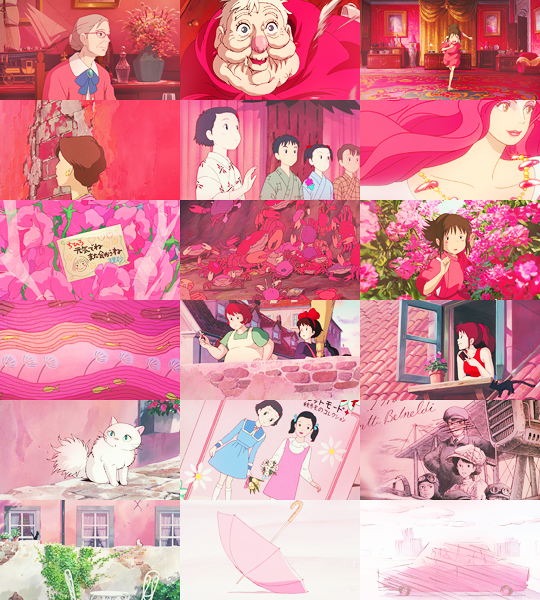
There are many animation productions not mentioned that Yasuda has been a part of working at Studio Ghibli. She has been with them since their beginning days. Figure 1 shows a still image from the animated film My Neighbour Totoro which was released in 1988.
Figure 1: Still from My Neighbour Totoro
This film is set in post-war rural Japan and follows the journey of two daughters encountering the wood spirits. This still image became an iconic representation of the film, from being on the poster to being on merchandise. In this image we can see Michiyo used dark tones for the environment and still kept the characters true to their original colors. The environment is the only thing affected by the rain. In an interview with the LA Times Yasuda states that “Color has a meaning, and it makes the film more easily understood. Colors and pictures can enhance what the situation is on screen.” From this still we can tell that this is an important scene that unifies both characters as they both hold an umbrella and even though the two little girls are well lit, the big Totoro character has a part of him coming into light. This would suggest that he is trying to be friendly while keeping one foot back in case things don’t work out. On the girl, Michiyo Yasuda chooses red and orange which are both tones to describe courage and strength. She gives Totoro dark tones of grey because he is a spirit from the woods but not an evil one.
Another project Yasuda worked on is the most recognized animated film Spirited Away which won an Oscar in 2002. Her colour choices brought to life the environment in the spirit world giving it an almost surreal look and each character resembled their chosen colors throughout the film as shown in Figure 2. For example in Figure 3, the character Chihiro, when she enters the spirit world she carries the color of a light pink. Whereas the character Haku, a dragon, carries the color blue in both a human and dragon body. In her interview from LA Times she mentions that understanding the director’s vision is the first step in determining the color for the animated film and how she tries to translate the color used in the storyboards to the actual film. Her color choices bring a natural relation to the subjects/objects as they are in real life, which helps relating to the fictional world.
Figure 2: Still from Spirited Away.Figure 3: Chihiro on the left, Haku on the right
Michiyo Yasuda worked on Ponyo, shown in Figure 4, which was her last film before retirement. She was interviewed by the LA Times during this time and she broke down the color choice for the character Ponyo. This explanation gave us a glimpseinto her creative process. She states “I just choose which color fits each character. The reason Ponyo is pink — or red — is because she’s based on a red goldfish.” So Yasuda keeps Ponyo to her true form through color. Even though Ponyo is in human form the color reddish pink is a reminder that she is in fact a goldfish. In Figure 4 you can also see the color blue being used interchangeably between other fish and the water. She states in her interview, “I chose a color that can be both the fish and the sea simultaneously.., I want to show the audience how you see or feel the color in the water.” So we can see that Yasuda believed in color being a form of expression.
Figure 4: Still from Ponyo
No matter which project Michiyo Yasuda worked on she always had the same mission in mind which was to have the color translate from real life in the animated world. Not only to reflect reality but to also give the audience a fantasy world that they can jump on. Her choices are seen through the animated films she has worked with Hayao Miyazaki and the colors are rich and vivid without being so strong, giving off a sense of pastels. Down below are some color palettes she used seen throughout the animated films she has worked on. She would be dearly missed on future Studio Ghibli productions but those who worked closely with her know how valuable she was in bringing Miyazaki’s visions to life.
Adidas is known worldwide as one of the leading sportswear company that caters to clients ranging from famous olympic athletes to the average trainee. The company first started out as a little-known shoe factory named “Dassler Brothers Shoe Company” by brothers Adolf and Rudolf Dassler. However, a family feud split them apart, with Adolf taking full control of the business and changing its name, in 1949, to “Adidas”: the formation from his nickname Adi and the first three letters of his last name. After being able to trademark the three stripes and the brand name, Adolf has been able to expand Adidas into the success that it is now.
Original logo created in 1949. I Photo by ZenBusiness
Before the feud, the two brothers released cleats that showed two stripes on the side of each cleat. This was for the mere purpose of the shoe’s bend and tightness. After the split, Adolf added an additional stripe to the two existing stripes. He realized that another company, “Karhu Sports,” had trademarked the three stripe logo. So, Adolf Dassler bought over the company to be able to have the rights over the logo. Once acquired, Adolf started using the three stripes on his footwear and his logos. During the 1920s, Adolf had famous olympic athletes such as Georg Lammers and Lina Radke wear his shoes which was a successful marketing technique because they both ended up winning medals. They were both sporting track and field shoes for the 100m and 800m race. His company’s initial logo contained the graphic image of a cleat in between two extended stems that originated from the letter ‘d’. The name ‘adidas’ sat below the cleat and it remained in lowercase san serif letters. The stems from the ‘a’ were made pointy, at an angle. The three stripes were shown on the image of the cleat. Adolf Dassler was adamant that his footwear company would be known as the three stripe company. In 1950, the company changed its logo to a wordmark in reverse on a black background. Seventeen years from 1950, the logo’s black background was removed and the pointed stems were removed from the letter ‘a’. The tittle on the ‘i’ also became aligned with the stems of the ‘d’. Although these two logos contained no graphics, the typeface remained san serif and lowercase.
The logo went through another change four years later because Adolf Dassler wanted to venture out into mainstream and casual shoes since sportswear competition started to rise. Adolf Dassler’s brother, Rudolf Dassler, was also running his shoe company, Puma, and both brothers were in an intense competition. Thus, the trefoil logo was born in 1971. Keeping the same san serif typeface and lowercase letters, a three leaf shape was added on top of the word mark. The three stripes were added as cut-outs at the bottom of the intersecting leaves. These three leaves are said to signify Adidas’ primary markets: North America, Europe, and Asia.
The Adidas logo changed yet again in 1991. Peter Moore joined Adidas as the Creative Director and he helped revamp the logo that’s iconic today. Peter Moore decided to join Adidas after visiting the company in Germany. He was known as the creative director who refreshed the Nike logo as well. While keeping the san serif typefaces, the three stripes were shifted at an angle, each stripe on top of each other, like a mountain. The message behind this new logo was to show relatability to the consumer of the obstacles athletes face towards success and owning shoes that athletes wear. Although a new logo was developed, the trefoil logo did not disappear and was used to represent the Originals series collection.
As the new millennium approached, the company logo gained a new addition to the family, the global logo. The global logo was created in 2002 to signify that the company’s products were now being sold around the world and so the round shape was used. As always, the three stripes were used at an angle like a claw mark signifying adaptation towards change. The latest change to the logo was made in 2005 by stripping everything off except for the three stripes and the brand’s iconic lowercase name. Going back to its origins and its consistency, the logo carried the three stripes on the left side of the brand’s name. The outer black stripes align with the x-height of the text.
Up until 1978, Adolf Dassler was able to maintain the success of Adidas. With Dassler’s death in September of 1978, his son Horst Dassler took over and with his father’s trefoil logo, was able to step foot into collaboration territory. This was done in 1986 with group Run DMC where fusion between art and sports started and is now called streetwear. After Horst Dassler’s death in 1987, the company suffered a great loss and became a stock company. By 1990, Adidas would have a new CEO and creative director that were able to resurrect what Adidas has always been, the best sports company in the world.
Adidas Originals Trefoil Collection I Screenshot from Adidas.com
Adidas has now grown larger with over 59,000 employees producing over 1.1 billion sport and sport lifestyle products around the world. In 2015, thier slogan has become “Creating the New” focusing on speed, cities, and open source. I have worn Adidas shoes since my tennis years in high school. Not only did I like them because of their three stripes, but because it offered the logo in different lifestyle selections from fitness to sports and from fashion to streetwear.
In the Dr. No title sequence it starts off with black and white and then proceeds into color. There are primary color of red, green, and blue being used. We also see complimentary colors such as yellow and orange. So they’re working welcome together. The shape of the circle is used continuously and no matter the amount of circles, the alignment is clear. They form rectangular or square alignments. The type remains white all throughout the sequence and is overlaid on the figures in the background. While with the circle shape, the type is aligned on either the left or right of it. In relation to sound, there is an attempt to make the circles flicker fast when the beat is faster in the audio.
In the apple sequence, the colors are complimentary to each other with colors of red, blue, etc, and circle shapes are also used. What is different is that they also used shapes that relate to the apple product or app icons. This in relation to the audio interconnected nicely because they also added actual audio that the products use. The type was also creatively used within the shapes that were created.
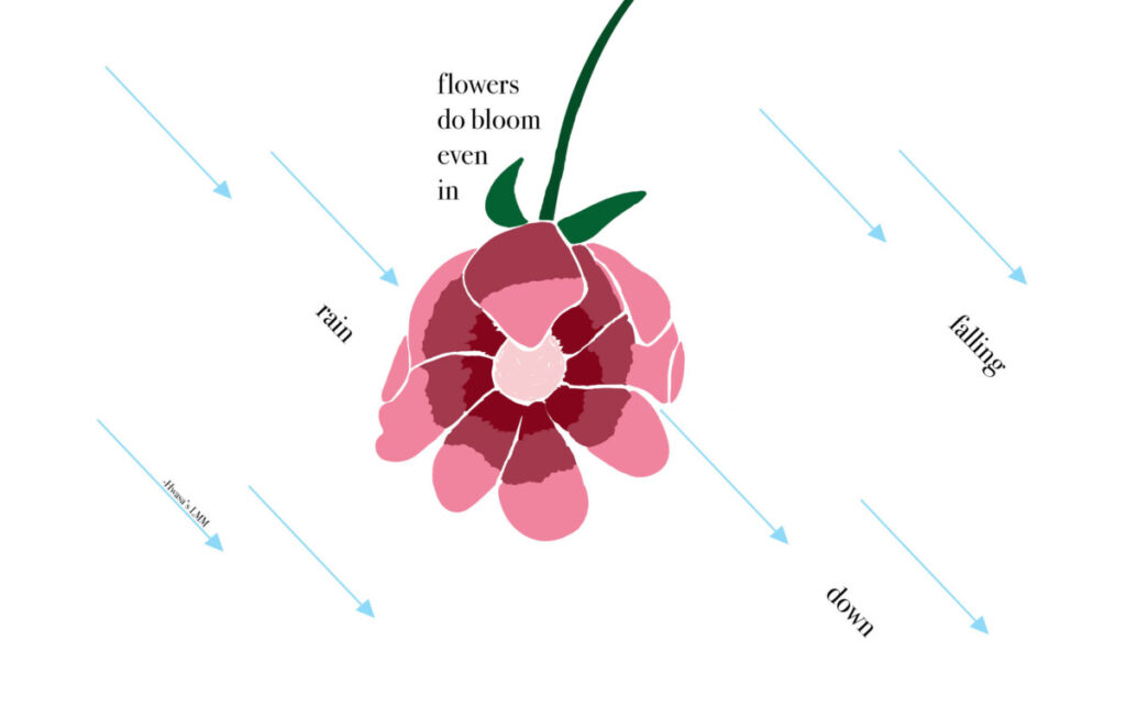
In this assignment we had to choose a quote from any form of reference such as a movie line, song lyric, book, and etc. I chose the quote “Flowers do bloom even in rain falling down” from a song called LMM. This song is by Hwasa and she is a Korean artist that I have been listening to lately as she recently released her first album. LMM is a song about strength and fears, and about being able to face forward even though it seems that everyone is pulling you down. Within this quote, I see the word ‘Flowers’ as her or us, individually, and the word ‘rain’ as the obstacles coming down at you.
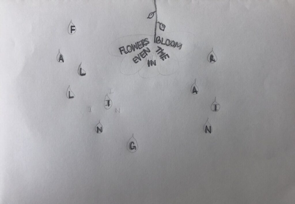
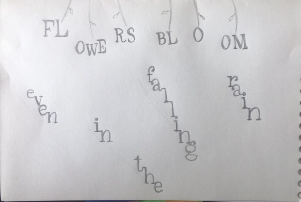
Before finalizing on my three pieces, I worked on some sketches to see in which direction I wanted to go. I knew I wanted to incorporate a flower because they’re seen as easily destroyed if not well taken care of. I also wanted to incorporate rain as attacks, but not leaning far away from actual rain. Here are some sketches that I started with:
Sketch 1
Sketch 2
Sketch 3
Sketch 4
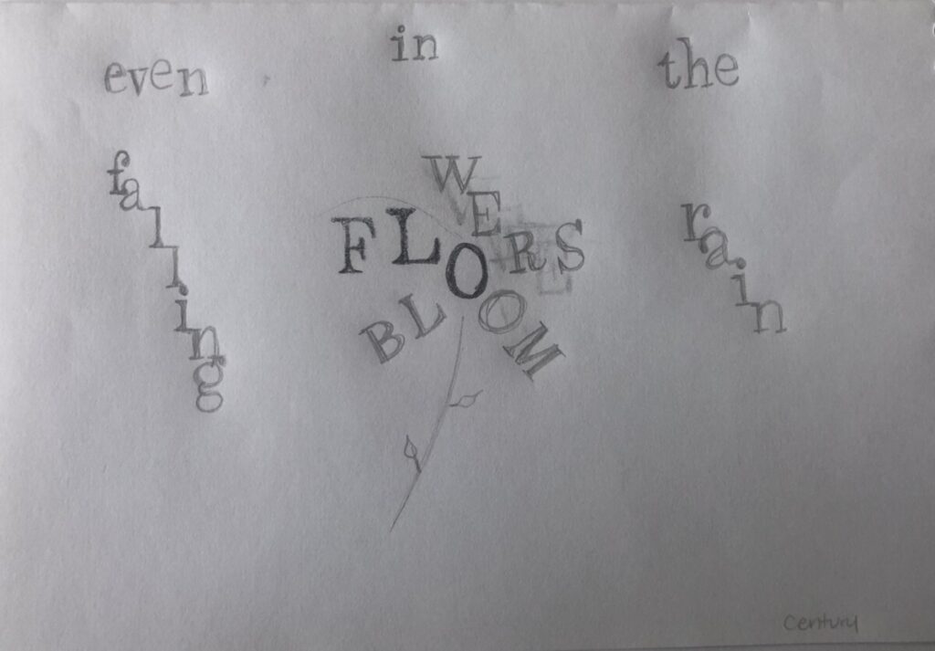
Concept 1
In my first concept, I wanted to focus more on the type. I used Didot as my typeface because I like the lightness on the letters. Using the bold font, the thin stems can be seen on some letters and this resonating with me as having some fragility. In the first half of the quote, ‘Flowers’ and ‘bloom’ aretwo focal points I wanted the viewer to see so I made both ‘Flowers’ and ‘bloom’ bold. The end of the quote, I wanted the type to mimic the rain falling at a diagonal so I used italic font on ‘rainfalling down’. All the texts are stacked on top of each and both parts of the quote are on opposite sides of not only the color solid but also the page. Initially, to split up the type, I had gone with a vertical split approach and I changed it to a diagonal because I saw the ‘Flowers’ rising over the ‘rain’.
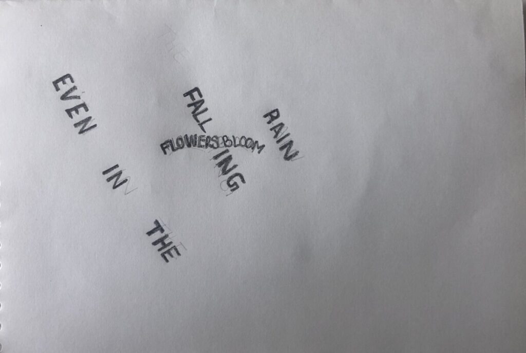
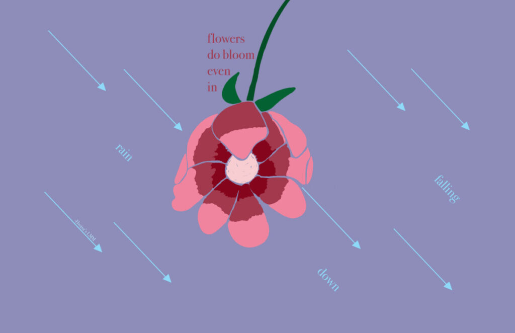
In my second concept, I wanted to introduce a bit of line art so I went ahead and sketched a flower and rain that look like arrows. I drew the flower coming down from the top just like the rain does because flowers usually are on the ground and it seems like the rain is attacking them. In this concept, I can show the flower blooming even as the rain falls and due to gravity, the rain would just slip away downwards. I kept the words ‘rain falling down’ are raindrops and so I also used italics to give it a diagonal visual. As for the raindrops, I gave them triangle shapes at the bottom of each one to make them look like arrows. In this case, I wanted the rain to be something hurtful to signify and enhance the sort of obstacles one has to face. Figure 1 shows these descriptions in its original form. In figure 2, I decided to add some color to complement the flower and to create an environment.
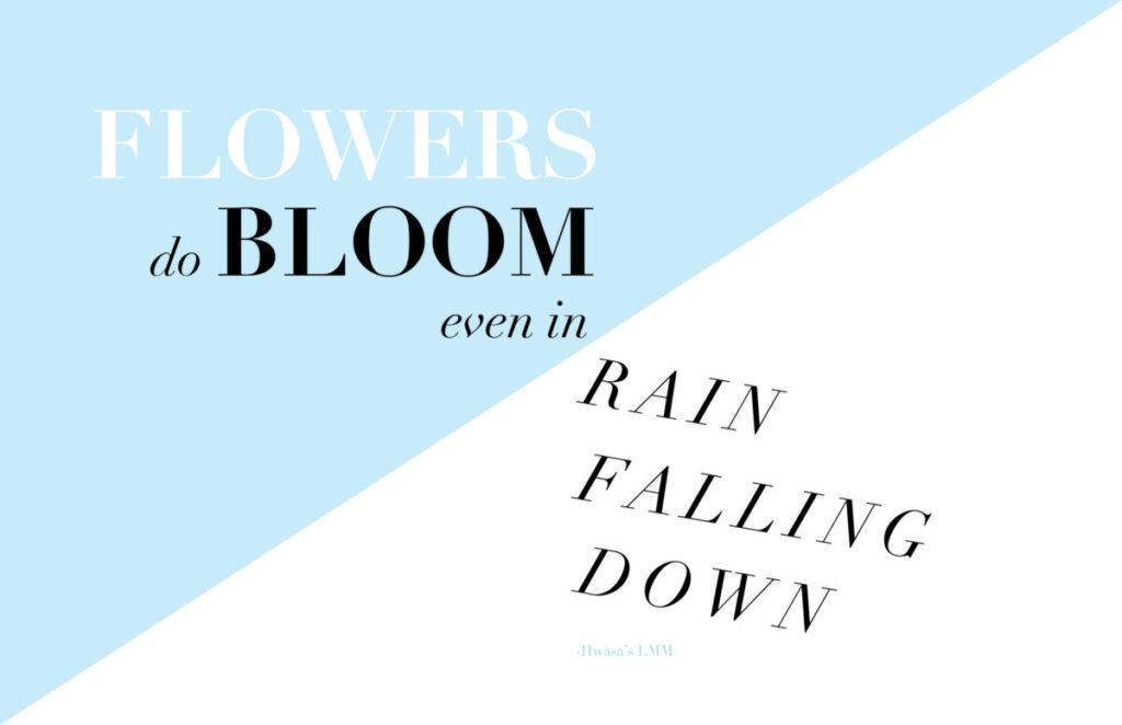
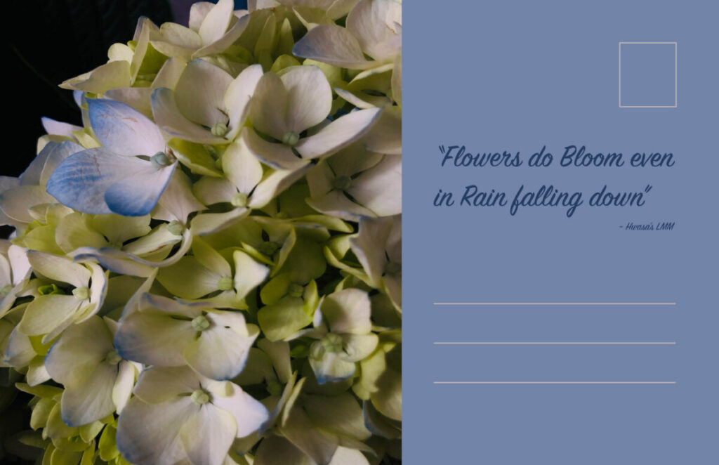
In my third concept, I wanted to use a photo and type to have it seem like a postcard. This is the reason as to why I have two sides. On the left I used a photo I took of some flowers I had and particularly this photo because it contained some shades of blue that give it color against a rainy day. On the right side, I also included a light blue shade to read off as calmness and strength. I wanted to emphasize on flowers blooming more and so I had the photo take over the majority of space. As for the text, the first half remained on the left side on the top of the flowers, giving it a light yellow shade so it can be legible and to correlate with the flowers behind it. On the right side, I kept the ‘rain falling down’ as italics and aligned each word on top of each other but at different starting points to mimic rain.
In Tom Petty’s lyric video, primary colors red and blue against a pale white/yellowish hue. The type was between bold and script. There was contrast between the fill color used for the text against the background. There was also alternation with the colors and text. I loved that some of the text would overlap the text in the background, but it doesn’t blend because of the choice of color alternation. There was careful placement of the text fitting in with the motion graphics, as well as hierarchy. The video also had like an old style texture, almost like film. In Prince’s video, the text color and type was maintained throughout the ad. The colors were in combination with the color palette of the album and the vinyls. So, colors were mostly black and bronze. There wasn’t much play on alignment of the text, it was mostly centered and it fit below the image or by itself on a solid background. This video also gave an older vibe because actual clips of Prince singing were being used.
Before starting the design development, research was done about previous logos. From here, search involving colors, or messages, and candidates were done. This really helps to check what kind of message the campaign is working with and what direction they decide to go with. It really is interesting that a new direction or change was the goal but they also chose something that followed tradition, for example the colors used. I like the one they chose but I have to say that I liked the 2nd final option. Maybe it connected with me because of where we are now in terms of social technology.
– There are no page numbers: We use numbers now to know where we left off or to find something we’re looking for. – Illustrated Text: The initial letter seems to be used to separate paragraphs and they are hand drawn with intricate design/details. Much of the illustration used now is digital – Separation of text: There is no separation between paragraphs or where something ends. – The use of colors to fill in text isn’t done anymore, and the use of colors are more so with educational books or media spreads.
– The text in columns: Usually the format with columns of text are used in magazines or newspapers. – Big initial lettering: Although it is not apparent in every paragraph, some books do contain chapters with a big initial letter size. – There seems to be some form of commentary or text on the side which can be found income educational books or even us when we like to notate notes. – The margins space is reduced much smaller depending on the book but it’s still used when deciding where to place text.
After watching/reading Dr. King’s Drum Major Speech, it gave me something to think about. It resonated with me because through observation I was able to see much more within people and society. The message within the speech was meaningful and powerful. He talked about the Drum Major instinct that we all have within us. This instinct is equal to the basic drive of human life and therefore when it comes to advertisers, we are taken by the persuasion. The Drum Major instinct is our sense in wanting to be better than the other and being the first or gaining attention. In terms of advertisement, he mentions how we are taken by it and even buy the products sold to us, because we would want a better car or a better home or have the latest product. It was an interesting analogy that he also intertwined with religious beliefs as well.
After watching the RAM commercial, I can understand the intent of using part of his speech. Maybe it was controversial because it was a truck/car commercial, and the speech was much more than that. I neither hate it nor love it, but I understand the meaning as a whole.