Logo History: Adidas
Adidas is known worldwide as one of the leading sportswear company that caters to clients ranging from famous olympic athletes to the average trainee. The company first started out as a little-known shoe factory named “Dassler Brothers Shoe Company” by brothers Adolf and Rudolf Dassler. However, a family feud split them apart, with Adolf taking full control of the business and changing its name, in 1949, to “Adidas”: the formation from his nickname Adi and the first three letters of his last name. After being able to trademark the three stripes and the brand name, Adolf has been able to expand Adidas into the success that it is now.

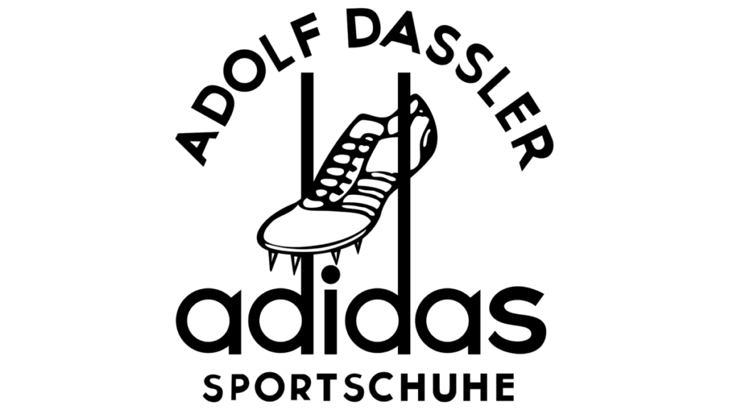
Before the feud, the two brothers released cleats that showed two stripes on the side of each cleat. This was for the mere purpose of the shoe’s bend and tightness. After the split, Adolf added an additional stripe to the two existing stripes. He realized that another company, “Karhu Sports,” had trademarked the three stripe logo. So, Adolf Dassler bought over the company to be able to have the rights over the logo. Once acquired, Adolf started using the three stripes on his footwear and his logos. During the 1920s, Adolf had famous olympic athletes such as Georg Lammers and Lina Radke wear his shoes which was a successful marketing technique because they both ended up winning medals. They were both sporting track and field shoes for the 100m and 800m race. His company’s initial logo contained the graphic image of a cleat in between two extended stems that originated from the letter ‘d’. The name ‘adidas’ sat below the cleat and it remained in lowercase san serif letters. The stems from the ‘a’ were made pointy, at an angle. The three stripes were shown on the image of the cleat. Adolf Dassler was adamant that his footwear company would be known as the three stripe company. In 1950, the company changed its logo to a wordmark in reverse on a black background. Seventeen years from 1950, the logo’s black background was removed and the pointed stems were removed from the letter ‘a’. The tittle on the ‘i’ also became aligned with the stems of the ‘d’. Although these two logos contained no graphics, the typeface remained san serif and lowercase.

Logo created in 1950. I Photo by logaster.com 
Logo created in 1967. I Photo by logos-world.net
The logo went through another change four years later because Adolf Dassler wanted to venture out into mainstream and casual shoes since sportswear competition started to rise. Adolf Dassler’s brother, Rudolf Dassler, was also running his shoe company, Puma, and both brothers were in an intense competition. Thus, the trefoil logo was born in 1971. Keeping the same san serif typeface and lowercase letters, a three leaf shape was added on top of the word mark. The three stripes were added as cut-outs at the bottom of the intersecting leaves. These three leaves are said to signify Adidas’ primary markets: North America, Europe, and Asia.

The Adidas logo changed yet again in 1991. Peter Moore joined Adidas as the Creative Director and he helped revamp the logo that’s iconic today. Peter Moore decided to join Adidas after visiting the company in Germany. He was known as the creative director who refreshed the Nike logo as well. While keeping the san serif typefaces, the three stripes were shifted at an angle, each stripe on top of each other, like a mountain. The message behind this new logo was to show relatability to the consumer of the obstacles athletes face towards success and owning shoes that athletes wear. Although a new logo was developed, the trefoil logo did not disappear and was used to represent the Originals series collection.

As the new millennium approached, the company logo gained a new addition to the family, the global logo. The global logo was created in 2002 to signify that the company’s products were now being sold around the world and so the round shape was used. As always, the three stripes were used at an angle like a claw mark signifying adaptation towards change. The latest change to the logo was made in 2005 by stripping everything off except for the three stripes and the brand’s iconic lowercase name. Going back to its origins and its consistency, the logo carried the three stripes on the left side of the brand’s name. The outer black stripes align with the x-height of the text.

Logo created in 2002. I Photo by 1000logos.net 
Logo created in 2005. I Photo by logos-world.net
Up until 1978, Adolf Dassler was able to maintain the success of Adidas. With Dassler’s death in September of 1978, his son Horst Dassler took over and with his father’s trefoil logo, was able to step foot into collaboration territory. This was done in 1986 with group Run DMC where fusion between art and sports started and is now called streetwear. After Horst Dassler’s death in 1987, the company suffered a great loss and became a stock company. By 1990, Adidas would have a new CEO and creative director that were able to resurrect what Adidas has always been, the best sports company in the world.

Adidas has now grown larger with over 59,000 employees producing over 1.1 billion sport and sport lifestyle products around the world. In 2015, thier slogan has become “Creating the New” focusing on speed, cities, and open source. I have worn Adidas shoes since my tennis years in high school. Not only did I like them because of their three stripes, but because it offered the logo in different lifestyle selections from fitness to sports and from fashion to streetwear.
Reference sources are located on the next page.


