Monthly Archives: March 2015

The Unemployment Rates Of Blacks In America

This Graph Shows The Unemployment Rate of blacks in america between 1980 and 2011 which is the 30 year period that we see a slight decrease and increase during that time. Black unemployment rate has been a big issue in america and the reason for this graph is to give and idea or example of how these types of graphs can be useful when dealing with accurate data based on population productivity in society and the way it affects us both physically and mentally.

The Graph Was Used In The Article To Determine the jobs report of august 2011 and how black umeployment has increased  to record levels of 16.7 % and higher which is why i feel this article makes perfect sense to how african americans have been misplaced in the labor force.

 Link:  

http://money.cnn.com/2011/09/02/news/economy/black_unemployment_rate/

Assignment #2

graph

This graph was created in July 2014. This graph is showing that as of July 2014, Asia is leading the world for installed wind capacity by region.

MAT 1190 Graph Assignment #2


cancer_sites_2011_cdc.0

This graph does a great job in showing deaths across many variables. The variables being  different causes of death associated with many different forms of cancer. It visually represents the amount of deaths caused by different types of cancer death rates 100,000 people.

I got this graph from (http://www.vox.com/2015/2/18/8052559/how-we-die)

MAT 1190 Graph Assignment

Rhondalisa Roberts MAT1190 M&W 2:30pm-3:45pm

Graphs are an essential means of visualizing information. This graph is very unique because the X values are to the left which are the countries and the Y values are to the top of the graph, which are the numbers. The Y values to the center has zero, then negative values left and positive values to the right.

The information from the TheEconomist.com (http://www.economist.com/blogs/freeexchange/2015/03/emerging-markets)  reflects the ability to these countries being able to cope through the financial crisis and compares two years, 2007 and 2014. Liliana Rojas-Suarez of the Centre for Global Development presented this data to show which countries will be most vulnerable and drastically affected by a global financial crisis.


Assignment 2

image image


These two photos are line graphs. In the articles these line graphs are meant to represent the percent of graduates  that end up not having career jobs . The articles talks about how so many college graduates get their masters and  bachelors, have dead end jobs.  By using the census the banks was able to tell through 2012 that 44 percent of graduates were underemployed, and it’s been the same since 1994.  This article is basically showing that there needs to be a change and show if you do go to school you can get a great job in your Felid that does pay well for your education level.

Assignment #2

20150509_woc997

The title of this article was named, ” Ebola in graphics: The toll of a tragedy”. The article spoke of the most current events of the outbreak of Ebola which started in December 2013, in an area called Guéckédou which is located in Guinea and near the border with Liberia and Sierra Leone. Travelers are suspected to be the reason why the disease spread. Reportedly 759 people were infected by the end of June 2014 an 467 people passed, which made this the worst of case of an Ebola outbreak. As of May 9th “Liberia was declared Ebola free”, for Guinea and Sierra Leone the cases are improving. According to the World Health Organization, “each country now has enough treatment beds to be able to isolate and treat patients with Ebola, and to bury everyone known to have died of the disease”.
The image above is a line graph, which shows the new cases per week of Ebola infections from 2014 to 2015 in Guinea, Liberia and Sierra Leone. As you can see the brown lines indicates patient reports of the Ebola infection and the blue represents the World Health Organization reports. For Guinea reports from each party are about the same, as for Liberia “W.H.O” has more reports than the patients report, and for Sierra Leone the patient reports are more than the “W.H.O reports.

Reference: http://www.economist.com/blogs/graphicdetail/2015/05/ebola-graphics?page=1

Ashley Allen Assignment #2 Brief Assignment and Graph

The graph that I chose for this assignment relates to my major Fashion Marketing. It is an article written by Amalia Agathou. The aricle is about a Spain-based Chicisimo fashion site. It has managed to establish itself as a go-to destination for street style inspiration, building a vibrant community for fashionistas to share their looks and tag their closet, opening them up to the world. Brands like Zara and H&M have joined Chicisimo, showcasing looks that feature their designs and rewarding the most stylish Chicisimo members. Chicisimo has managed in such a short of time to go beyond being one more fashion community, taking an in-depth look into street style, data mining and generating statistics from its members’ activity. Having published fashion reports based on data like this in the past, Chihisimo has now published new findings, highlighting correlations between fashion items. There are millions of girls out there who have to decide, daily, how to combine a yellow sweater, or how to rock a little black dress, or simply, what to wear tomorrow. We believe helping girls make these decisions is a very interesting challenge, and that’s our focus! We are obsessed with building an awesome and useful product for the community. Right now our two main features are “share your looks” and “create an album of looks” – you can create an album and aggregate looks with ideas to go to a wedding, or looks with military style, or anything that makes sense.9pi


Assignment#2 Reproduction of news article with graph by Meizhu Deng

Ebola in graphics                                                   

                                                          Ebola in graphics
                                                       The toll of a tragedy 

                                         Mar 12 th 2015, 11:30 by  The Data Team       

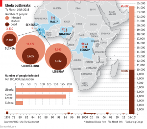
              THE first reported case in the Ebola outbreak ravaging west Africa dates back to December 2013, in Guéckédou, a forested area of Guinea near the border with Liberia and Sierra Leone. Travelers took it across the border: by late March, Liberia had reported eight suspected cases and Sierra Leone six. By the end of June 759 people had been infected and 467 people had died from the disease, making this the worst ever Ebola outbreak. The numbers keep climbing. As of March 10th 2015, 24,350 cases and 10,004 deaths had been reported worldwide, the vast majority of them in these same three countries.
         The outbreak continues to claim lives, but Liberia had no confirmed new cases for a second week. Sierra Leone is still struggling with widespread transmission and cases continue to be detected from unknown sources across the whole region. However, the World Health Organization reports that each country now has enough treatment beds to be able to isolate and treat patients with Ebola, and to bury everyone known to have died of the disease. The chart above shows numbers from both the WHO’s regular situation reports and from patient databases till Mar.10th 2015.

Reproduction of the chart:
           The map of Africa shows the Ebola hit countries in blue color, which are mostly in south-west African countries, with Sierra Leone, Liberia and Guinea most severely hit.
           The color circle graph indicates the infected number of people and those dead in countries where Ebola break out till March 10th 2015. The 3 heavily-hit countries are Sierra Leone, with 11,677 people infected, and 3,655 dead; Liberia with 9,343 people infected and 4162 dead; and Guinea with 3,330 people infected and 2187 dead.
          Below the circle graph is bar graph tells us number of people infected per 100,000 population, with Liberia having the highest rate of infected people about 250 infected every 100,000 people.
          At the bottom of the map is a horizontal line (serves as year) and vertical bars (act as infected number of people and those dead) making bar graph. The bar graph tells us from 1976 to 2015 there are 10 outbreak of Ebola in all in south-west African countries, of which the outbreak beginning with 2013 is the biggest disaster, up to 24,350 people infected and 10004 dead till March10th, 2015.

            The map of Africa with 3 graphs is used to tell us the data about Ebola outbreak in African countries since 1975.

How math relates to my career

dental hygiene

The major I’m persuading is Dental Hygiene and math relates to my major since we have to use mathematical skills everywhere, throughout our daily routine. We must know how to add, subtract, divide, etc. the use of simple math for managing bills, insurances, or calculating the costs of dental treatments. Every dental hygienist must know how to calculate and measure the amount of materials that we must use in our work-field.

How Math relates to my career

Hi there my name is Catherine Feliciano, my major is Communication Design Management, I would also like to take a Business Management course as well because I would like to know how to properly manage my own business.  I may have the right creative skills but I also need to learn how to calculate production costs, determine pricing for my products, analyze finances, inventory management, and marketing sales forecasting all which revolve around the knowledge of math. (Below are two of my first items sold, a plain Mario Case for a DS, and a Leopard Kindle Case)

CFeliciano

CFELICIANO Products

CFELICIANO Products