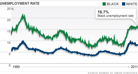
This Graph Shows The Unemployment Rate of blacks in america between 1980 and 2011 which is the 30 year period that we see a slight decrease and increase during that time. Black unemployment rate has been a big issue in america and the reason for this graph is to give and idea or example of how these types of graphs can be useful when dealing with accurate data based on population productivity in society and the way it affects us both physically and mentally.
The Graph Was Used In The Article To Determine the jobs report of august 2011 and how black umeployment has increased to record levels of 16.7 % and higher which is why i feel this article makes perfect sense to how african americans have been misplaced in the labor force.
Link:
http://money.cnn.com/2011/09/02/news/economy/black_unemployment_rate/


Reference (link)? How was the graph used in the article? Also, we have no way of knowing who you are.
One thing to note is that the between 1980 and the beginning of the last recession (2007), the gap steadily narrowed. Since then it has ballooned, with devastating affect in the African-American communities.