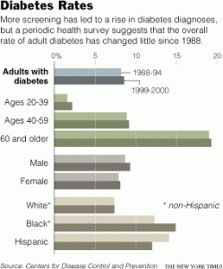
 While searching the New York Times, I stumbled upon an article with this graph. This graph shows the demographics of people with diabetes. The demographics range from people ages 20-39, 40-59, 60+ years, male or female sex, and also by ethnicity. It showcases results dating from 1998. It is important to graph information like this, because it give us a way to forecast the progression or regression of diabetes based off of past statistics and advancements in fighting the disease.
-
Recent Posts
Recent Comments
Archives
Categories
Meta


When providing a reference, please provide more information. When was the article in which the graph appears published? What was the title? Also, the assignment asks you to discuss how the graph was used in the article.
I saw this graph before. It is actually very interesting, it demonstrates how the rise in diabetes is affecting all of us. It shows how we can all be affected and the graph also shows which age group are hit most with diabetes, which can help us understand that with age we are more prone to diabetes, and we should contact all elder people we know so we can inform them of this and try to help lower this graph. A correlation that I notice in this graph is with age (as you get older) you’re at more risk to get diabetes.
How was the graph used in the original article? Has the submitter correctly discussed its place?
Good observation about age. However, I do differ with you regarding the “rise”. If you study the graphs carefully, you see that there has not been that much change in the 1o year period. Among African-Americans, the rate has gone way up. Among Latinos, it has gone down.