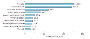
This graph does a great job in showing deaths across many variables. The variables being different causes of death associated with many different forms of cancer. It visually represents the amount of deaths caused by different types of cancer death rates 100,000 people.
I got this graph from (http://www.vox.com/2015/2/18/8052559/how-we-die)

