LL 1- Composition

Select what you think is the best photo that you took today. Create a small (in terms of file size-200kb or less) jpg and post it with your description of what makes this a successful photograph. Include at least one term from today’s shot list.

Posted in LL 1-Composition | Leave a comment

HW #1 – Gregory Mitchell

The photograph I chose was Steam Rising, New York City, USA, 2000 by Michael Kenna.  I really like this photograph because it looks very mysterious. The reason why it looks mysterious is because of the light around the building which gives it an aura that makes it look like it’s glowing and also the steam looks like smoke that’s rising which adds a haunting effect. The photograph  is taken at a upward angle which kind of gives the building a pyramid look, which I think is adds to the mystery and looks intimidating. I like the simplicity of this picture because you don’t have to try to figure it out, as soon as you look at the photograph you get a feeling of mystery and you can clearly see the building rising out of the steam.

http://www.michaelkenna.net/gallery.php?id=14


This building is balanced right in the center which makes the photograph symmetrical. If the photograph was not symmetrical it would not have be as powerful and would be easily over looked. The contrast of light and dark add to the mystery because the top of the photograph is shadowed and dark which contrasts with the light around the building which makes the building look like its glowing. The angle of the shot makes the building have a pyramid shape which makes it look like it is rising.  All of the lines in this photograph are very straight and clean which makes the photograph pleasant and easy to look at.

Posted in Uncategorized | 1 Comment

HW#1 – Julissa Pichardo

Eugene Richards, Stepping through the Ashes, photograph # 11

Of all the photographs, the following stood out the most to me, from Eugene Richards’s Stepping through the Ashes gallery, which contains several photo’s taken by Eugene, in New York, shortly after the tragic events of 9/11, exactly 12 years from this very day.

http://www.eugenerichards.com

Eugene took a photograph of a hospital wall, being viewed through the front side window of a car. The car’s window frame is blurred, with the focus of the photo being on the the hospital wall, which is filled with taped white sheets of paper, containing pictures of the many victims who had passed away due to 9/11. The only way the viewer can tell it’s a hospital is because the photograph captured a sign on the wall that reads “Ambulance Entrance” although the text isn’t very legible. By the sidewalk of that wall the viewer can see some caution tape, as if part of the sidewalk had been closed off. The day appears to be a quiet and emotional one. The photo has no one insight, and sends a sense of helplessness, emptiness, and suffering to the viewer.

Eugene used several elements to help create and convey the mood of this photograph. He uses the shape of the car’s window as his picture frame. I believe this was done to make the photograph more personal and touching to the viewer, and the lines of the hospital’s brick wall gives the viewer a sense of length, telling us the taped up pages run further up this wall. The pages are randomly hung up, they are cluttered and their placement also help show the mood of this photograph. The contrast between the car’s dark window frame, surrounded by the focus of the hung up white pages also makes the viewer feel anguish and closed in.


Posted in Homework, HW1-photo description | 1 Comment

hw1

http://www.dawoudbey.net/index.php/photographs/harlem-usa/

The photograph Three Women at a Parade, 1978 by Dawoud Bey, captured my attention because of the focus point on the three women. In this photograph you can tell a lot by the facial expression they are making. The two women on the left look like they were very   focused on what was going on in the parade. They looked aware of their surroundings and maintained a serious face. The third woman on the right looked as if she was having a good time and enjoying herself. She looked as if she had just finished greeting someone which made me feel as if i was there. All three women were very well dressed with fur coats and fancy hats which meant they were high class and maintained a strong appearance. The police sign railing made them look as if they still had authority to do anything with the attitude on their faces.

The mood of this picture would be attitude. The main focus is on the two women on the left where there facial expressions are really serious. Therefore gives the image a sense of attitude. The black and white effect makes the image look stronger because it contours the shadows on there faces. This makes their wrinkles pop and there clothing look more flawless rather than having color in it. This makes the image have contrast due to the lighting of the balloons and there bright white hats and blazers. The contrast in the picture sets the mood into a bright and dark form of use. The darks really pop and the whites pop there are few mid tone colors.


Posted in Homework, HW1-photo description | 1 Comment

Homework 1 – Jennifer Ramos

A Boy in Front of the Loews 125th Street Movie Theater, 1976

During our class, the photographer that stood out the most to me was Dawoud Bey. So, after taking a look through his Harlem stories collection, I decided to go with the black and white photograph “A Boy in Front of the Loews 125th Street Movie Theater, 1976.” Dawoud Bey’s photo shows a young boy leaning against a police barricade with a book in hand. The ticket stand that’s directly behind him, and the darkened entrances on either side draws the focus to him. The boy’s posture, his sunglasses, and his outfit just shouts attitude. When it comes to the photograph’s mood, you will notice that it brings across a strong feeling of confidence and cool. It also reminds me of a the vast amount of confidence a child usually has, but is sometimes worn away by life. The boy’s confidence is not overpowering; it is strong enough that we notice it, but innocent enough to see that he is just a kid, enjoying having his photo taken.

The elements that help to create the mood of the photograph are the following: contrast of light and dark, use of lines, shapes, asymmetry and balance. The photographer makes good use of the contrast between light and dark to bring his audience to the focal point of the photo – the boy. The way the boy is leaning on the barrier suggests a break of the line, which, again, draws the eye to the center of the photograph. The shape of the  ticket booth behind him is framing his body, which helps form the mood. The boy’s body language creates an interesting shape against the strong ridged lines surrounding him. He is breaking the symmetry of the photograph and making it asymmetrical – yet, it is still very well balanced. Dawoud Bey has done a phenomenal job with this photograph and I look forward to seeing much more of his work in the future.

Posted in Homework, HW1-photo description | 1 Comment

HW #1 — Darren Parvatan

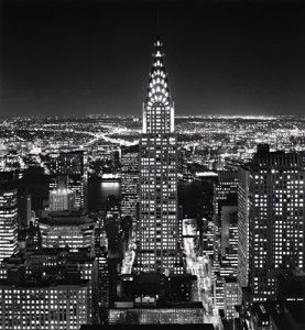
f72e297 Chrysler Building by Michael Kenna

I chose this photo because it really shows how great the city of New York is. This photo really shows New York as the city that never sleeps. With all the bright lights on you can tell that this photo was taken during the night. You get a feeling of excitement from this photo due to the bright lights and the busy nature. With the great view presented in the photo how could one not help but want to visit. Looking at this picture alone to me represents the “American Dream” that many seek. Opportunities and the chance to live a better life all at your disposal as well as a new hope. New York City is all that and more and it couldn’t be seen as any better through this photo. The view of the skyline, the busy streets, opportunities are endless.

There are also many elements used within this photograph. There is minimum contrast between light and dark besides the obvious light in the buildings, streets and skylines. There is use of line throughout the photo in every building, window, street etc. The lines also serve as a view of perspective due to the different points in the photo. These being the foreground and the background. There is strong use of shapes as everything in the photo is in the of shape of something. I believe the strongest element of the photo though would be the balance. The angle at which he took the picture presents the viewer with a clear centered look of the city as it places emphasis on the Chrysler Building. Although the focus is on the center it doesn’t take away from its surroundings. The photo has equal proportions throughout with obvious symmetry also. I feel that my favorite aspect of the photo is how simple it really is, yet how much it shows.


Posted in Homework | Leave a comment

HW1- Aisha Ali

Flatiron Building, Study 1, New York City, USA, 1976 by Michael Kenna (photograph 21)

Michael Kenna has this way of capturing New York City not as a bustling, upbeat city but as a very calm and composed kind of city. Staring at the photograph of the Flatiron Building made me feel like I was standing in the middle of 5th Ave staring up at this beautiful skyscraper, hearing the cars and people slowly growing silent. It seems to me as though the whole city slowed down for Kenna to capture this photograph, as if we are able hear, not only see what he is trying to convey with this simplistic yet extraordinary picture. What I find to also be very fascinating is that I’m not able to distinguish what decade it was taken in, not looking at the caption. Yet this place is every but familiar to me. New York City through Michael Kenna’s lens made me recognize the city I live in, but see it in a whole other view.

 The Flatiron Building photograph (study 12) by Michael Kenna consists of many basic visual categories that makes this photograph as strong as it is. For instance, the use of line work is very marvelous, the way the silhouette of the streetlight creates a unique shape with the building gives this picture a stronger impact. My eyes were instantaneously drawn to that intricate design and changed my perspective of the city, which made me feel at peace. The black in this photo really pops out against the lighter background, almost blending into the white background of Kenna’s website, making the contrast that much bolder. There isn’t even a visible source of light in this photograph yet it doesn’t come across as dark and gloomy but extremely beautiful due to all the factors Kenna was able to use. 


Posted in HW1-photo description | 1 Comment

HW #1 -Photo Description

Eugene Richards has a very unique way of expressing a story through a photograph. The majority of his collections are depressing and inspiring. The photograph that was striking to me is in the “Cocaine True, Cocaine Blue” collection. It’s a photograph a african american woman, who appears to be pregnant. She is holding a cigarette and blowing smoke into the air. The setting is an apartment, that seems to be very plain and dull. It takes place in the livingroom of her apartment. This woman is definitely living in poverty and on drugs. The mood is disappointing and depressing. The key elements of the photo tells the story for you. You can come up with all of these scenarios based on how the photo was taken. This photo makes me look at it as a story, and beginning to wonder why she would increase the complications of her pregnancy. Or wouldn’t she want to deliver a healthy baby. Cocaine True, Cocaine Blue

Eugene uses balance very well in this photograph. Everything seems to be in the right place. On both sides of the picture there are things to observe. The woman is more dominant because she’s upfront. This photo is in black and white, creating the gloomy feeling. There is some contrast of light and dark. There is so much emotion in this photograph. Her body structure shows emotion, it shows how she feels about her actions. She looks as if she doesn’t think she’s hurting herself or her baby with the cigarette. The darker spots of the picture makes it look dramatic. Which is incredible because the scene appears to be dramatic. Theres also some shadows making things look more realistic. It almost feels like your sitting in the living room with the woman. This is why Eugene’s work is so emotional and inspiring.

Posted in HW1-photo description | 1 Comment

HW1-Photo Description

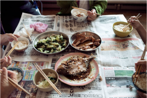
The entire “Lams of Ludlow Street – 5 Years Later” collection of images is, as a whole, extremely depressing, expressive and yet hauntingly unavoidable. This collection follows the life of the Lam family, a large family living in a tiny apartment in NYC, in which Thomas Holton, the photographer, studied them for two years and then photographed them again 5 years later. The images show extremely cramped living conditions and the expressions on the family members faces expresses exactly how they feel about it. The specific picture that I chose was one entitled, “Dinner for Seven,” featuring 9 bowls/plates on a table, offering very small portions of food. The table is also lined with newspaper as a tablecloth, and you can see the family members hands holding chopsticks. Coming from an Italian/Latin background, this photo is incredibly scarce in food, in my opinion. My cultures are prone to appetizers, multiple entrees & deserts; an overflow of food. On the table, each person has their own small bowl of rice, and they share a small fish, what looks like chicken breast and some sort of white and green vegetable. There is one napkin on the table and a rag. I feel that this photo would be overlooked by most because or the lack of people in it, but if you take a second to look at it, you can see why the photographer chose to include this image in the collection, out of probably hundreds to choose from. The square shape of the table encases the round shape of the bowls and plates and the overall dull colors of the newspapers seem to emphasize the colors of the food. There isn’t too much light and dark in the photo but more of a blurred effect where the people and floor are blurred to present the main focus of the photo which is the food, specifically the main 3 dishes. Although this photo could easily be hinting at the dire lack of food for such a large family, it also could be capturing a time where this was considered a large amount of food for them, which would make it a sort of bitter-sweet picture.

Screen Shot 2013-09-11 at 10.12.35 AM

Posted in Uncategorized | Leave a comment

HW #1 – Freddy Hernandez

The first photograph that caught my eye from the list of photographers was, A Woman with Hanging Overalls, 1978, by Dawould Bey (Photograph #7). In this photograph there is a woman standing in front of a store with a shopping bag and on her right side there is a building with vandalism. On the beam in the middle of the composition there are four overalls hanging by a string from a window on the side of the building.The overalls hanging from the window and vandalism show a difficulty in living conditions. While viewing this photo I get an empty feeling. I get this feeling because of the combination between the monochromatic photo and the scenery which consist of graffiti, cracks on the side of a building, scratches along the central beam, along with the facial expression from the woman standing. The mood of this photograph suggest the struggle of life.

In A Woman with Hanging Overalls, 1978, by Dawould Bey, there are many elements of design incorporated. The four overalls that are hanging draw the eye immediately to the top center of the photo because of its repitition. The contrast in lighting is another huge element incorporated in the photo. The image goes from dark to light with shadows caused by the beam and overalls which add some interesting shapes within the composition. Many of the lines produced in this image are either vertical or horizontal and the lack of activity on the right side of the image shifts most of the balance in the image to the left side. All of these elements incorporated in this photograph help suggest the mood of the composition because of how the viewer perceives the image.

Posted in Homework, HW1-photo description | 1 Comment