Loubna’s FC Reflection

Project Management 

I started working with the WAC (Writing Across the Curriculum) fellows. They had a serious of workshops that ran through out the semester. I designed a postcard that announced the dates of all 4 workshops of the semester. For each workshop, I had to design a poster. They all included the same connecting theme/ design, with different graphics for each workshop. During the same time, I designed a poster for the Living Lab symposium for their 5th year anniversary. I recently began working on a big project that I’m excited about, which is the Literary Arts Festival event. It includes a series of designs that vary from postcards, posters, bookmarks, thank you cards, t-shirt designs and more. I was able to complete the postcard design and work on recruiting students and performers for the writing competition and festival. I also worked on the New Faculty invitation cards for their orientation and following that, I will be revising the seminar program for the 2016 year. I’m always looking forward new and exciting projects.

2. Design Skills/Techniques 

InDesign is one of the most important aspects of my design techniques. After laying out and brainstorming different words and designs on paper, I like to “sketch” on Indesign and start working. I like to try many different ideas at once and a big part of my design process is research.

I use other programs as well like photoshop for images and effects, and illustrator for logos. That being said, InDesign is where I’m most skilled at and can use different tricks to get my idea executed properly.


3. Work Relationships 
Explain how you communicate and build relationships with the following:
A. Design Team
Having a design team is very important and very supportive. I design for other programs around campus, but at Faculty Commons, my work turns out as a better result because I have people around me who are in the field and who give helpful feedback by telling me what works and what doesn’t work. Mandy is always around to help with my designs. I call her my Art Director. Kevin, who is a technology and web master is also around if I’m having any sort of technical difficulties. Other members in the design team like Marlon, Mayan, Dorian, Raciel, William, and Mathew help with both the design and editing in case there are any grammatical errors or misspellings.
B. Clients
I worked with Professor Devers for the WAC poster designs and was always in contact with Jacob, who was one of the WAC fellows. For the Living Lab Symposium, I worked with Professors Westengard and Mathews to create the Microbes to Stars, 5th year celebration poster.
I am currently working for with Professor Ostrom, and Professor Sears for the Literary Arts Festival. I have to say that I am extremely excited to continue working with them on this project. It is an important event that needs proper promotion, and I’m excited to be the one designing for them this year.

Training: 6th and final day

Thursday, June 11, 2015

What did I Learn?

Today was my last day of training. The group and I got a lot of work done. In the beginning of the day we were, yet again, brainstorming about the app project we’re working on. As we were all assigned a role in the making of the app, and after collaborating ideas, we all started individually working on designing the application. I was in charge of gather the students’ content information and setting the typeface and creating good visual hierarchy within the “pages”.

What were my challenges?

Yesterday’s challenge was coming up with a name for the app. Today’s challenge was creating a logo for the app. We all sat for about two hours brainstorming and sketching ideas for the logo. Raciel is ultimately the one in charge of creating the final logo design for the app.

How did we help each other?

Like I mentioned before, we all collaborated ideas during the first two hours of the day. The way the app is being designed is by giving each person a specific part of the app to design. Mandy is in charge of the layout and where things go on a page of the app. Raciel is in charge of the logo design. Willian is creating the icons that will symbolize certain ‘to go to’ pages on the app, and finally, I am in charge of creating the students’ profile pages. Despite the fact we are all assigned different part of the app design, we all exchanged or ideas do that there is unification and visual harmony in the final presentation of the app.

Training: Day 5

Wednesday, June 10th, 2015

What did I learn?

Today, I presented my element project. Based on critique and feedback from both my trainers and William, I was satisfied with my presentation and final project. From the suggestions they gave me, I knew I had to do minor adjustments to both my presenation slide, and my final emelemnt peice. Overall, I think my project was well presented.

What were my challenges?

In today’s training, we al started brainstorming ideas for an Application we will be doing for the First Year Program. The App will be a way for first year students to collaborate with their mentors in a contemporary and formal manner. I think the most challenging part of our discussion was naming the app. We all had various ideas, and through inspiration and brainstorming, we finally came up with the name Find My Mentor. (Although, I loved Mandy’s initial idea of naming it Reach, which she later found would not work).

How did you help each other?

William and I collaborated with the trainers today most of the time to work on the App idea. We exchanged ideas and worked together to create categories, layouts and fun ideas for our Application. We were each assigned a role, including Mandy and Raciel, so that the design process can be less time consuming. My role was to gather profile content for atleast 5 Mentors (or upper level students) and at least 5 First Year students.

Insperation

I get inspired by many things that surround me. I’m inspired by designs, music, people, Ads, movies, celebrities, photography, and the list goes on.  Some people may have that moment when they’re designing and they feel stuck, and they look back at a specific picture, or design and they’re automatically inspired and motivated to continue. Personally, I get motivated from different things at different times. I will say, though, that my older brother, who is a medical student but a freelance artist, inspires me. I always take his critique and feedback to consideration. He always has respect for the work I produce and motivates me to continue. I also think that I inspire myself. Every time I create a design, I look at myself at a better stage than where I am. Motivation and inspiration come from different places, but it’s that one factor that keeps me moving forward.

Training: Day 4

Tuesday, June 9, 2015

What did I learn?

I got a lot done in training day. Today, I actually earned a few things about Adobe Illustrator and InDesign that I never new before. Today I officially completed my business card and made it ready to print. In addition, I completed a few banner updating and adjustments for Blackboard, Openlab, and iTec.

What were my challenges?

Today, I didn’t face a lot of challenges, rather than asking questions. When I was updating the banners for Fall 2015, I noticed that the dates on the banners didn’t match with the dates for the fall academic calendar. I had to double check and match them so that the information is correct and I’m not misleading anybody.

How did you help each other? 

I received a lot of feedback from Mandy and Raciel today. And I’m also glad to say that I received a review from Professor. Jordan. With her critique and thoughts on my Openlab Header designs, I was able to narrow my work down even more and create new idea. I’m very inspired by the team here at Faculty Commons.

Design Process

Tuesday, June 9, 2015

Brief

There is probably some special reason of why Silver has the Ag symbol on the periodic table. I never looked into it, but it was interesting enough for me to choose Silver (Ag) as my Design symbol. I was initially going to use the Ag symbol to make a poster, but I thought more into it, and was compelled to make a logo and place it on a business card.

Research

For my research, of course, I looked up silver, learned a lot about it’s basic structure, and found Silver related compounds. I walked around the campus taking pictures of anything silver, and noticing the same gray shining in every piece. After I knew I was making a business card, I worked on making a business card for a silverware company. I researched different silverware companies and visited the Oneida website for reference.

Concepts

After looking at silver and studying it for a few hours, I lost the sense of color, and there was nothing in my brain but a gray-scale. With that in mind, I had the idea of creating a value based business card, rather than color. I also figured that it made more sense, due to the fact that it is a silverware company, and at first glance, I don’t want it to be mistaken for a Diner business card. After embossing, and beveling the letters, and after drop shadows and lighting, I saw that too many effects were being applied, which distracted me away from the actual logo that is in the business card. The logo is fairly simple and minimal, but has a strong feel to it. I wanted to separate the back of the business card from the front, so that one can appreciate the logo and the strength of the typeface.

Sketches

When it comes to sketching on paper, I can either make very few thumbnail sketches, or I can fill 4 pages of thumbnail drawings. It all depends on the project I’m working on. For this project, I felt like sketching anything that came to mind at that time, which were mostly logos of the symbol and different ways of writing them, along with a couple of sketches of what I wanted my business card to look like. Generally, my sketches are just different layouts of the same idea.

Execution

I used InDesign to create my business card. I usually create my logos on illustrator, but this logo was strictly typeface so there wasn’t going to be any Illustrator needed techniques. I used the pen tool to create the shapes on the business card and the type tool to create my type and logo. In addition, I had to adjust the leading and kerning to make the type and card as a whole attractive and legible

.FC_elementdesign_summer2015_2 FC_elementdesign_summer2015_22


Training: Day 3

Monday, June 8th, 2015

What did I learn?

My third day of training at Faculty Commons, yet again, went very well. Today, I completed (or became close to completing) my Openlab header design. I had already designed multiple headers and was adding more, which I learned, made life more difficult. In addition to the header, I completed my element design. Initially, I was reproducing the Silver Linings Playbook movie poster because my element is Silver (Ag), but I figured that it will take a lot of time to make the poster work and look presentable, like the way I had it in my mind. I took my ideas a step back and decided that I was going to make my own silverware company and design a business card. My company name is called AG Silverware and it evidently sells silverware. I use simple yet strong techniques to design a powerful looking business card. During this process I learned that instead of making many designs at once, I need to focus more on creating one at a time, and stepping away to critique my work.

What were my challenges?

I have to say, today was a bit more challenging than other days, but definitely more exciting. Again, I was designing 2 to 3 templates at once, which made my design process more difficult. But I can say that there’s no better feeling than configuring design problems and solving them. With the help and feedback of my trainers, I was able to select one design that worked.

How did you help each other? 

I collaborated once again with William, and I was able to give him some advise on how to transfer an illustrator file to an indesign file. He was also able to help with organizing my Openlab blog which I learned today, I have been doing them incorrectly. I also recieved feedback from Mady and Raciel on choosing design templates that work for each project. They are always telling me which design works and doesn’t work.

I always tell my friends and family that when i’m designing and I run into problems or challenges, I’m always at my best stage when I’m trying to solve these issues, and I can happily say that I’m experiencing that here, at Faculty Commons.  

Training: Day Two

Friday, June 5, 2015

My second day of Training went perfectly well. I entered the graphic Design major because I have a passion for designing, and being able to do that for hours is making me thoroughly happy. In the beginning of the day, I chose an element from the periodic table to create a design process, As of now it is still a working progress. I also was finishing off my design for the header of the Faculty Commons, and with only a few more adjustments and critique, I’ll be able to say that I’m finished with the header design. Today, I was accompanied by my good classmate and peer William Luperena, who is also working on the same design process as I am. I always look at my friend’s work for inspiration, and being a great designer that he is, I like to take a sneak peek at his work to see how that can reflect and motivate my work. Today, I got critique from Mandy and Racial, who both work as designers for Faculty Commons, which was extremely helpful. Again, I’m looking forward to fun and exciting challenges.

Training: Day One

Thursday, June 4, 2015

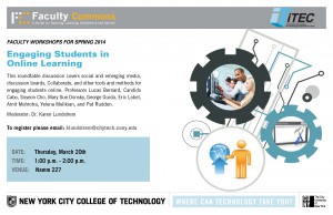
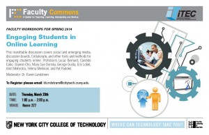
Today was my first day training at Faculty Commons. Once I came in and got comfortable, I was told to make a poster replication. The poster was for the iTec program at City Tech. I think I did a pretty good job replicating the poster and making sure all the images were exactly in place. I will admit, though, that despite my “type-nerd” character, it took me some time to find the typeface that was used for the poster. After reproducing the poster, I emailed my client (The iTec Director) my information and available hours so that we can schedule a meeting soon to discuss important information. I also got started on tomorrow’s assignment and started designing a new header for the Faculty Commons Openlab site, which is still a working progress.

Original Poster

Original Poster

Poster Replica

Poster Replica

So far, my first day training at Faculty Commons went fairly well, and I’m looking forward to fun work, and more challenges.