Category: Internships (Page 1 of 2)
The apps that I have tested out are blender and cinema 4d.
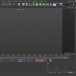
For Cinema 4d when you first open it you will see most of your basic tools on the top of the screen. On the right side, you will see your scene details, and below that are the properties. Cinema 4d does not have a basic scene set up and is blank when you first open it. On the bottom of the live preview is the timeline where you can view materials you have downloaded. This program is similar to blender in the sense that it has its scene on the right side and its tools on the left. The shortcuts are quite different as well as the mouse buttons. This program is paid and so far I have been able to use this program to sculpt and do a simple rendering of characters and items. I would assume blender would have the same feature as well. What stands out about this program over blender is the readily available materials that are searchable through the content browser in the middle of the program which looks like a box. You can drag and drop the material you want and apply it to your object by dropping it directly on the layer.
Animation is interesting in this program, you can view things through the lens of the camera and also get a preview of your render before you download it. I learned how to use a scalable vector graphic and create it as a 3d text by importing it into illustrator and saving it as an illustrator file. It has to be the older version because cinema 4d cannot read the newer version of illustrator. You can also paint the models you sculpt and also deform. All the necessary tools and options are on the top which I like but the scene organization can get confusing when you dabble into skies and formulas. You can use a formula to animate objects to float a certain way on repeat.

For Blender when you first open it up you will be brought to a scene with a basic cube, lighting, and camera. There are tools on the left side and on the top, you will see the different modes. On the right side, you will be able to organize your scene by placing objects in folders. I have not figured out how to color my models yet but this is similar to Cinema 4d as you can scale, rotate and duplicate. What makes this program more unique to me is that you can create low poly quite easily. Cinema4d has options to make text look more interesting by using caps, and the lighting is easy to use but if I want to model low poly I would prefer a blender. Both blender and cinema4d look confusing at first glance, it takes a lot of tutorials to learn both programs in my opinion because so many options are hidden between tiny steps that are easy to miss. But I think Blender is preferable since it’s free and tutorials are readily available as a lot of game devs turn to this program.
- Web banner
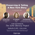
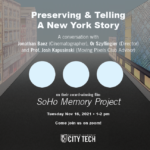
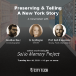
- Soho Memory
- Draft 1
- Draft 2
I finished my work for Professor Hellman with Philip as my mentor. Everyone was very nice and insightful with their suggestions and I appreciate the long-distance I’ve come as a graphic designer. In this project, I learned that I should communicate frequently with my mentor and do my best to give out updates as soon as something happens so that they are aware I am still working on things. I also learned various things such as dimming down something is not the way to go. I should play around with color more and always give everything headspace and room as I would with my illustrations. I enjoyed this project very much! I only had one professor and one mentor to communicate with here. It was a successful meeting since Phil helped me create a timeline since I wasn’t too sure what to ask.
- Science Fiction Video Card
- Science Fiction VideoCard
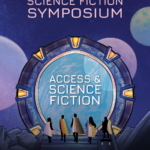
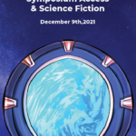
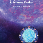
This is the poster finished working on with Professor Porter, Professor Ellis, and Professor Kwong. The theme is science fiction and access. My mentor is Or and she has helped me greatly with the suggestion of adding a stargate, the ramp as well as font options. Prof Biehl suggested that I had put Access and science fiction in the stargate and also helped me fit the text in. So far I am enjoying my time here at Faculty Commons since I feel like the suggestions I receive are very clear unlike some of the classes I’ve taken here at City Tech. I communicated with a mentor as well as three professors, it was successful because Or was able to help me break the silence.
As a self-evaluation, I think I performed okay in this internship. I need to work on asking meaningful questions so I can avoid the silence in the meetings. Our internship doesn’t have many virtual events, we hold weekly meetings every week and I’ve met very skilled people and seen their works. In my internship, we work with Anai, Cherise, June, and I had a mentorship opportunity with Or and Phil. I really appreciated learning the alignment tool and clicking the corners of the boxes to readjust the size from Phil, and measuring the space between objects with shapes and using ctrl c, ctrl alt shift v, clicking on an image with ctrl and then ctrl x to cut shortcuts from Or. I also learned how to make the title stand out with color, size, and caps. The internship was amazing and I learned a lot.
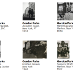 Gordon parks created an exhibition of photos about migrant workers. He used his camera to expose the bad things of America such as poverty, racism, and discrimination.
The first piece that stands out to me is Gordon Parks Emerging Man, Harlem, New York 1952. Gelatin silver print, 8 7/16 × 12 7/8″ (21.4 × 32.7 cm). It’s a picture of a man coming out of a manhole cover. The reason why it stands out to me is that maybe this man is on the run and is using manhole covers to escape. It is also a possibility that they may live there since poverty is a big issue. The photo is in black and white and the subject is in the center of the composition. I chose this exhibition because I had designed a poster for it during the grace gallery. Scenes like these where someone may be emerging from a manhole cover are rare shots if it’s not staged. This picture is full of mystery since this man looks wary of the viewer. He doesn’t look comfortable but he does look like he’s been there for a long time and knows how to navigate.
The second piece that stands out to me is Gordon Parks Harlem Gang Wars 1948, Gelatin silver print, 10 15/16 × 10 1/2″ (27.9 × 26.7 cm). It’s a verticle composition of a couple of people fighting on the street. Gordon Parks used his camera to take multiple pictures of what life is like in a neighborhood with gang wars and some publishing agencies took these photos and printed them out. This photo is in black and white as well and it makes me remember that New York used to be a very dangerous place, and it still is. It makes me think that a lot of crime is not talked about as well. People don’t mention the gang activities that happen elsewhere in the school, nor do they look back at the somewhat recent lootings of Manhatten when riots broke loose. Without photographers like Gordon Parks, a lot of truth is buried since people rely on the news and their perspective too much. Photos to me are more of an unbiased thing that allows the viewer to make their own judgments.
Another one that stands out to me is Gordon Parks Untitled, Harlem, New York 1948. Gelatin silver print 10 5/16 × 13 1/4″ (26.2 × 33.7 cm). This one stands out to me because it’s a picture of trash on the streets. On the right side is a trash can that’s full and next to another staircase are two that are full with some litter on the floors. It’s not much different now and then with the trash on the streets. In modern life in New York, there is somewhat less trash depending on what location you are in but it does come across that not everyone cares about the city’s condition. The more trash a neighborhood has it gives off the idea of poverty, filth, and danger to me at least. I feel like an exhibition online is way different than when I visited the poster house for Alphonse Mucha. Seeing things for their real size lets you see all the little things added that you may have missed online unless you zoomed up and stared long at them. However, I do prefer the option of a virtual visit given the circumstance.
• For each of the three artworks you select, be sure to include the name of the artist, the size of the piece, and the medium (oil painting on canvas, bronze sculpture, print etc.). The subject should be discussed also–abstract or representational, etc.
• Color, type, texture, composition should all be discussed
• Discuss why you selected the piece and your response to it. It could be either a positive or negative response.
• You can also discuss how a virtual experience of an exhibit compared to visiting a museum in person and write about whether you felt the virtual tour was effective, providing a rationale for that opinion.
- Final Draft
- Draft 1
- Draft 2
Last week I had a new client, I will be doing the Science Fiction Symposium and representing everyone as a superhero to include them in Sci-Fi. Since I had some time before my meeting I tried to search up things related to space to save some time when it came to inspiration. My internship usually asks the client for logos, we also use the city tech logo all the time since we are given a file of that. We usually do not alter the client’s logo, so if it comes in a color that doesn’t work for our poster we try our best to accommodate. We haven’t signed any confidentiality or non-disclosure agreements unless it was for the recovery corps. In the case of the ESP project I did, I have to keep the research confidential.
In the past when I used another creative’s work for school purposes I never really credited it, examples would be for photoshop exercises. If I used it for my essays or powerpoints I had to credit it in the works cited areas. My opinion on the copyright issue for the hope poster case is a bit on the fence. I think the artist should have credited the photographer who took a picture of Obama. Only because the figure is the same, the pose, the expression. The colors are different, but I would personally label it 50% different. When you do fan art illustrations of characters usually you would change their pose, have a different way of drawing their expression, and also shading. This is mainly the reason why I stay away from realistic portraits as well. I think it is difficult to edit photos in a way that looks entirely different. And if you stylize a figure too much, like Beyonce you could be at risk for lashing back. I watched this happen to a Netflix artist who drew her for TikTok. I feel like in this situation, whether they profited or not from the hope poster they are still using someone’s photograph. The golden rule I hear from fellow illustrators is that if it’s not 70% different you must credit.
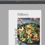 Today I watched Annotate and collaborate: Streamlining online text reviews. In the adobe cloud, you are able to browse many resources, inspiration on Behance, and look for fonts. Within my work you can find your library of work, you can also find all the assets you have been using from colors to images and vector graphics. You can share this with your colleague so they can see the library. You are able to put images InDesign by pulling them from the creative cloud library, you may also search directly from the InDesign app. Afterward, you can invite people to share for review and add comments. When your teammate accepts the invitation it takes you to a browser view and you can comment on the InDesign document themselves. This saves time because people can review the already made comments to save time instead of the repetitiveness from chain emails to multiple people. They can resolve the comments as they go and it is all through the same URL. What I learned today is that there is an application similar to google docs specifically for designers. I think this is definitely useful and should be implemented in our current remote work and ongoing because sometimes it’s hard for some of us to receive auditory feedback and remember them. Or maybe students who are thinking the same things can try to come up with new feedback after reading the existing comments to get more variety and constructive criticism.
On Friday I attended a general ed meeting where there were many professors who presented their own projects and findings. I was invited to speak about my student success story about being an emerging scholar, and continuing my work in the summer with the recovery corps. Everyone was very supportive of each other and had many questions. When I presented I had my camera on and I talked about my process of creating visuals out of technical information. Not only was I able to understand soil mechanics but I was also able to draw it in comic form even though I had never taken narrative class ever at my time here at City Tech. I am proud of my results, and I will forever be grateful to my professors for inviting me to speak and work on this project. Thank you to Professor Guzman and Professor Woolley for supporting me and guiding me this far, and for providing me the opportunity to work at faculty commons. I will continue to strive to better myself as a student and as an artist.
Today we did a trim path challenge where we could only use shapes and text tools to design something. We could advertise for ourselves if we didn’t know where to start so this is what I created. During this exercise, I noticed a lot of settings in after effects have changed since I last used it. Everyone had one hour to design something and I created this sushi and sun combination. I didn’t know how to make other shapes but everyone else had some really cool techniques like making outlines and zooming in and out of the frame. Overall I thought it was a very creative excersise. The event was hosted by Daniel King.
Club meeting that met with Justin Volz, he worked at titmouse.inc asa an intern. He worked in the management section and then got hired to be a cleanup animator. It was helpful for them because they learned how people put together their files for the final animation. Then he got hired for background design, they also got to animate it. Eventually, they got to do character background and layouts, animation and did background painting. They also worked as a motion designer at BBDO. He got to work with multiple big clients and pitches. This artist went freelance after that and got into UI/UX animation. Meeting these artists and hearing about them tell us about their journey has taught me that progress isn’t linear. There are people who get experience and then go into freelance, or freelance first before they get into a company. The work produced is amazing and seamless. I love the illustrations for the bittersweet valentine’s gif, and how the ribbon stretches across the flowers. Watching and hearing about this process makes me really appreciate motion design. If there was a free program that was like after effects I would have considered this career but unfortunately, I don’t really have the luxury to afford the adobe subscription.
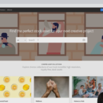 The webinar I chose was “Creating high impact presentations”. Adobe recommends that you use their adobe stock. For a presentation, it’s important to have images and videos. To create an impactful presentation you need images that work with your presentation. You shouldn’t mix illustrations and photos together, try to keep images all the same style. After selecting your images you can license the images. You can add adobe stock to import these images in your presentation. This saves time because you do not have to worry about licenses after doing this and reduce the number of files saved on your machine.
