This is my final pdf for my internship. Overall I’m very happy to have had this opportunity to Intern for this company and hope to apply my skills that I have learned during this internship to other areas of web design or possibly ux/ui in the future since I’m interested in that as well.
INTERNSHIP BLOG #9 WHAT I’VE LEARNED
Today I will talk about what I learned from my experience at NetComFix and what I took away from interning there. This has been quite a stressful semester to say the least. Trying to manage an internship, portfolio and senior project is not something I’d recommend to any Citytech student to take in the same semester, but sometimes you have to do the work and make it through. I tried my best to make it through, and working for NetComFix was actually a really pleasant experience.
I’m not sure I would have made it if Mr. Iftikhar didn’t allow me to use some of the time to learn some of the skills on the job. Originally he wanted me to work 15 hours a week, but I said I can do only 8 which was the minimum a week to make it to 120 hours. He was cool enough to allow me that freedom so I can also work on my other projects. He took the time to explain how to setup and use things like XAMPP, MySQL on cpanel, and allowed to work on his clients websites and took his time to communicate with me remotely through TeamViewer.
It was a bit of a struggle, in the beginning, trying to navigate websites I was designer for but he was patient enough to explain each important css file or how to use php to make my life easier. Overall I’m very satisfied working with NetComFix and I hope we can continue for a while and learn more.
Internship blog #8
I’m going to update some things I’ve learned about doing my internship lately. I just completed my full 120 hours working for NetComFix and I have to say I got along really well with Mr. Iftikhar, the manager, and owner of NetComFix. He really let me take my time and get familiar with the websites he had in the works, and I told him I will keep helping him out with future projects and he will pay me as well which is nice.
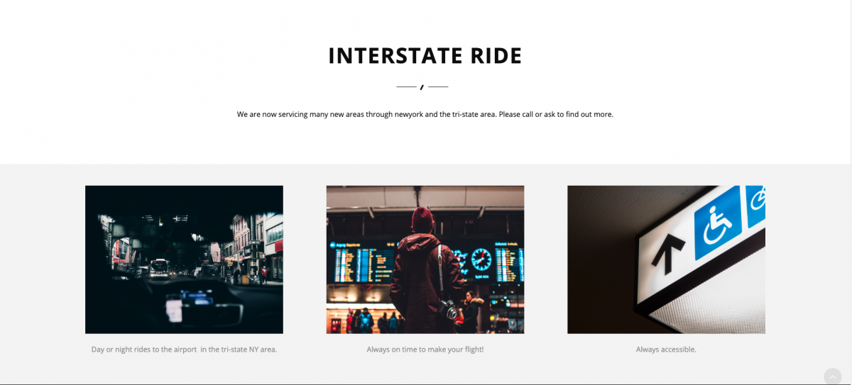
I had mentioned earlier that he had me doing work for a client with a limo/transportation service called Interstate Ride. I had been designing some logo concepts and had already begun working to layout the website with the owner. Below is some screen of the website’s main page. It’s really cool however to discover things like importing API’s into your page to make the website more interactive, such as putting maps so people can search their destination.

![]()

Unfortunately after spending a good amount of time trying to get this project started, I had to give it up and stop working on it because of issues the client and owner were having where the client had lost some important files that were to be on the site and it sounded like wanted to put it off for awhile, so Mr. Iftikhar had me stop working on it and we will come back to it later possibly. It still had some filler text in it and far from complete. We were using bootstrap for the grids.
Podcast/Video
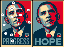
I haven’t really gotten around to talk about a webinar or podcast I’ve listened to recently but I’ll quickly summarize one very interesting video that relates to design and to a problem I’ve faced in my own design work recently with my own projects. I do watch a lot of videos and podcasts on graphic design and tech videos. One that stood out to me is by Will Patterson and one of his videos on YouTube was about the google logo called What’s WRONG With The NEW Google Logo??? I also included the Nintendo switch logo as another example because if you see, it looks like they are symmetrical, but they are not. They are not equal in width and that’s to create visual balance.

![]()
He talks about how in type, some things need to look good OPTICALLY. This concept I didn’t truly understand until recently when working on my own project for senior project. The G for the google logo is not a full circle, and that’s not a mistake. Honestly, this concept is still something that confuses me. What’s optically good is not based on math, so it’s based on vision and compensation of different elements within the type. I’ve seen other videos on this topic in podcasts though this video was fresh in my mind when I saw it recently and thinking about it is definitely important in design that I thought I would use this to discuss something I learned from content online that relates to design.
Fairey Copyright Case
This was a very interesting article and I have been thinking about this kind of thing recently lately because of my senior project. For my senior project, I have used a lot of stock images from adobe. I have however purchased a license to use them or obtained images that were royalty-free. I have altered them a lot as to fit my general concept, so much so that it completely altered the meaning of the original photo. When you have a major project like this, using stock images, you can focus more on the concept and not the technicality of the drawing. However, the question comes to mind. How much of it is yours? And that’s how this relates to Shepard Fairey’s copyright case where he used someone else’s image to make something out of it that suited his own vision.
While I don’t agree he should have sabotaged any of the evidence against him, I believe the photo was changed enough that it had no resemblance to the original source. The cropping was different, the colors were different, the context was different as well. I do think some amount of credit needs to go to the original source, however, in this case, it was also used in a way that was not out to make a profit, though he did through the company Obey Clothing, it was for a cause he believed in, so I certainly don’t believe the original creator of the Obama photograph should get any substantial amount of money. Credit in some regard, yes. Perhaps the ability to use the image themselves was a good choice.
Recently I went to an adobe portfolio review for CityTech students and when they were reviewing my work I had some images from my previous semesters that weren’t completely mine. Some aspects of them, but I should have been more aware of not using too much of the original material. The person reviewing my work said I should watch out for that as we should be more respectful of other people’s work. I completely agree with them. I did change the photo, but it was not enough to call it completely mine. In the future, I want to be as original as I can be and try hard to create everything myself. I am more aware of these kinds of things now and this article was interesting in that regard to the Fairy case.
Print Making Workshop
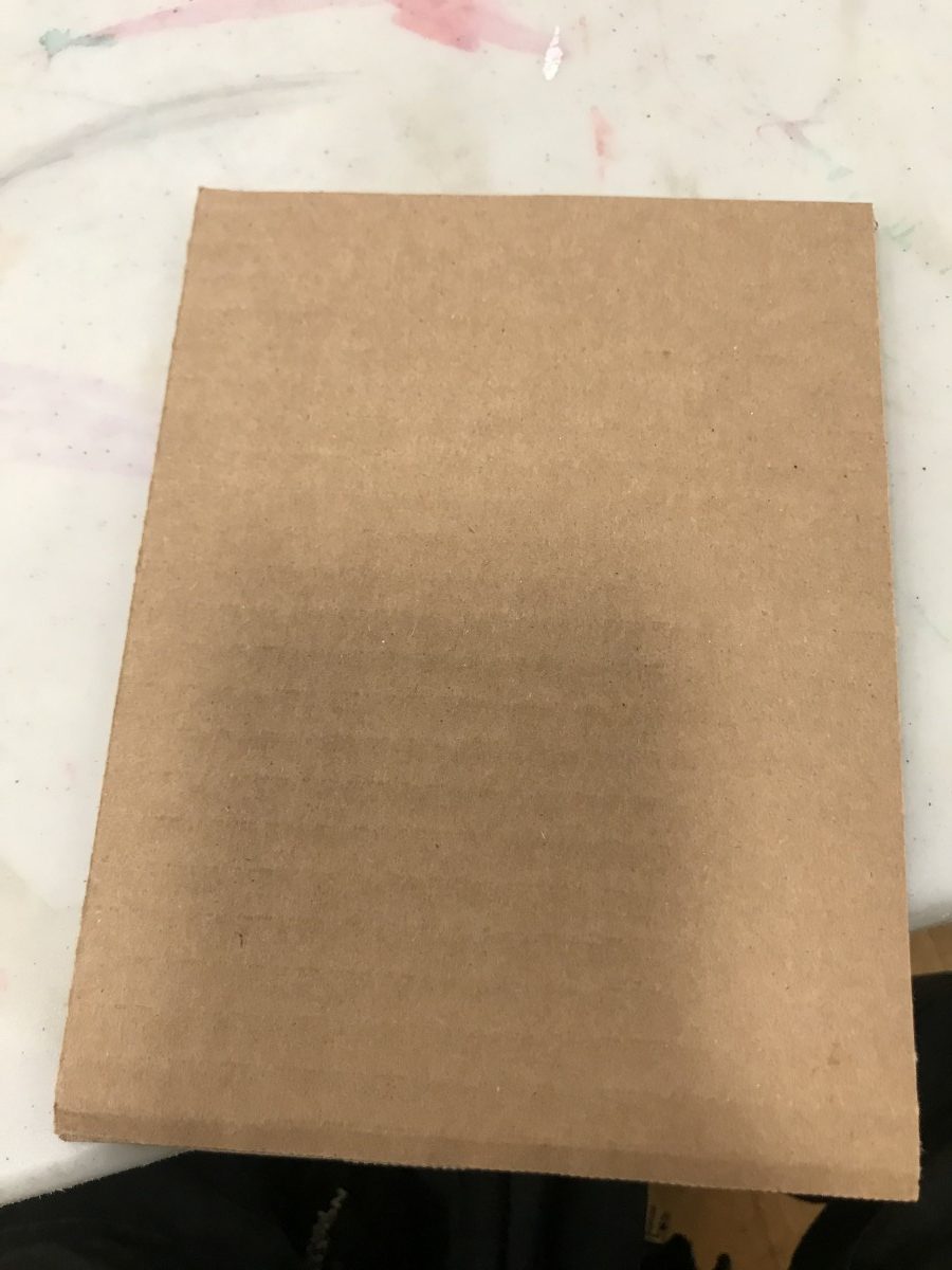
This is an event I attended on December 2, and I thought it would be something interesting to try and go see what it was about. I wasn’t really sure what to expect when I attended but it turned out to be interesting. It was definitely more freestyle and abstract than I thought it would be.
When I got there I noticed some random materials in the front and when I sat down The instructor began describing the process of what we would be doing. The first thing we all did was go to the front and get a thin rectangular piece of cardboard and after we sat down with our materials and played around with the objects we got in the front. The point was to apply the materials first and then add ink to it creating a design on the applied paper.
The type of objects were things like strings and fabrics, glue to stick them on the cardboard and other objects to apply the cardboard. It was really cool to see what some people did with these objects and the different kinds of designs that were created in the process. About 45 minutes after we all made our designs, the instructor told us how to apply the ink. One important note was not to mix the inks because it would spoil the design with different color inks.
I wasn’t very successful however when applying the ink to my first print. I possibly did it too fast or there was something I missed that the instructor did that made it successful. I still got to witness others who did a much better job than I did. This experience kind of reminded me of my first graphic design class when we were learning about form and abstract ideas rather than creating a concept. It was nice to be free from such constraints sometimes. You are just expressing yourself through abstractionism. Some people had more conceptual looking art than others.
This is just to show I tried, maybe I should have had a bit more help. The lady was nice enough not to say it looked terrible. I had no access to scissors so the strings and materials were kind of sloppy to make something really nice.
Overall this was an interesting experience. I wish I had taken pictures of the people’s art sitting next to me as there’s were so nice and well put together. I had so much school work to do so I left a little early, and the weather was terrible that day however I thank the people who tried to teach us how to do this.
AIGA Design and Business Ethics Handbook
Today I will discuss some interesting things I learned from reading this article and compare it to my internship at Netcomfix. I did know about the legal precautions of using copyrighted fonts and typefaces and using other people’s artwork in my own work. When I started working at this internship, I actually discussed taking original photographs for the website and putting them on the website, because it seemed like he used some stock pics from a template.
We have been using twitter bootstrap as our main template, however, I noticed some of the pictures Netcomfix were using seemed part of a template, and I talked about and was working with him on using our own images to put on the website. The owner of the company started his website to advertise IT and web services to manage his clients, so I am not sure how diligent they are when it comes to legal issues of images and fonts.
For the logo I helped them redesign, I told them I got my typefaces from font squirrel which offers free commercial-use fonts. I let them know that and they haven’t really pursued it any further than that in terms of the legal side of things.
Below is an example of an image we need to swap out with real ones we took ourselves. Icons to be clicked on are things I intend to work on myself.

Some features included on the website have been purchased by the company such as the ability to speak directly with clients from the website. Also using free API’s are always useful in designing websites.
As far as software and websites go. We are looking into integrating WordPress for some of the web services because you can easily modify it through php. However, i would like to find out more about any issues with that when using WordPress specifically.
Event #2
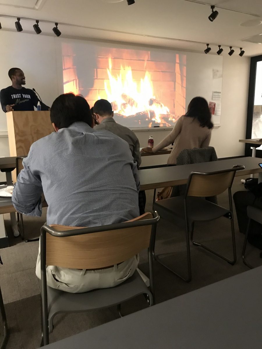
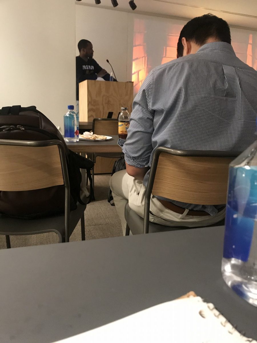
Today I will be talking about the event I went to in Brooklyn which isn’t too far from CityTech. It was in the Flatiron school building. It was a fireside chat about UX/UI, and how to get your foot in the door to a career in UX/UI. They do try and promote access labs which is a bootcamp curriculum that gets people skills in jobs in the industry as coders and designers for UX/UI.
Though some of it was a promotion for the school, it was a great way to learn about the industry including getting to hear people answers questions about the industry. We all introduced ourselves and got to know a little of why everyone was there. I learned exactly what people in UX/UI do, and what it is specifically. To put it directly it is the experience someone has before/after they are using the product. The UI serves as the cosmetics of the body. I learned about the importance of colors and psychology. Most importantly I learned about how crucial it was to have empathy for the user. To do your research on how the user uses the product is also very important.
A user should find things very easy to use without even noticing how convenient the technology they are using is. The industry and technology are always changing so you have to be willing to change along with it.
What exactly is an interface? A point where two organisms meet and interact. So it’s important to know how versatile that definition could be used when talking about UI. Some programs used in the industry are Sketch, Photoshop, After Effects, Invision, Keynote, Principal, Illustrator etc. Some of these were new to my knowledge so it was really nice to learn about them.
One last cool thing I learned about is a wonderful website called https://www.siteinspire.com and it’s a great website for getting inspiration from websites that have great UX/UI. The person giving the talk highly recommended. it. One of them used to be a product manager, and switched to UX/UI and also teaches.
Below is a pic of the chat. It was pretty amusing that they had a screen of a fireplace. They gave us free pizza as well, which was very nice of them. overall it was a very cool chat. My pics aren’t the greatest but I didn’t want to be too obvious taking pics.
Creative App #2
The app I am going to talk about today is called Sketchbook by autodesk. I really like this app because of it’s UI. I have adobe suite and use illustrator a lot lately for my senior project and took an advanced Illustrator course so I am well familiar with Illustrator and I know why vector is used for, but this app is wonderful for just sketching out ideas before you get to that stage. It’s just good for drawing in general. it has many different styles of brushes and pencils and has a really cool user interface.
It’s available for iOS, Android, Mac, and Windows. It’s also free! The fact that it’s so versatile is such a great perk. You can digitally sketch ideas out anywhere you are. I tested it with a real Wacom tablet and it’s great with taking pressure sensitivity to the tablet to the screen. Below is a snapshot of how it looks like when you open it up.
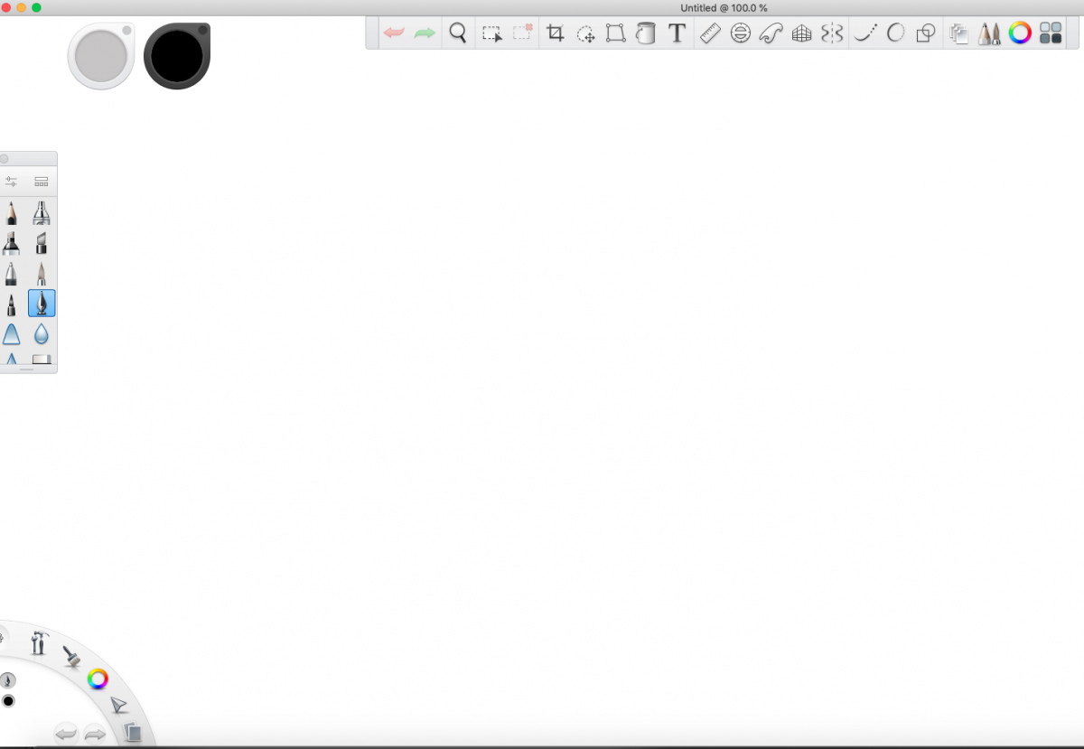
Above is the desktop version, and as you can see it has a really easy to use interface. It works similar to how photoshop and illustrator work in terms of how layers are used and layered. Not everyone has access to an ipad pro so it’s a much better option of you just want to use an android tablet or an Iphone or older Ipad.

Internship Blog #7
Today I want to talk about what I was discussing with my internship advisor and owner of NetComFix. Earlier in this semester he had discussed working on a clients website that is a start up limo company that takes the inputs of the customers information and sends email’s of confirmations about what time and date the customers will be requiring the service. It’s interstateride and I’m soon to create some concepts for the logo for the company.
It was interesting to hear about how he set up the database for the company using MySQL. I was learning about how to set up a database in C-panel and how using php to send the users information to an email account. When I saw the website is was very basic and plain and immediately asked him if I could work on the logo. Once I get the files I will update this blog with photos of the original Logo and One that I plan to make for the company.
I’m glad I have the freedom to learn while working for netcomfix because I can learn new things about the more technical side of web development. Working on an already created website has made it interesting to find parts of the website I am looking for within such large files. Sometimes if the company is using a template such as wordpress it can be easier, however this website is using twitter bootstrap as a framework for the website so learning that has been interesting.

