Author Archives: Simone Haylett

Inspiration for My Final (Gregory Heisler and Nick Fancher)

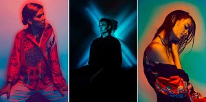
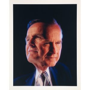
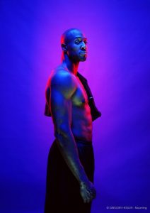
When I was brainstorming ideas for my final project the first image that popped into my head was a portrait by Gregory Heisler. I remember the image was so striking because it utilized the color cross lighting method. The subject was an athlete facing one side and looking into the camera. He was shooting on a blue background illuminated by a red rim light, with blue and red cross light filling the shadows and defining the subject. I was also intrigued by Heisler’s portrait of George Bush showing the subject with two heads. This image made me think he was trying to portray Bush as having two sides or a split personality. I wanted to use this in my concept because my piece is about facing challenges in life that take us to completely different headspaces as if we were different people entirely. But it is through determination and perseverance that we’re able to pull ourselves out of those dark spaces to realize our potential. Gregory Heisler is an advocate for breaking technique or thinking outside of the box because he believes constantly relying on just technique can be limiting. Continuing my research, I went on looking for more images using this method and stumbled onto Nick Fancher. Fancher is a photographer, author, and educator specializing in dramatic lighting and bold color exploration techniques. His experience ranges from commercial and portrait photography to fine art. He is most known for his work method using minimal camera gear and shooting in unconventional locations. When I looked at Francher’s work, I was inspired by his use of colored cross lighting, and shadow. In one of his panels, there are three images, one with the subject lit in mostly red with a gradient background, the second with a subject illuminated by a blue X shaped lighting and the last with a subject on a green backdrop lit by a yellow rim and cross light. Visually these images are eye-catching and add a sense of wonder to the emotions of the models, this is an effect I hope to achieve in my own work.

Nick Fancher


Gregory Heisler

Inspiration of Philip Lorca diCorcia

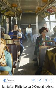
Philip Lorca diCorcia is a well known figure and street photographer born in 1951. He grew up in Hartford,CT attending the University of Hartford in the 1970’s. Corcia later moved on to Boston School of the Museum Fine Arts, rounding out his education at Yale. In his early work, he photographed friends and family making the images appear candid, when actually it involved hours of staging and utilizing lighting techniques. His objective was to blur the lines between the everyday and fabricated scenes.  In the 1980’s, Corcia worked as a commercial photographer creating spreads for clients like Esquire, The New York Times and Harper’s Bazaar. From 1990-92, he traveled to Los Angeles working on a series he called Hollywood. The subjects consisted of prostitutes, hustlers and drug dealers which he paid to pose for him. Corcia would name the photos according to the person he photographed and how much he paid. He went on to photograph larger crowds in New York, Tokyo and Paris, setting up flashbulbs in the area waiting for the perfect moment. In his more recent work, his subjects range from pole dancers to the New York metropolis exploring the topics of identity, reality and artifice. His style has been described as combining documentary with conceptual photography. Philip Lorca diCorcia is a recipient of the Guggenheim Fellowship and has had many solo expeditions at the Museum of Modern art (MoMA), Centre National de la Photographie in Paris and Reina SofiĂĄ in Madrid. He currently lives and works in New York. The image below is titled “Ian” depicting a young man with long black hair sitting in the back of a bus. The man who I assume is named Ian is looking into the camera, the image is balanced with passengers on each side. Although the subject is in the middle of the scene, my eyes are also drawn to the passengers in the background. The man falling asleep holding a goldfish in a plastic bag perfectly still and a woman with blue eyeshadow and a floral blazer looking down in her lap or also possibly sleeping. It makes me start to think about which elements or subjects are real in the scene and which are orchestrated by the photographer. 

Inspiration of Henry Hargreaves

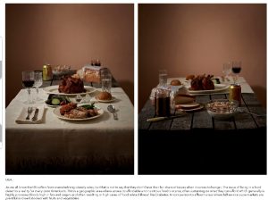
Henry Hargreaves is a self-taught food photographer, born and raised in New Zealand. His fascination with food came from previous experience working in the food industry before becoming a full-time photographer. He was amazed by customer’s requests and what it said about their personalities and character while they ordered. He tried to translate these ideas into his work by using food to create visual connections. After leaving the food industry, Hargreaves worked in fashion in the early 2000’s and was even a model for 4 years. It was then he realized that he wanted to be the person “calling the shots behind the camera”. He started out buying a camera just to play with the idea and see if he could get it to “take some nice shots”. Over time, Hargreaves picked up some lighting techniques and tricks and got a good sense of balance in his compositions. In his work, he gets inspiration from anywhere creating images that appeal to him. He says “If it makes me laugh or constantly comes up in my mind without me having to write it down, I want to try it. Once I decide to execute the only challenge is motivation”. Hargreaves also does a lot of collaborations in his work, he believes it’s a lot more fun and makes the work come out better. He says “collaboration is great for having someone challenge your ideas and compliment your work. A successful collaboration blurs the lines between photographer and artist/stylist and vise versa.” He continues by saying “get out of your comfort zone, that’s when you’ll learn something and get an unexpected surprise.” In the example of his work below, I notice that although most of he likes to be playful with his work, Henry Hargreaves is not afraid to get political. The photo below is from a series called “Power Hungry” where he uses the abundance of food on one side of a table and the scarcity on the other side illustrate the idea of using food as a weapon in society. Throughout history, depriving or restricting access to food to the poor or underprivileged has been used as a way of controlling or silencing the voices of those groups. In the photos, the first picture is well lit and positioned with silverware and table cloth making the food itself look more appealing. In the second picture, the mood of the photo is darker with less appealing food to represent the reality of commoners.


Inspiration of Tim Wallace


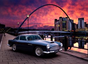
Tim Wallace is a internationally recognized corporate and commercial photographer based out of the UK, and often described as conceptual and dramatic. His works with a wide range of industries such as automotive, truck and logistics, aviation, marine, engineering, and freight operations. His clients include McLaren, Peugeot, Jaguar, Land Rover and many other iconic brands. Looking at his work, I am amazed by the sense of wonder he creates with conceptual photographs, showing just enough of a subject to draw the viewer’s eye. In the examples above, I notice that he utilizes show depth of field and light/shadow to create a mysterious yet elegant and whimsical feeling persuading the viewer to want to know more about the scene. In the first photo, I notice that there is a cast of purple color on object and the image is tightly cropped conveying the idea that there is more to see. In the second image, there is a lot of shadow created by a dim over head light making it more mature and serious, the netting and pattern is more textured and defined like you want to reach out and touch it. This image is also cropped tightly leaving a sense that the object goes on beyond what you can see. It gives the feeling that the brand is powerful, elegant and refined. Tim Wallace is beyond talented in this field whether he is capturing the concept of a subject or creating movement using shallow depth of field and dramatic backgrounds.


Final Project Proposal

My concept for my final Advanced photography photo shoot was inspired by the challenges my friends, family and I faced during this past year. Basically, we are all in our early 20’s juggling work, school and a variety of other issues that can become physically, emotionally and psychologically draining on a person’s well being. Speaking for myself and what I’ve experienced from others these various challenges can take us to very dark and negative spaces in our minds, so I want to do a portrait shoot depicting that. I want the shoot to be transitional going from a depressed, stressed, overwhelming and dark feeling to something more hopeful and positive like finding light at the end of the tunnel. My subjects will include myself and four other people (family members, friends, spouse). My audience is young people like us who are also going through some of the most difficult times in our lives trying to be successful and live well but at the same time feeling like we’re running out of time. We fall into pits of depression so deep we often become our own worst enemies doubting ourselves and our abilities thinking we’ll never reach the finish line. I want to see this all narrated by the text from Langston Hughes’ poem Harlem. In the dark scenes, I want to see my subjects in a lot of shadow like partial silhouette in the more positive scenes I want a more hopeful light setting. In the dark settings, my subjects will be wearing dark clothes to add to the mood, in the more positive settings they will be wearing clothing and props that depict what their future aspirations or dreams are. All of this will be back lit in the color red because it represents a feeling of pain and anguish but also passion and strength. This idea can also be explored in a still life by photographing objects representing negative behavior like alcohol, drugs, razor blades and objects representing a person’s aspirations like books, art work, cameras, etc.  My inspirations for concept and lighting are works from Gregory Heisler, Nick Fancher and Jordan Peele’s poster art for his recent horror film “Us.

Lighting


Concept

Inspiration of Richard Foster


Richard Foster is one of the most talented specialists in still life photography, working with various big clients like Prada, Adidas, and Vogue Magazine just to name a few. Looking at his work, I notice that Foster uses lighting, color and other elements to make his images more dynamic and eye-catching to the audience adding to the brand’s presence. In the examples above, Foster is using a colored back light forming a diagonal shape behind the items making the product a more powerful and life like feel. He’s careful to use color that doesn’t draw attention away from the object while keeping the light at an angle that doesn’t produce a harsh glare into the camera. He also uses rim light and probably fill or main light to bring out features and shadows of the glass, this helps add a sense of personality or emotion to the item. When I first saw the photos I thought about the emotion and the audience it would apply to. Being that the first image is a bottle of whiskey it already signaled to me that this was for an older crowd. Then considering the lighting the image felt kind of mysterious and rugged but classic at the same time because of the mature and clean design of the bottle. In the second example, the name brand Prada already signals a luxury item but the strong diagonal of hot pink light gave off a powerful, confident personality that would make someone stand out from the crowd. It honestly made me feel like purchasing the item myself because those are the same ideas I would want to present to the world about my own personality. Richard Foster stands out from the crowd because he gives the subject of his photography a personality even though its an object, after achieving that the image comes to life on its own.

Inspiration of Gregory Heisler

Gregory Heisler is a very talented photographer who believes in that technique can limit creativity. In a video giving advice to photographers, he stated “looking outside yourself for what’s going to spark your career or photo will not help you more than your own mind. Techniques are like gloves anyone can buy them and wear them for different occasions, your vision is like a fingerprint they don’t change. Techniques may actually hide your fingerprint so it doesn’t show as well.” He was saying that all photographers utilize techniques in their work but if you are wrapped up in the technique you use to compose a photo you lose the unique way you would take the photo.  In Heisler’s photography, I notice there are a lot of black and white frames using a wide range of lighting techniques such as split, rim, short, broad and 3- point lighting. His skills also carry over to his color photography, his subjects looking comfortable in the frame as if they weren’t overly instructed to pose a certain way. As a photographer, he has a don’t think too hard, just shoot type of personality about him.  He advises other photographers not to spend time studying the work of their idols and aspiring to be like them. He says ” Don’t think about how someone else would shoot think about how you would shoot then do it”. It means that photographers shouldn’t compose under the constraints of “how would this person/ or that person do it”, the only person you should be comparing your work to is yourself. He also encourages photographers to be resourceful and ready to shoot under any circumstances because there’s always a chance things will not go as planned. It’s possible that professional lighting won’t be available or you won’t have as much time with a subject as you may have anticipated, but you must be prepared to work well under pressure.

Inspiration of Andrew Scrivani


Throughout all of my semesters in photography, I’ve found that I enjoy photographing two main concepts. Portraits and food. I remember the first time I photographed food in my Photography 2 class in the spring, it was one of the best classes we ever had. It seemed like being able to make interesting compositions while eating brought out the human side of all the students in the class. Looking at Andrew Scrivani’s work I am memorized by the attention to detail and composition skills used in the photos. What makes food photography interesting is selling the the viewer the desire to eat or drink whatever your photographing. You’ll know you’ve reached your goal when even you find yourself wanting to eat it too. In the photo above, I was drawn to the feeling of wonder I got from looking at the bubbles of the beverage. It also made me feel a sense of mystery and intrigue because of the shallow depth of field, I was caught between wanting to drink it and wanting to stare at it all day. In Scrivani’s second photo, I’m drawn to the use of color and the complimenting background. The photo feels light and healthy with the background not clashing with the subject but adding to the ambiance. I also find it interesting that I don’t feel the same type of desire that a person might feel when looking at a photo of a Big Mac from McDonald’s or a Whopper from Burger King. Fast food advertising always seem so aggressive and demanding when promoting their items kind of playing on the idea that a consumer might feel less fulfilled by not eating that burger and fries. Scivani’s approach is more calm and inviting building a consumers interest in the food rather than playing on insecurities.


Inspiration of Annie Leibowitz and Awol Erizku

Demi Moore’s pregnancy photos taken by Annie Leibowitz’s for Vanity Fair Magazine in 1991, sparked worldwide controversy becoming one of the most influential photos of all time. The photo portrayed Demi in all of her nude glory posed in a side profile covering her left breast and supporting her baby bump. The photo appeared to be front lit creating shadows around the subject standing against a plain grey background and looking off camera. Leibowitz went into the shoot with the concept being “glamorous and sexy” photographing Moore in an array of couture gowns and jewelry, only taking the nude photos towards the end of the shoot. The photos were originally only intended for Moore’s family as she had done with her first pregnancy. Leibowitz joked that the nudes would “make a good cover” but never expected it to be the final pick. She believed her best work was actually featured inside of the magazine, but the cover seemed to outshine them all. The photo stirred up a huge controversy with some people loving the portrayal of motherhood and the idea of being sexy while pregnant but some found the photo pornographic or indecent. Overall, the photo bought ideas of female nudity and pregnancy out of the closet to be more widely accepted by the public.

In 2017, Beyonce’s pregnancy photos by Awol Erizku drew widespread interest gaining The Guinness Book of World Records title for most liked photo on Instagram within 8 hours. In the photo, similar to Demi Moore’s Beyonce is posed in a side profile supporting her pregnant belly. She is looking into the camera partially clothed, wearing a greenish veil, in a kneeling position, set against a deep blue background and in the middle of a wall of flowers. The photo appears to be evenly lit probably using both a main and fill light cropped comfortably around the subject. Erizku was inspired by classical artworks like Botticelli’s The Birth of Venus also focusing on color and composition. He utilized flower arrangements and re-purposed items throughout the whole series photographing Beyonce, her husband Jay-Z and their first child Blue Ivy.

Inspiration of Yousef Karsh and Nadav Kander

Yousef Karsh was a well-known photographer working in the 20th century. He was described as patient with his work, waiting for an interesting moment rather than just snapping away at a his subjects. He believed there was a difference between casually speaking to the subject during a shoot rather than bombarding them with excessive talk or questions and making them too distracted to sit and take a photo. Karsh captured the essence of decency and humanity even in the nastiest of people. He was restless and believed despite all his work and experiences, his best photo was yet to be composed.

In his work, Karsh uses many different lighting techniques such as back/rim light, front light, broad and strip light  . This photo is an example of strip light, Karsh place two lights somewhat behind the subject bring the audiences’ eye to the subjects features while leaving the face in shadow. This gives a 3-dimentional effect like the subject is leaning closer out of the frame.

Nadav Kander is an active photographer working through portraits, landscapes, film and commercial medium. He fell in love with the technical aspects of photography as a child putting long hours into practicing his craft. Kander received no formal education in photography but focused on the abstract and surrounding area in a photo before he included a subject . Naturally, he fell more into landscape photography not including people in his photos until he was 30. When he finally did venture into portraits it was less about who was in the pictures and more about recognizing the human condition.


In one example, Kander is using both main and background light photographing a close-up of Obama’s face, with a more questioning or relaxed experession.  In the other example, its a wider shot, using mostly 3 point lighting with some shadow,adding more focus on the concentrated expression.  In his portraits, Kander also utilizes color, light,and shadow to communicate the mood of the photo.