Author Archives: Kel Em

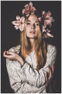
Pauline Suzor (My Inspiration)

For my final shoots I decided to choose the photographer Pauline Suzor. I really love the photos she shoots with the models and the flowers, it gives it a certain aesthetic that is just enjoyable to my eye. I think the backgrounds and the models contrast with each other and by adding the flowers it adds colour to the photograph and makes the photograph vibrant and more alive.


Richard Foster Inspiration (Kelvin Moncion)

Richard Foster used a style of light refraction, and colour, combined with a low angle camera. Foster uses certain angles to catch different geometric shapes in his photographs. For his glass photography he was an expert at catching the different light effects that the glass produced showing the beautiful rainbow effect on the surface.  His photographs are very infomercial-like, looks like something you would find on a television commercial or a magazine. The products which are the subjects are very crisp and you can see every edge and corner of it, there is no extra lighting or effects to the photographs, they are already well done in quality it is quite simple and has a certain aesthetic to it that is eye candy.

Gregory Heisler Inspiration.

After looking at Gregory Heisler’s work there was an impression of calmness and he was attentive when choosing the models for his photographs. When shooting the portraits Heisler seems to have made sure that his subjects were in the right angle for the light source to give the subject a dramatic look. The calm expressions and the black and white filter gives the photo a dramatic tone and, the photos with colour are also very well done, they are well lit and have a cheerful tone to them. In most of Heisler’s work you can see that select parts of the photo are blurred out and usually the clear part is the subject’s face or figure which is another dramatic tone that these photographs have. One photo that stood out to me was one of the old man who seems to be a monk of sorts, Heisler seems to be using Rembrandt lighting, it gives the man a look of “I have so many stories to tell” which is great because every photo should tell a story. The triangle shadow that the man has is also a good touch and goes to show the great lighting that Heisler uses.

Celebrity Pregnancy – Kelvin Moncion – 2/25

Before Beyonce’s head turning pregnancy, that drove the whole media and fan base wild, we had Demi Moore’s pregnancy in 1991. Of course with these pregnancies. came the photographs of these women. Starting with Demi Moore’s which was photographed by Annie Leibowitz, the photograph turned lots of head, one half of the people did not like it at all, the fact that Moore was in the nude was an act of “indecency” and was viewed as “scandalous”. The other half embraced the fact that Moore felt comfortable and, Moore was representing motherhood in a way that has never been publicized before. This even paved way for a new concept that photographers would use in the future where it is all about capturing the the beauty of pregnancy. Moving on to Beyonce’s photograph, this captured the eyes of everyone and it was plastered everywhere (annoying.) you could not escape it. Beyonce uses a fine arts insinuation, which was Paula Modersohn-Becker’s painting “Sixth Wedding Anniversary”, you can see Beyonce holding her belly the same way Paula did. Comparing Moore’s and Beyonce’s pregnancy photographs both photographers use different approaches for example in Moore’s we see that Leibowitz used a broad light on her, which compliments the left side of her face and ears, her right hand covering her breast and the left hand holding her belly. For Beyonce’s it looks as if Erizku used a front light, there is a balance of lights and shadows, which would be a really flat and boring picture, but what really puts everything together is the flora in the back, the vibrant colours give this photo a beautiful finish, which is symbolic as well, since flowers represent love, beauty, purity and, that is every emotion and thought that goes through a mother when she first holds her newborn in her hands.
Inspiration of Dawoud Bey

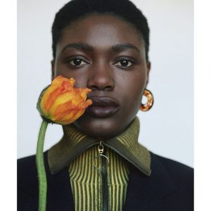
Dawoud Bey high school portraits consists of each subjects to make eye contact with camera. Each of the subjects are centered, therefore our eyes don’t wander and just stay focused on the subjects. The photographs have a certain aesthetic feel to them that are very appealing to the eye, they have a soft look to it, as if a filter was added but I doubt it. The background seem to have a pale colour which contrasts the foreground (subjects) who have a  colours that have a pop. Each subject has a story to tell whether it is a serious one or maybe a funny one that would put a smirk on your face. Bey kept the images tightly cropped where either their whole bodies were showing or it was shot from waist and above. Bey analyzed each of their clothing and placed them in a part of the classroom that complemented their clothing. Bey’s photographic technique is the type of technique that appeals the most to me, I enjoy the aesthetic of it and the way the subjects are set up in the photographs really makes the images seem alive and full of emotion.