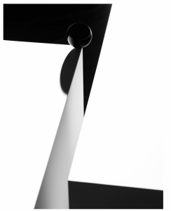
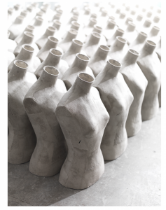
Richard Foster is a sought-after still life photographer because of the dynamic feel his photos have. The photos also has an artistic feel to them making the still life more interesting that will catch the eye. Some people that shoot still life might make the products simple and plain only but Richard Foster I believe puts more thought into his photos where he may use patterns like the photo on the right or give it a asymmetrical look like the photo on the left. The lighting for the one on the right makes the mannequins pop more.
Author Archives: Emmanuel DeWalt
Inspiration Post: Philip Lorca-Dicorcia
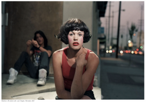
In this photo the way the light brings out the subjects face really makes the photo interesting it’s almost like she was caught doing something and the expression really shows it. The composition might make the photo less interesting but I think the subject being in the middle while someone on the side tells a story of what is going on. The location goes hand to hand with the subject as of course part of the location is at a corner but you can also see the street behind them that brings out that 90s feel.
Inspiration Post: Tim Wallace
Tim Wallace made these photos successful because of the way he lights the cars. The tire in the first one has a subtle light to it that gives it a luxury look to where you can see someone well dressed coming out of it. As for the one below the bronze just like the black tire has a good look to it because of the light. The white really pops out capturing the emotion of the high end photography.
Inspiration Post: Gregory Heisler
In this photo taken by Gregory Heisler the lighting and the expression goes hand to hand. The way the shadows appear below his eyes really gives a darker and evil look to the subject. The prop is also a nice touch as the subject holds what seems to be happier times and comparing it to who he is now. The expression compliments the subjects evil aspect as the subject is looking straight at the camera with evil intent. Also the fact that the photographer didn’t place the subject in the center of the frame was a nice touch too giving it a unique look by showing alot of darkness next to the subject almost as if he is being engulfed into the darkness. 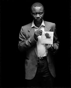
Inspiration Post: Demi Moore & Beyonce
Annie Leibowitz photo of Demi Moore from 1991 and Awoi Erizku photo of Beyonce from 2017 are similar but different in a way. Demi Moore photo can be looked at as more risky and bold than the Beyonce photo because of the sense of nudity that is being shown in the photo. The chose of wardrobe for Beyonce may have been the deciding factor to why it was the most liked photo of 2017 on Instagram. When it comes to the lightning it is more complimentary to the Beyonce photo than the Demi Moore, looking at Beyonce the light seems to be more subtle and smooth while Demi Moore is more harsh and the glow that is on her face proves it. Composition and props also play a key role to these photos and Beyonce photo once again takes the cake. The blue sky background with the arrangement of the flowers really helps the photo pop more, you may say that less and simple is better like the Demi Moore photo but I believe when shooting a women who is going to give birth you would want the background and the things around her to look inviting and not as plain as the grey background in Demi Moore’s photo. There is however a similar position of the subject where both women are not exactly placed in the middle maybe the photographers were using the rule of thirds placing their subjects more to the right than centered.
Inspiration Post: Yousuf Karsh & Nadav Kander
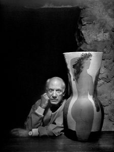
Yousuf Karsh was a Armenian Canadian photographer known for his portraits of important and famous men and women of politics. His photography can be seen as strong and powerful because of the different sets of lighting that he used. When shooting famous politicians you would want them to stand out and look just as important as they are and I think Yousuf really captured them that way. Through expression and props he shows that he really got to know his subject before capturing them in the moment. The photo I chose from Yousuf is the photo he took of Pablo Picasso and in this photo I believe it shows exactly who Picasso is and what he believes is important to him. The lightning that he chose seems to be a broad lighting capturing a lot of the right side of Picassos face. The vase with the women silhouette was a clever and key prop to showing off the artist that is Pablo Picasso.
Nadav Kander is a London based artist, director and photographer who is notorious for landscapes and portraiture. When looking at this photographers work you’ll see that his photos captures a sense of personality from his subjects. The way the lights are utilized are interestingly and amazingly done. Some of his photos give off a unorthodox feel where the subject is used in a way where you’ll leave being mesmerized and curious. The photo of Nadav Kander that I chose was the one with Sadiq Khan where the light is shadowing a bit of his forehead and chin boxing in his eyes and nose almost like Kander is trying to show how strong and bold of a personality his subject has.
When entering a new assignment after looking at Yousuf and Nadav I think I should focus on my subjects personality and try to match the lightning to the mood my subject is giving off. Using a broad lighting set up can be good for people with a strong, bold and confident personality or a person with a soft side to them who are kind hearted maybe butterfly lightning or short lightning will be good for them.
Manny DeWalt – Dawoud Bey Inspiration
Looking at Dawoud Bey photographs I think that he uses facial expressions and body gestures to really give off a sense of attitude and personality from his subjects. When it comes to his framing, all of his photos of the young people are put at the center of the frame possibly trying to show how important the subject is to the photo. The lighting of his photos give each photo a different feel and look especially the one with the girl with her hands crossed together, the light seems as though it is coming from the center while the background is dark which gives off this powerful feel almost like the girl is the boss of the classroom and she is in control. The foreground and background of the photos also plays an interesting role in the photos. The last photo with the kid with the fcuk sweater is a good example as the background goes hand and hand with the attitude with the young man himself, there is a blue tone that you can say gives off a chilling vibe and with the young man intense stare. Some ideas I got from his photos are to pay more attention to the expression of the subject because that is something that can really bring out the personality of not only the subject but the overall scene of the photograph. Also I think the setting of the photo is also important as he said in the video he moved them from where they were sitting in order to incorporate the setting with the expression and body language of the subject.

