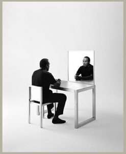
This image by Gregory Heisler is of OJ Simpson, he sits at an empty mirrored desk with his hands folded staring into his reflection. There is a nice range of gray, deep black and bright white focusing the eye on the subject’s gaze onto himself. The desk is at a 45-degree angle away from the photographer, which creates a nice light in the mirror that further isolates Simpson. He wears all black, which further contrasts the image on the soft gray sweep & metal looking chair, this also frames the subject. Light reflected off the back of the chair brings the eye to the bright area on the mirror, leading to Simpson’s gaze. He investigates himself like he is wondering what his life turned into.
Author Archives: Zakiya Owens
Glass!
Marcel Christ
The image is on a bright field setting. I think the light is being shined through a surface to help spread light. The image is shot at a low angel to make an interesting halo with the cup opening. Christ uses photo collaging to make the milk splash up from the bottom of the cup. This could have taken at least six images to put together for this one interesting image. While the primary tone of the image is very bright and clean the details in the cup rim and bottom really bring the work together.
Greg Schapps
Image is shoot on dark field set and lit from above. This is a sharp contrast color image with motion. The use of a neutral tone blue to contrast the mini rubric cubes was smart and captivating. The image is shot straight forward to emphasis the motion of the water as it settles from the splash. The contrast from the lower half the hand helps to keep the eye focused on the cup and contents.
Final Project- Paul Laurence Dunbar
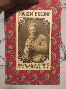
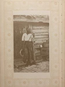
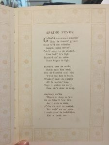
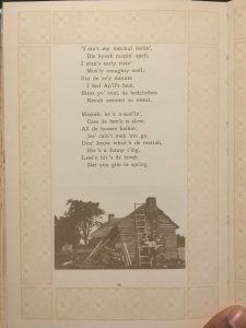
Paul Laurence Dunbar a son of Emancipated African Americans and writer who lived from 1872 thru 1906. He wrote and published several books of poetry written in broken English as tribute to his parent’s roots of plantation life. For this final project in Advanced Photography I am creating visual content for a poem in Dunbar’s book, Joggin’ Erlong entitled Spring Fever. This book was published the year of his death.
While a complete collection of Dunbar’s poems is on the internet, my inspiration comes from the physical book. The cover is fitted with red fabric with a pattern that resembles ameba, reminiscent of bandanas worn by select groups as a fashion and symbol allegiance to their set. Within the book are light, and modest illustrations that border poems and embellish pages, along with photographs of black people.
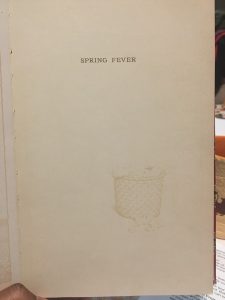
Spring Fever is a poem about what it is like to wake up on a spring day on the plantation. Opening with the complaints of being woken up by the birds fighting and expressing the want for more rest. The result of lack of sleep is the urge to sleep in but work needs to be done and the “Mastah” is yelling. Yet still, they move slow. The result is violence.
The images I will be creating for this project will consist of both still life and models.
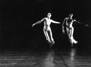
Shoot 1: As representation of the squabbling birds we will use two models on a grey background with a single light over head or from the side. They will interact a short distance from one another in a mock dominance display.
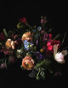
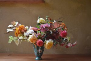
Shoot 2: Still life of spring flowers on a dark background lit from the side, high contrast dramatic.
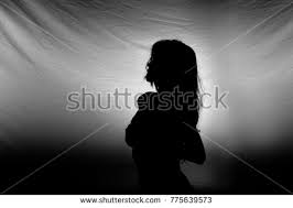
Shoot 3: Self portrait consisting of flower elements. Dark Silhouette image, light through floral print fabric.
Michael Paul Smith
Michael Paul Smith builds detailed miniature scenes and photographs them. Most of these tiny environments are of streets or involve cars. Smith pays attention to the details in the scene in relation to the surrounding background that will be included in the photo. By manipulating light, Smith creates the desired feel. The images are not filled with light, rather they have areas where light is focused and encourages the viewer to look at the whole photograph, or just a specific spot. The color scheme of the props in each scene are harmonious to one another, the background, and the subjects. For each image to look correct & appealing, Smith uses low angles and forced perspective to create interesting depth and angles throughout the scene.
By emulating the techniques Smith uses to create his work this week’s class shoot can be successful. This week I will be using different pattern cloths and gel lighting to covey the messages of the selected poems.
Art Crawl!
For class on Feb 28 we took a trip to Chelsea where we viewed eight galleries. Here are three of the most memorable to me.
Prison Nation at Aperture
Artist: Lucas Foglia , Bruce Jackson, Emily Kinni, Jesse Krimes, Jack Lueders-Booth, Deborah Luster, Chandra McCormick and Keith Calhoun, Zora Murff, Nigel Poor, Joseph Rodriguez, Jamel Shabazz, Sable Elyse Smith, Stephen Tourlentes
This exhibit was a collection of images that were taken inside of prisons of inmates, recently released from prison and getting reacclimated, and art made by inmates. The main series of the exhibit were the images that were of the inmates who were performing religious plays. The mood of the inmates seemed to be indifferent to the situation. They sat in costume staring into the camera while they waited. The portraits were well lit on the subject against a black background in high contrast, which helped to bring the focus to the costume and facial expressions. Most of the subjects were placed right in the center and cropped near or bellow the waist. The exception to this was one image of a man in costume armor. He was exposed from head to toe sitting on a stool draped in black cloth. This image allows for the audience to see more of what is taking place around the photograph.
Moving Stillness at James Cohan by Bill Viola
Focusing on The Sleepers instillation, we enter a room that is painted all black with several barrels filled with water and placed around the room. The barrels have a blue glow coming from them and once inspected reveals a t.v. screen at the bottom displaying a sleeping person. The room is still and quiet, while peering down on to this sleeping person I get an uneasy feeling, like I am violating this person’s privacy. Yet I couldn’t look away, I pulled out my phone and recorded this moment of protected exposure. The videos were very close to the subject, giving little context to the whole room they were sleeping in. What was strange was that none of the subjects rolled over.
DCTs and Scenes from the Blackout by Stan Douglas at David Zwirner
The works on view are a series of images that started off as staged photographs that depict what if scenarios in the event of a blackout. The images are dark with minimal sources of light, high contrast. What makes this work more interesting is how he edits them. Douglas manually manipulates color, frequencies and amplitudes to create the desired feel, then prints them on coated surfaces to give them a more surreal feel. One image shows a loot. A hand is shown in the near center of the image, top left of a glass window with a hole in it. The hand is lit by a single light, highlighting the theft.
Philip Lorca-Dicorcia
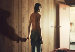
The image by Philip Lorca-Dicorcia from the series Hustlers is of a white man who stands topless in center frame with his hand touching the wall. His jeans are ripped, his skin and pants seem to be dirty. He stands with his back facing the camera but in reflective lit shadow. His hand on the wall creates a long shadow that darkens the left of the image to contrast the bright light coming from the open door on the right that he is facing. The light is strong, almost blowing out the detail on the door. It seem like the light is diffused and directed towards the torso. The subject is the middle of a light to dark gradient of the room, his skin blends well with the wooden paneled wall.
Maternity photos!
A snapshot of a mother to be proudly displaying that bump has been created a million times before and will continue. Each photoshoot is as unique as the mother, to convey as much as she needs to say. Annie Lebowitz and Awol Erizku’s maternity photos of Demi Moore and Beyoncé both produce stunning images. Both portraits feature a beautiful woman in ¾ pose clutching their body but that’s where most of the similarities end.
Demi Moore in Lebowit’z portrait is a high contrast image with diffused Rembrandt lighting illuminating both the subject and the backdrop. The light brings focus onto Moore’s baby bump, framed by her hands. This portrait is striking yet simple, the subjects are emphasized only by light. I feel a sense of strength and courage, two things needed to bring life into the world.
Awol Erizku portrait of Beyoncé, is overflowing with props and light. This image is displaying abundance but not for Beyoncé, for the life that she is nurturing. Erizku drapes the face of the mother to emphasis the focus on the bum that’s only protected by loving hands. Around the belly itself is void of distractions like flowers to help bring the eye to the subject.
Beyoncé is saying I am giving you all that you need to be great. Demi Moore is saying I am giving you my strength. Both portraits are a message of the devotion and sacrifice. Perhaps these portraits are a reminder for the mother to look back on and renew the ideals she held.
Richard Avedon & Jonathan Mannion
Richard Avedon uses light, framing and leading lines and movement to create compelling photographs. Many of his portraits use blown out lights and over exposed darks to isolate the subject. From Avedon’s work I get the impression that he only wants us to focus on exactly what we are looking at. There is an effortless feel to the way I experience his photographs. Avedon’s images at a glance can seem simple but he uses the “photography rules” to his favor by abandoning them. The consistent theme for Richards photographs is the high contrast isolating a centered subject.
Jonathan Mannion adopts the style of isolating the subject center frame from Avedon, however Mannion uses dark backgrounds and selective lighting to bring attention to the subject. For dramatic isolation Mannion uses a washed-out background relying on high contrast and leading lines to make the image a success, for example the Jay Z portrait. Mannion built on what he learned by making creative use of color gels to add contrast and dynamic levels while separating the background from the subject. Mannion seems to stay relatively close to the boundaries of conventional studio photography.
Nadav Kander
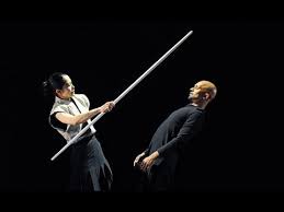
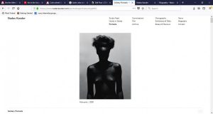
Kander’s portrait work has a pattern tight on the subject, edited on the cool side, and the subject looking away. For the most part this is what I observed. His style is distinct and can feel dreamy.
I would like to recreate an image like this. It’s high contrast but the sharp corners of the model’s body being highlighted by the light overhead while hiding her face make this image successful.
Yousef Karsh
After reading up on this 20th century artist I am wondering about the conversations Yousef Karsh must have had with his subjects. They ranged from entertainers to governmental leaders and he made it a point to “do homework” on his subjects. His portraits have dramatic looks due to the artificial stage style lighting he uses.
This image on the left of the man smoking uses high contrast and broadside lighting to make the image successful. To help the subject to stand out from the background he lit the back side of the subject as well. Yousef was able to capture the subject in an expressive state, maybe they were about to take another drag from the cigarette or they were mid sentence. We will never know, but what we can tell is that is image is captivating. This is something I would like to create.

 High Contrast, Dramatic Lighting


