Author Archives: Niko Mohan

Niko Final Project

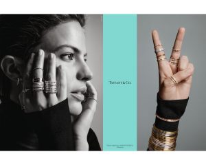
For my final project I have decided to test my abilities and push myself I do a magazine ad for Tiffany & Co. and Saks Fifth Avenue. I will have to admit doing this shoot would be a challenge because this is a something I have tried to before and failed to meet the overall object. However, I am not going to give up and will success this time.

My target audience would be for individuals 20+ due to the fact both of these companies’ retail very expensive and high-quality items targeted to those who have a large number of funds and mature customers. To show this aspect of these retailers, I would need a model who has a mature look to their face somewhere around the age of 25-35.

In terms of the lighting and set, I would most likely use a white background because, I can make the background itself white or grey which both of these retailers use in their campaigns. The lighting for this would incorporate a one to three light setup. I would be using a 32in octabox and 40in beauty dish to create some very unique quality of light.


Chelsea Galleries

Last week, I had the pleasure of visiting a hand full of art galleries located the neighbourhood of Chelsea. After visiting these galleries, I had a discover three photographs that I found quite powerful and define the true definition of art.

The first gallery we visited was in Aperture with the pieces by Stephen Tourlentes. One photograph that that allured my attention was that one titled “Rawlins, Wyoming State Death House Prison”. Looking at this photograph, we can see that glimpse of light that draw attention and us question “what is are those lights?”. In terms of lighting, it is very soft with a grey to black gradient. It’s beautiful and looks like 19th century painting. On the contrary, this photograph has dark meaning behind it. Like the title stated, this a death row prison. Thus, this is  the meaning of the dark side of beauty.

This photograph by Jeffrey Milstein, titled “Newark Airport Terminal B, 2017”, was the most powerful photograph I had the pleasure observing. This struck me because it reflected something I wanted to be. As a little boy, I wanted to become a pilot. This love of aircrafts and flying was all I wanted to do. I had the opportunity to attend a college for aviation and there I believed in 2020 I would be flying for Lufthansa or Delta. Unfortunately, my dream was crushed due to finance reasons and I was forced to go elsewhere. To see this photograph, it showed me a dream that lost and a career I could have had.

The last photograph I will discuss is the portrait of Ella Watson by Gordon Park. This photograph was captured during the 1940’s, when the majority of the US was racist. With that noticed, blacks where restricted from high paying jobs that their white counter parts had. So, we had to settle for the jobs that white people didn’t want to do.  Like cleaning, farm work and especially taking care of their very own children. We this so strongly represented here. We see a black woman, most likely tired and bored of a job, but strong, as she stands upright with no expression one her face. Broom and mop, she stands in front of the American flag, looking determined to provide for her family.

 

Hustlers

Philip Lorca- Dicorcia is one of the best photographers I ever witnessed. Photography is not just an art to capture photographs, it is an art that that tells a story. With that, we can see the sheer mastery of his work that captures that ability to tell you a story.

One photograph in particular from his “Hustlers” series, is the one of a man sitting at on the edge of a balcony. This mysterious man is a prostitute and the way how this photograph was set up, we can conclude some meaning behind it. The subject is sitting,looking down, with his hands grasping the rails. It makes you wonder is this man proud of what is doing, that is what explains the look of sorrow on his face. He appears to look bounded to his work, bars symbolise that seems restricted and if his line of work is the only way out of his situation. Then we have a classic play with leading lines where the railings are leading us toward the exit of the car park. Maybe that could be another way out of his situation. Not to mention the pop of flash that creates a strong shadow that is an allusion of Jesus’ crucifixion. As we all know, Jesus was persecuted and died for our sins but, the real question is, is this man ready to die for his sins?

Beyonce & Demi Moore

In today’s post I would be discussing Demi Moore and Beyoncé’s maternity photograph . Firstly, when you observe these two images, we clearly see difference in the styles of Annie Lebowitz (Demi Moore) and Awol Erizku (BeyoncĂ©).

To begin, I would to like to confess that Annie Lebowitz is an artist that I follow and tediously study. Her style is rather quite simple and straight to the point however, she does to such great extent, that work becomes legendry. Annie tends to work with one to two lights. This makes her images very bold, and “constrasty” with a kiss of light. We can see her style reflected on Demi Moore’s maternity photography. The light was positioned in high- right, tilled down onto the subject. And if you look, the subject is position relativity close to a grey background. We then can see Demi looking up into the light, which can symbolise God’s gift to mankind, a child. She looking into the heavens as she proud and courage while she holds her womb. Despite the sheer simplicity of the setup, it accurately portrays ­the underlining message of the photograph; a new chapter in a woman’s life.

On the other hand, we have Beyoncé’s image taken by Awol Erizku. I’m going to rather frank but, I absolutely and positivity hate this image and the artist behind it. To me, Erizku’s work looks rather amateurish and all over the place. Most of the images are not sharp, not in focus, dull, oversaturated, undersaturated and completely makes no sense. It’s like a toddler with crayons drawing all over your wall. Looking at Beyoncé’s image it’s too simple. The flowers are distracting, your eyes go all over the place and it takes away from the experiencing the emotions and feeling a connection to the photograph. The light is just a simple 1:1 or 1:2 with no gradual effect or mood to the subject. Overall, a simple snapshot with nothing to connect to.


Master vs Apprentice ( Richard Avedon & Jonathan Mannion)

Before I begin, I want to say that I’m in no way trying to say which of these two artists in a way to says who’s better. This is more of a more a comparison and contrast between two of the best fashion photographers to ever exist.

Starting with the master, Richard Avedon was major influence in the field of portraits and high-end fashion. For me, his work tends to play with the fundamentals of photography such as line, shape and pattern. With this, he uses these principles to create forms which forces you to examine every corner of a photograph. He uses these to the fullest extend which results in photographs that taps into our emotions; they can make you feel uncomfortable, curious, heavyhearted and question the anatomy of humans. The best application of these principles being used in the photograph of “Ronald Fischer, Beekeeper”. In terms of lighting, we can see a high key photograph, completely evenly lit, with relatively low contrast. In addition to that, we see him using pattern and rhythm in the form of bees. It makes you feel uncomfortable, but sparks your curiosity and you begin to question “how is this even possible?”. This is the style of Richard Avedon.

Now compared to his teacher, Jonathan Mannion has a similar style to Avedon in terms of using high and low-key lighting, but that’s where the similarities end. Jonathan tends to broaden his style of work by using colour fills and capturing his subjects in their natural background. You can see that Mannion has acquired this from most of Avedon’s work; which he then uses it to his advantage. In the portrait of JayZ, he utilises Avedon’s lit white background and most likely one more addition light to light the subject to get that very strong- define, low key photograph. I would love to try out both techniques high and low key lighting to see which one makes a photograph powerful.

Yousef Karash & Nadav Kandar

Film vs digital. Old school vs new school. Colour vs black and white. These are some of the many titles that can be used to describe two different masters in the field of photography ; Yousuf Karash and Nadav Kander.

Yousuf Karash was an Armenian- Canadian  photographer who was active during the 20th century. He was mainly responsible for photographing  the 20th century celebrities and icons of the era. He has photographed the likes of Wilson Churchill, Martin Luther King Jr, Mother Theresa and even President John F Kennedy. His style of photography is rather quite simple and straight forward due the technical limitations of his time. However, his limitation became his strong-point. One portrait in particular I feel an attachment to is the portrait of John F. Kennedy (JFK). In this portrait, Kennedy has is body position to the side with his hands clasped, looking upwards with a glint of light hitting is right side of face. This is powerful moment that I read has Kennedy’s dream and hope for the future. This idea of sending the viewer an outlining message is what I would love to accomplish in the next class.

Nadav Kander is  British Israeli photographer who is active in the 21st century. Like Yousuf, he photographs celebrities and icons in today’s media. His work is focuses on using colour, shadows, depth and slow shutter speeds to create an unique style I found unthinkable. He also has a strong interest with double exposures and using a screen projectors to display an optical illusion of an image upon an image. One photograph that I find powerful is of Rosamund Pike from the movie “Gone Girl”. In this photograph Nadav utilized colour, depth and the use a projector to display an image of tree branches. I would love to play around with this idea in my next shoot with in conjunction of Yousuf style. Together, both of these two different styles would hopefully create something powerful.

Portrait Photography| Niko

After viewing Dawound Bey high school photographs, I have observed several key characteristics that made his work unique. One of these characteristics is using face expressions to give the viewer a sense that the subjects emotions. One portrait in particular is the one that shows a Muslim man named with aggressive facial expressions. His muscles surrounding his eyes are tense in a “V” shape. This is then reinforced with a very manly “cross of the arms” with a clench of his fist. This emotion is backup with the subjects thoughts with follows ; “I know that I shouldn’t but sometimes I wonder how other people look at me. What do they see first? My brown-ness, my beard, my cap, my clothes, the color of my eyes, the design of my T-shirt? I think that people see my skin color first. They probably see me as a brown guy. Then, they might see my black beard and my white kufi (prayer cap) and figure out I am Muslim. They see my most earthly qualities first. Brown, that’s the very color of the earth, the mud from which God created us. Sometimes I wonder what color my soul is. I hope that it’s the color of heaven…”Omar.The subject is clearly expression his mind of what society thinks of him, rather than knowing him on a personal level. This ties back into his aggressive demeanor. In today’s shoot, I would perform a series of images that would play with this central idea of emotion. I would try to answer: “What makes a photograph powerful?”, “How does body language affect the overall photograph ?”, ” How can I show not one emotion, rather multiple emotions?”, ” Does my lighting affect how an emotion is expressed and perceived?”. Today, I would push to answer my question and see if I can create an emotional masterpiece.