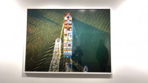
Last week, we visited Chelsea art galleries and we looked at many photographs. I loved three photographs which interested was Benrubi Gallary which was at 521 W. 26th St. The exhibition was leaning out and photographer Jeffrey Milstein. I was amazed to see how bird’s eye view photography. I never imagined a ship would so interesting to see from the top view. It is so colorful and it allows us to see how color harmony works in our surroundings. Benrubi Gallary enhance my vision of photography. It has from all around to get the most out of the ship.The colors are vibrant and require a lot of light to get this kind of shot.
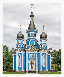
The second image which got my attention is this one at Facades at the Grand Tour at the Yossi. It was amazing to see how this image was taken by Markus Brunetti. I was amazed by the color and how the photo is taken at the center. The most amazing thing is every detail is captured in the photo and for a photographer, it is an achievement. The light is perfect for this kind of shot because of you able to see each detail in the image. Again I mention the color is very hard to get in outside location. For architect this the best example to idealized this building.
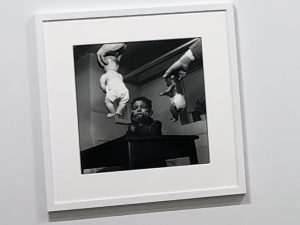
The photograph is taken By Gordon Parks. The image has a different angle from where it is taken from. It is a very unusual composition of this image. The kid in the image is looking very thoughtful and the two babies are handing in front of him. The image has al lot curiosity because you want to understand what is going on. The light has created a contrast effect on images which focuses on the babies and the kid.


the important thing about the facade images in the show of work by Markus Brunetti is that they are pieces together from thousands of photos. You don’t mention this.
The Gordon Parks photo that you posted is very strong in it statement about race. the high contrast does add to the drama and also makes the choice between black and white seem very stark.