Gregory Heisler

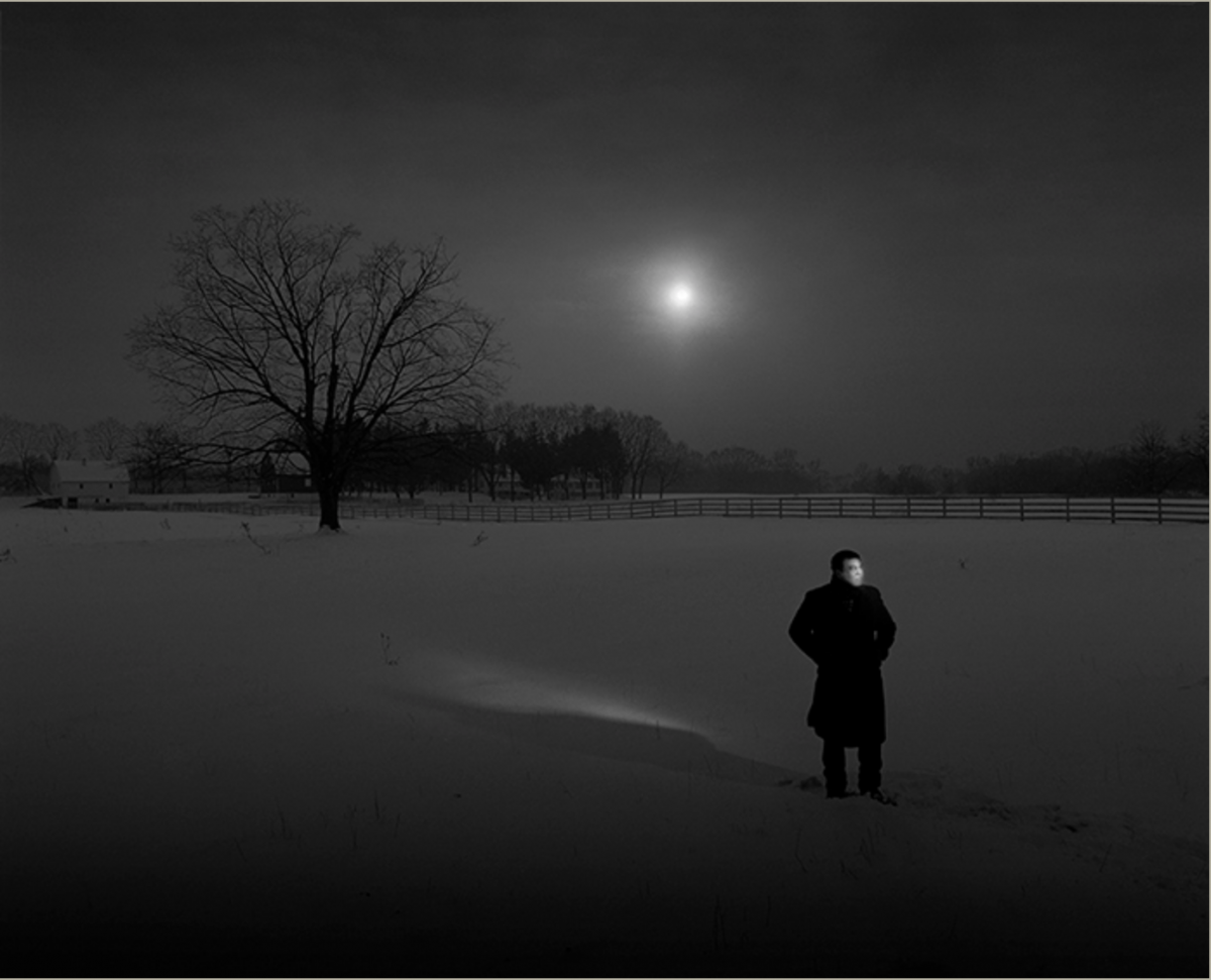
This photograph that Gregory Heisler took got my attention because I mostly enjoy looking and taking great black and white photos. While examing it the visual hierarchy drew attention to the man wearing all black, even though the background is present. The negative space is what makes this piece intriguing, as the land filled with snow resembles the reflection of the sky along with a spec of light coming out from behind the gloomy clouds. The expression I get from looking at this photograph is sadness because the man standing outside by himself is in isolation with the model own thoughts, And the only tree in plain sight is dead.
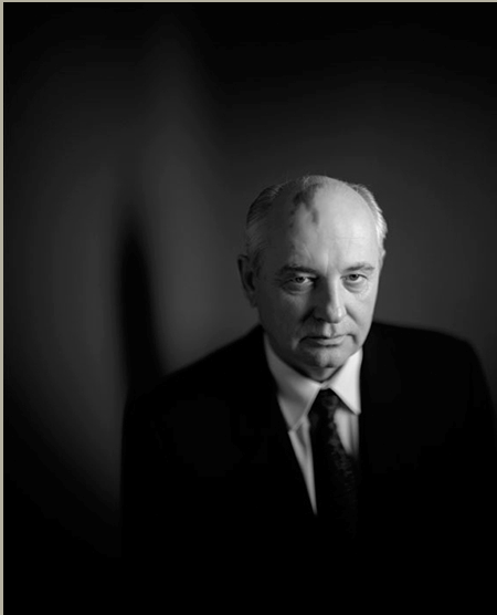
Final Project Proposal

Topic: Self Esteem Campaign

This campaign is inspired by the Lung Cancer Alliance


My target audience are people who struggle with self esteem. People who have a negative state of mind when it comes to their looks, body image, or anything pertaining to themselves. My images will include people. The tone is very happy, confident, energetic. The approach is very literal as it will be portraying very high self confidence. My models will be 3 women & 3 men of all sizes expressing the confidence that matter how you look or what size you are, you are ecstatic about life. The lightening for the this campaign will be straight forward lighting to emphasize the beauty as a whole.

Gregory Heisler

Gregory Heisler’s images are amazing because it uses a very harsh but gentle lighting style for the subject. The images that are his vibrant photos made me think and feel that the subject added the vibrance to the background. Different emotions are convey throughout each portrait. The light he uses in one particular image (right), he uses a front light, hair light and back light. Those lights plus the background make thVibrancee image beautiful and amazing. The emotion on this young man’s face is priceless and is glowing.

Michael Paul Smith

Michael Paul Smith uses front light to covey a story within his still life pieces. In his pieces he is able to bring out the lighting of every part of his still life. Each still life has a different story but it looks like it was all done outside. Being able to bring light through a vehicle is unique and using reflectors to capture the art of still life is beautiful. I was able to see the focus of the black car and it looks like the light is hitting all sides of the car.

Liebowitz/Erizku

Anne Liebowitz uses the lighting style of rembrant to bring out Demi Moore’s facial features. The lighting style brings out the look of her body against a really dark background. Also, it looks like the features of her hair is also coming out. The use of front light is amazing as well. It is hitting every part of her body making it look natural.

Erizku uses the lighting style of short and front light. The front light is is bringing out natural features of her body and also making it easy for us to see a different lighting style that is on the flowers. We know that BeyoncĂš is a natural born icon but in this image she looks like an everyday woman.

Gregory Heisler

One of my favorite portraits by Gregory Heisler is from his simple series. His subject is placed more on the right side of the gride not really in the middle which worked with the choice of lighting he uses and the dark background. The lighting he used is I believe short or broad light because the right side of his face most of it has a light on it and the left the side of his face barely or has no light shining on it. The model’s expression is more of a serious kind of sad but more serious expression which worked out well with the lighting styles that Heisler used.

Richard Foster

Richard Foster’s work is beautiful he made still life photography look excellent with just perfume bottles, lighting, and colors. I believe he uses gels or adds the colors and angles the product in about a 45-degree angle to get the right reflections without this ugly glares. And that’s what he showed in his Prada fragrance campaign. For his Tom Ford campaigns, he used a live projection in one of his images for Tom Ford and I liked how he projected the image to just slide through the background showing the beautiful colors the through the bottle to a black background where it focused on the perfume bottle. Where his other Tom Ford image he angled the bottle with less light and fill which made the background dark but the product light with reflections and shadows. Same to what he did for the first Tom Ford campaigns the Stella McCartney perfume bottle is also angled the same way or almost the same way but the lighting and choices where different. It looks like the light is in front of the perfume but not directly shinning at it because of its reflecting in front of the bottle with a little shadow and glare but not this weird glare. Overall, Richard Foster’s work for these campaigns is really beautiful and my favorite is his Tom Ford campaigns. He made still life photography look good with just one item by creating shapes and colors so there is much more going on than just a regular product shot.

Michael Paul Smith

Michael Paul Smith’s work is amazing in the fact that he makes toy cars look like they are real life like cars. He sets up his cars on location on a table then takes the image up close i believe but he ends up with amazing results that amazed me. When I first looked at his work I thought these were real life cars that he shot. But then I saw the image under it of the toy cars set up in the way he took the image to make it look life like and also looking closely his work shows a 1950s feel based on the cars he photographs.

Philip Lorca-Dicorsia

The photo that I chose from Philip Lorca-Dicorsia’s series is Marilyn, 28 years old, Las Vegas, Nevada Photograph. In case for composition Philip Lorca-Dicorsia took the photograph of Marilyn and positioned the camera so the the subject is right in the middle of the gird. Also liked that everything else is out of focus and the subject is in focus cause that’s the main focus. And having another person sitting next to but a little behind and not in focus but you can clearly see him really bring the whole photograph together. Philip Lorca-Dicorsia used a front light and a back light because you can see the light in her hair and separating the subject form the background. Looks like he also used front light because the light is directly on her face, it’s very light and bright to me.

Liebowitz/Erizku

Annie Liebowitz photograph of Demi Moore pregnant portrait shows more of a dramatic look. And that helped with the dark background and the fill light on her face that gave it more of a dramatic look. And the Beyonce photograph by Awol Erizku also had a dramatic/serious look with similar lighting styles, to be it looks like Erizku used front light and a fill to get this results. Both images have contrast. But I believe that Liebowitz’s image of Demi Moore has a strong and sharper contrast then Erizku’s Beyonce photograph. Which might have to do with the fact that Liebowitz’s image has no background except the dark background and the fill light making Demi Moore the main focus. Unlike Erizku’s image that has so much going on with the flowers behind Beyonce making us not only focus on her but on the background as well.