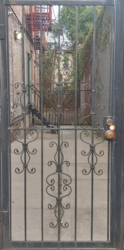
I chose Nicole’s photo because I like the relationship between the metal design in the door and the metal bars in the background along with the green leafs. I think the mixture of nature and metal gives it a nice touch.
Category: Lab: Week 3 – Perspective (Page 2 of 3)
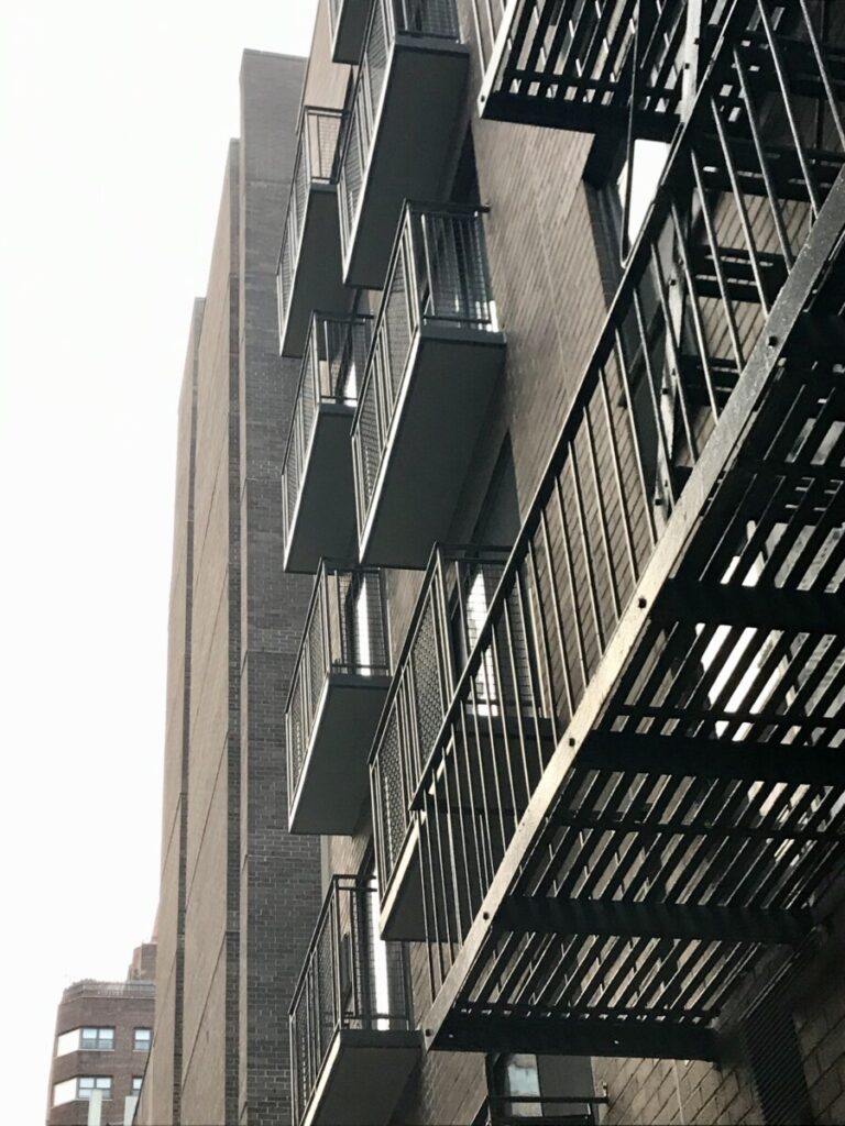
There is a sense of depth and perspective through the clear and continuous metal balcony. This also is shown through the small building on the bottom left and lighting from light to dark.
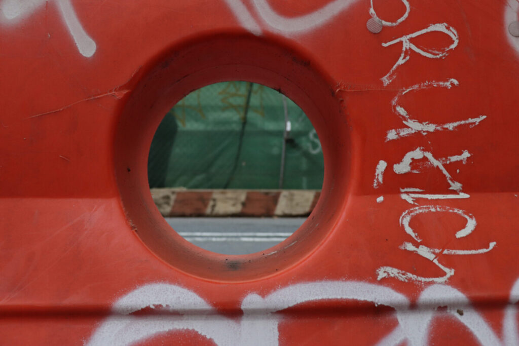
Taken By Andrew
I picked this picture because it stood out to me the most. The hole being in the center of the photo drew my attention.
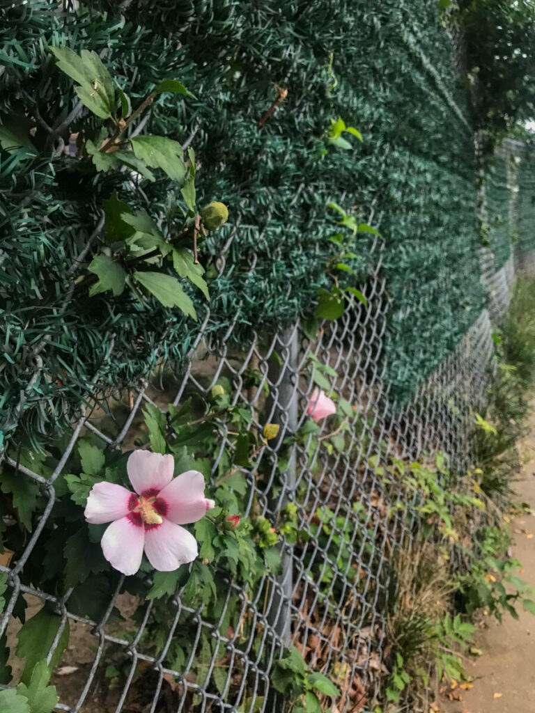
I chose this particular photo that Isadora took because I really liked how the flower stood out much closer to the camera and with the size of the flower compared to the fence, you can see that they’re both very similar in size. As the perspective goes further away, the holes in the fence tend to be smaller and the diamond shaped-holes are less apparent. Everything becomes more out of focus as well when you follow the fence to the furthest point.
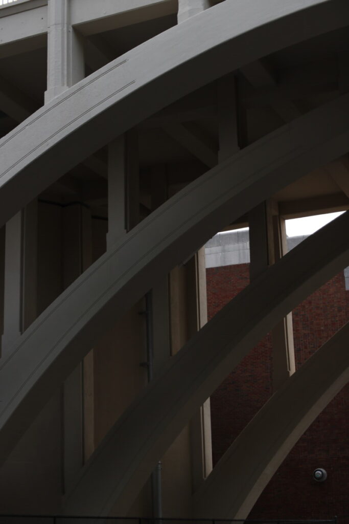
This photo by Jon Baez is a prime example of perspective, depth, and space. It is a depiction of the under supports of a bridge. The way the waning sunlight is a gradient across each beam, with the light concentrated at the closest and highest beam, down to the dimmest light at the furthest and lowest beam, creates a sense of depth and moody space. The gradient of light across each beam not only shows perspective, it also is very visually striking.


Recent Comments