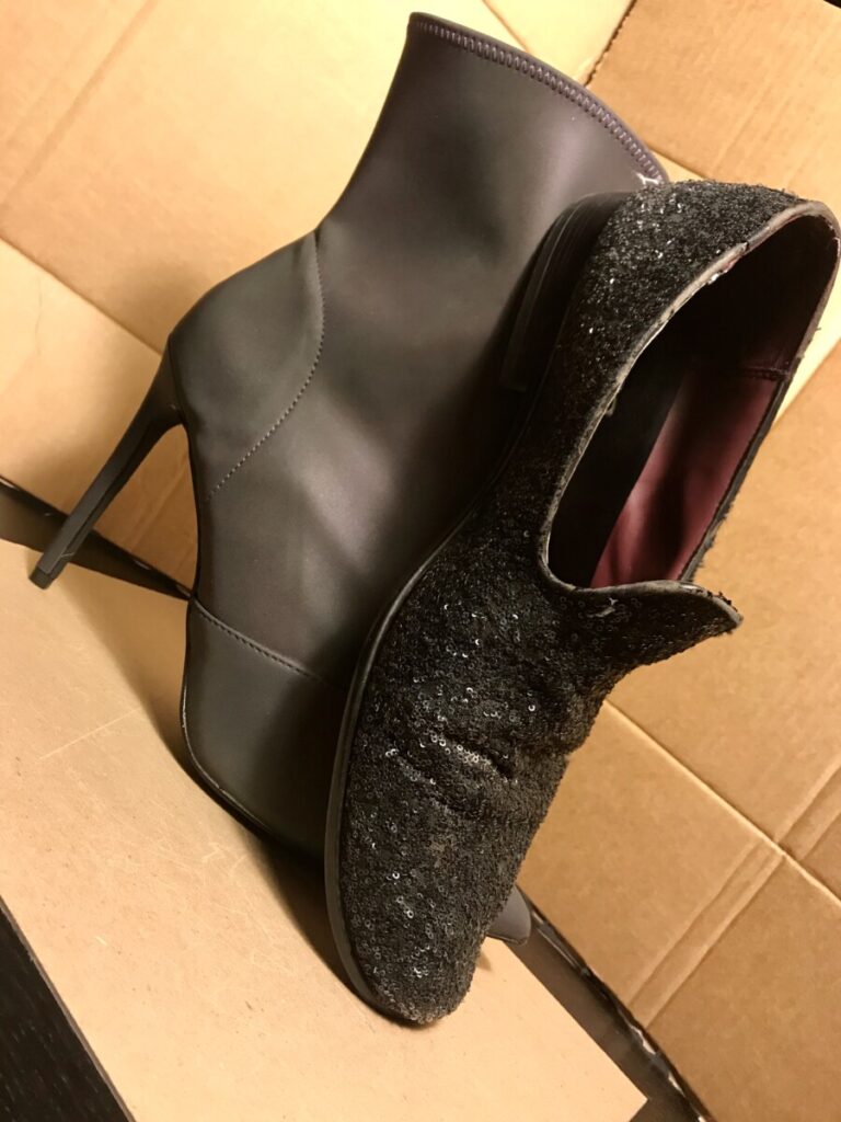
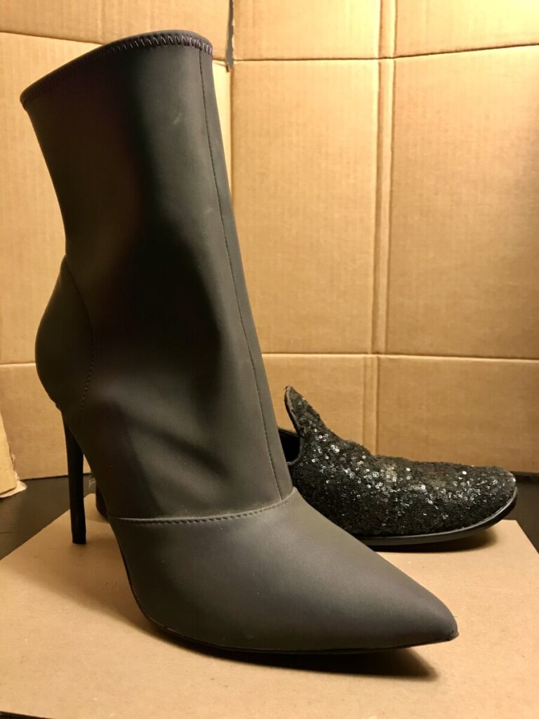
I started with two of my shoes from my wardrobe, one flat and one stiletto heel, and I tried to arrange them next to each other in an interesting way. I manipulated the camera angle too much and it came out looking too cheesy. So then I positioned my camera in a more straight on way and placed my stiletto closer to the camera to convey it as being more dominant, with the flat loafer behind the stiletto in the background. I also used a brown cardboard leftover box as a sort of seamless backdrop, which I chose to contrast with the glossy and sparkly materials of the black shoes.
Robin Michals | COMD 3330 OL98 Fall 2020
© 2025 Photography II
Theme by Anders Noren — Up ↑


What you think of as cheesy I like. I think the tilt to the first photo works. What I don’t like about that photo that you changed by the 10th is that the loafer hides the shape of the boot. The cardboard backdrop works well but the whole shot looks too yellow.
In the Lightroom Photo Editor app try using the temp slider under color to adjust the white balance.