https://www.dropbox.com/sh/71rpqd9gyd08xyw/AADYgWkLUZ04IanM81B8tNxSa?dl=0
Author Archives: Nadia Chin
Chin Nadia Path
I think the use of type on a path works because the type flows well along with the image of a fingerprint it is portraying. The type is simple to read since it flows with the shape of the image and isn’t random.
Chin Nadia Page Margins
Chin Nadia Project Final 3
Chin_Nadia_ TC_3d
Chin_Nadia_ TT_RP
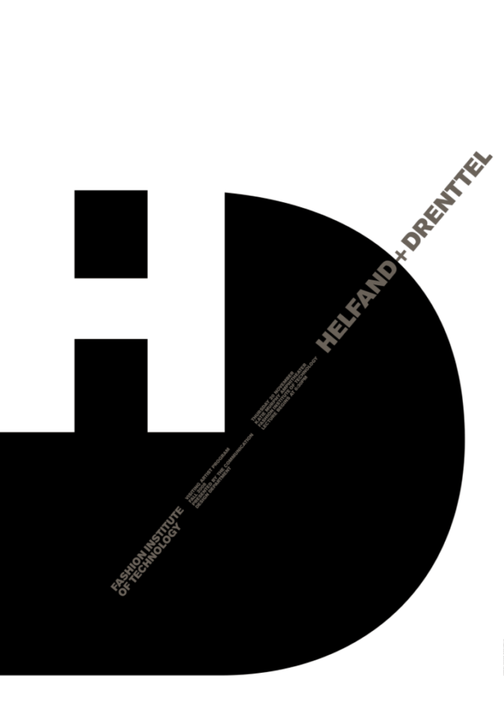
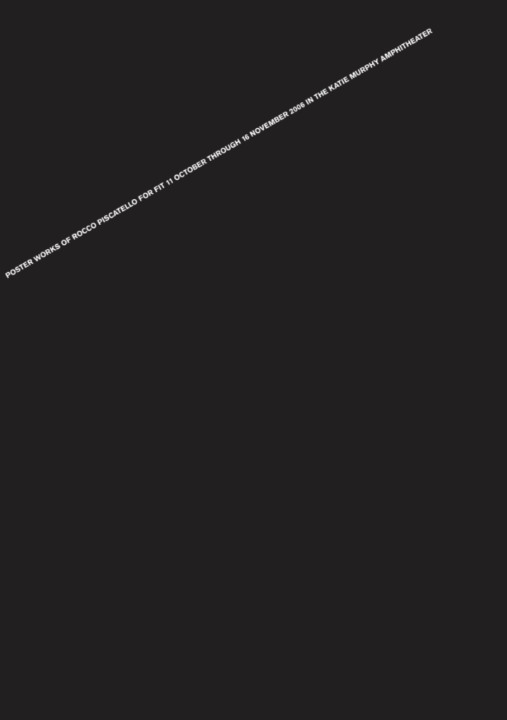
I think the poster on the left works the best. This is because there is a pretty good figure ground relationship. I also like how the grey is used for the smaller text, because it still stands out despite being a darker shade. The poster on the right works the least because of how empty it is. I can kind of understand the concept, though I feel as if it could have had a bit more detail.
Chin_Nadia_ TC_LP
Chin Nadia TC-ET
Chin Nadia_Typebook
Chin_Nadia_-TC_CT
Chin_Nadia_ TC_TS
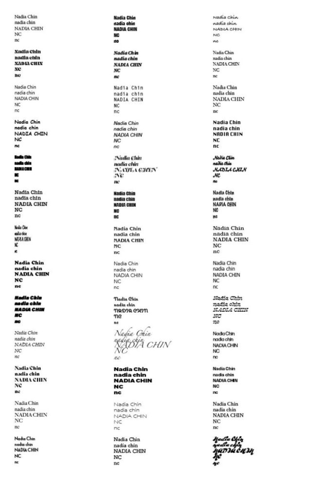
Type Challenge OpenLab_setup_Nadia

My favorite font right now is Degular. I think it is super simple yet can be used in many different contexts. It has different weight and style variations that also look amazing.
Here I used it in its medium weight variation, one I use the most when I’m creating personal projects.
