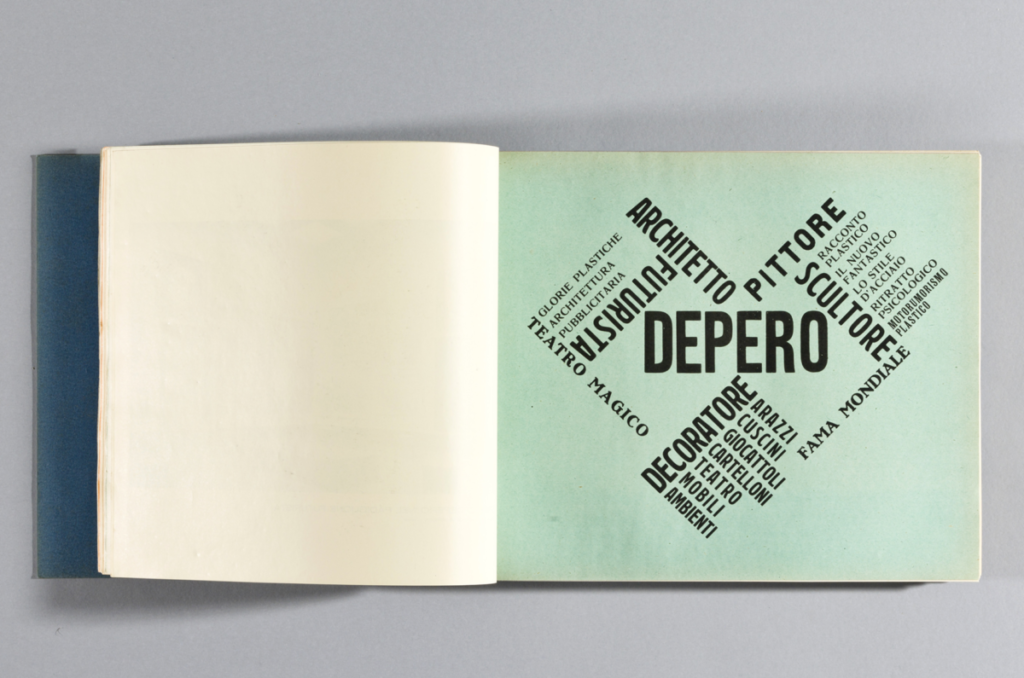
The one that has the most dynamic usage of font and layout would be the one on the left because there’s a usage of space being used and the words being demonstrated are visible to read and are not hard to comprehend. The color overall is really bright and catches attention more than the one on the right.
The OpenLab at City Tech:A place to learn, work, and share
Support
Help | Contact Us | Privacy Policy | Terms of Use | CreditsAccessibility
Our goal is to make the OpenLab accessible for all users.
top


