The OpenLab at City Tech:A place to learn, work, and share
Support
Help | Contact Us | Privacy Policy | Terms of Use | CreditsAccessibility
Our goal is to make the OpenLab accessible for all users.
top


Our goal is to make the OpenLab accessible for all users.
Our goal is to make the OpenLab accessible for all users.
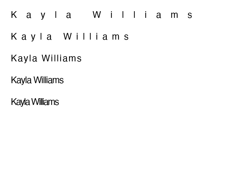
The bigger spacing between your letters work for your name because the i and l are so thin compared to other letters that when the kerning is tight they get lost among the letters. For instance in JPEG 1 on the bottom left the ll and i get so mushed together they get lost and it becomes difficult to read. Meanwhile in examples where your kerning is increased reading is much more easier and clear.