Light = Color vs. No Light = Black
When we see color, we are seeing light that has been modified into a new composition of wavelengths by an object.
Without light, there is no color, only black. In a darkened room, only the rods (nerve cells in our retina) are operational, allowing us to detect variations in brightness even when there isn’t enough light to see color.
What is light?
Like audio, light can be seen as waves, each described by its wavelength.
These wavelengths are measured in nanometers (nm). A nanometer is one-billionth of a millimeter.
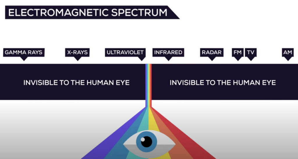
Light is the visible part of the electromagnetic spectrum
The electromagnetic spectrum is visible to the human eye ranges from about 400 to 700 nanometers.
- RED is visible around 700 nm
- BLUE is visible around 450-500 nm
- VIOLET is visible around 400 nm
- ULTRAVIOLET means beyond violet
- INFRARED means below red
The Three Elements of Color
- Light: without light, there are no wavelengths.
- Object: without objects there would be only white.
- Viewer: without the viewer there would be no sensory response that would recognize or register the wavelengths as a unique color.
Color is a function of perception and highly subjective based on the viewer.
How the human eye and computer screens perceive colors?
The cones, photoreceptive nerve cells in your retina break down the visible spectrum down into its most dominant regions of red, green and blue to create a wide range of colors.
Screens imitating the human eye use red, green and blue light.
RGB is known as the additive color space because taken together in even proportions, they produce white light.
The different ways we perceive colors
- Emissive: coming from computer, tablet, phone screens.
- Transmissive: through a transparent film like movies projected in theaters.
- Reflective: printed on a surface like paper.
When we print, we are using the subtractive primaries, Cyan, Magenta and Yellow. The inks act as filters absorbing light being reflecting from the paper.
If the inks were pure, black would be the result of full ink coverage. They aren’t, so we add black (K) to the CMY for printing (CMYK).
Connecting the spaces
- RGB > R+G+B = White (light through a screen)
- CMY (K) > C+M+Y = Black (ink on a surface)
Write this two acronyms like this and you can easily remember how the two spaces interact.
- CYAN absorbs RED (long wavelengths)
- MAGENTA absorbs GREEN (medium wavelengths)
- YELLOW subtracts BLUE (short wavelengths)
But, RGB and CMYK are device dependent.
In the graphic arts, we are always moving from RGB to CMYK and we need a way to manage this process effectively to ensure we achieve the results we want.
The subjectivity of Color
We can’t actually measure color because color happens in the observer’s mind.
What we do instead is measure the light that enters the observer’s eye . We also can use devices (such as densitometers, colorimeters and spectrophotometers) to measure light reflected from objects.
Color Schemes are an organized way of putting colors together to use in your graphic designs, in fashion and in interior design.
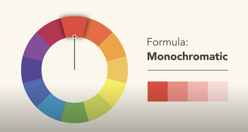
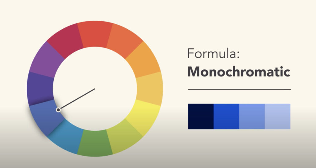
Monochromatic
Mono = one + chroma = color
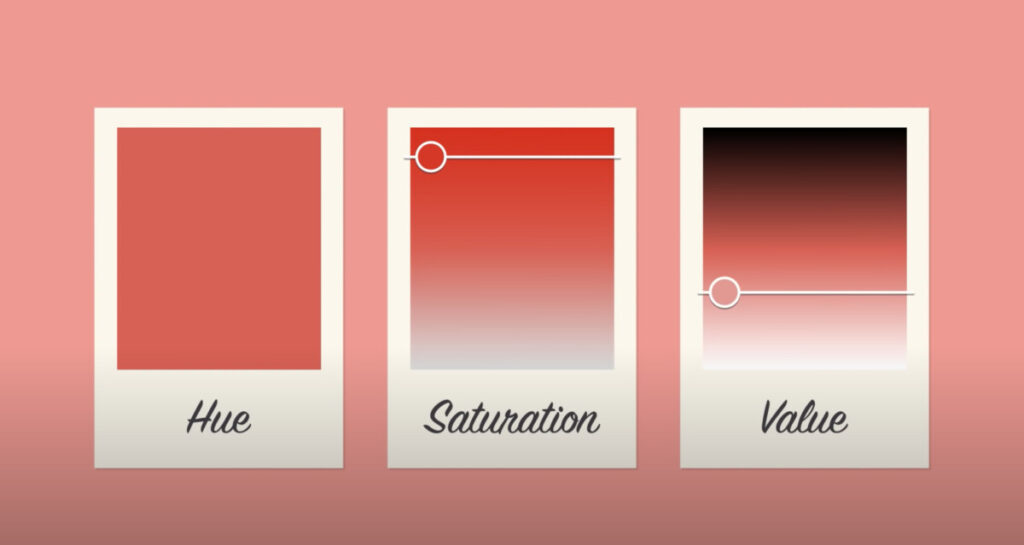
This type of color scheme has only one color and its values.
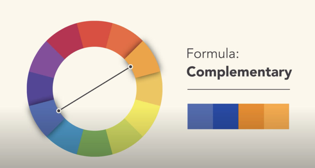
Complementary
Complementary colors provide a high contrast to one another- the reds and greens of holiday cards are one example. Note that they are opposites on the color wheel.
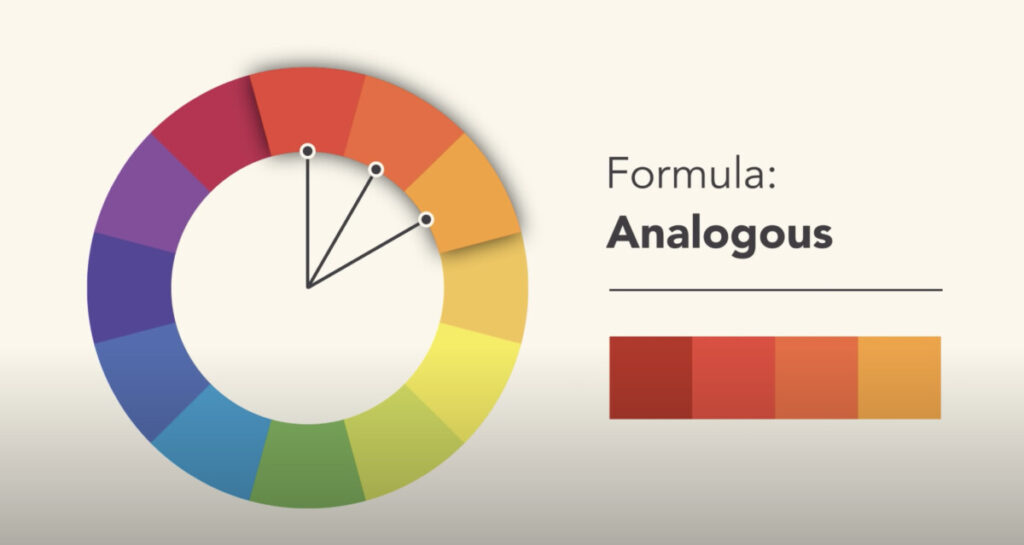
Analogous
Analagous color schemes offer very little contrast, a more calming effect and are close to one another on the color wheel. Blues+Greens, Reds+Oranges ect.
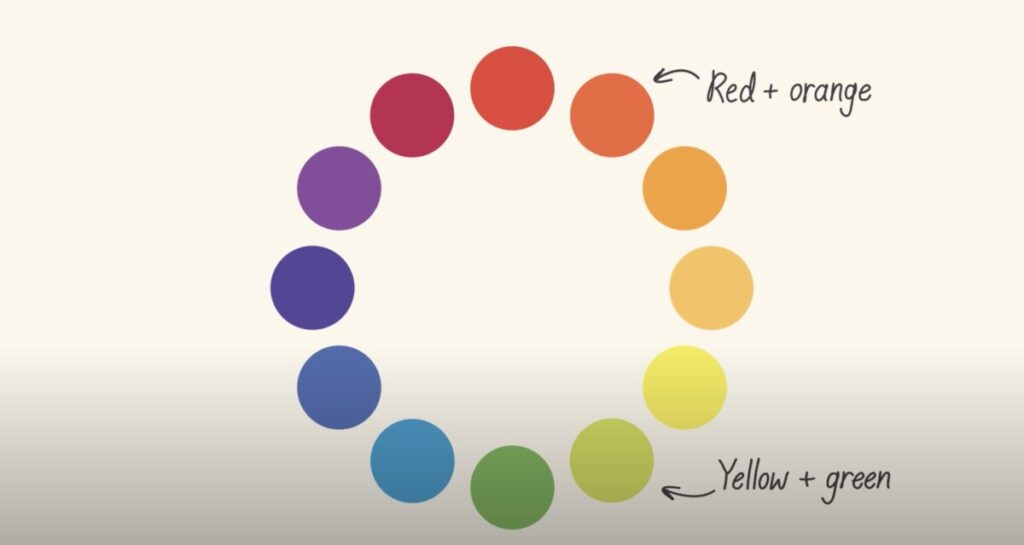
Warm colors are found on the right side of the color wheel.
Cool colors are found on the left side of the color wheel.

