There’s a whole science (and art) in the meanings of colors. As a designer, it’s essential to be aware of these color meanings to help you choose your colors wisely and tap into the magical power of color symbolism.
Video from Skillshare, to skip the intro and start at the list of colors with their meanings go to 1.18.
Color meanings are caused by psychological effects, biological conditioning and cultural developments.
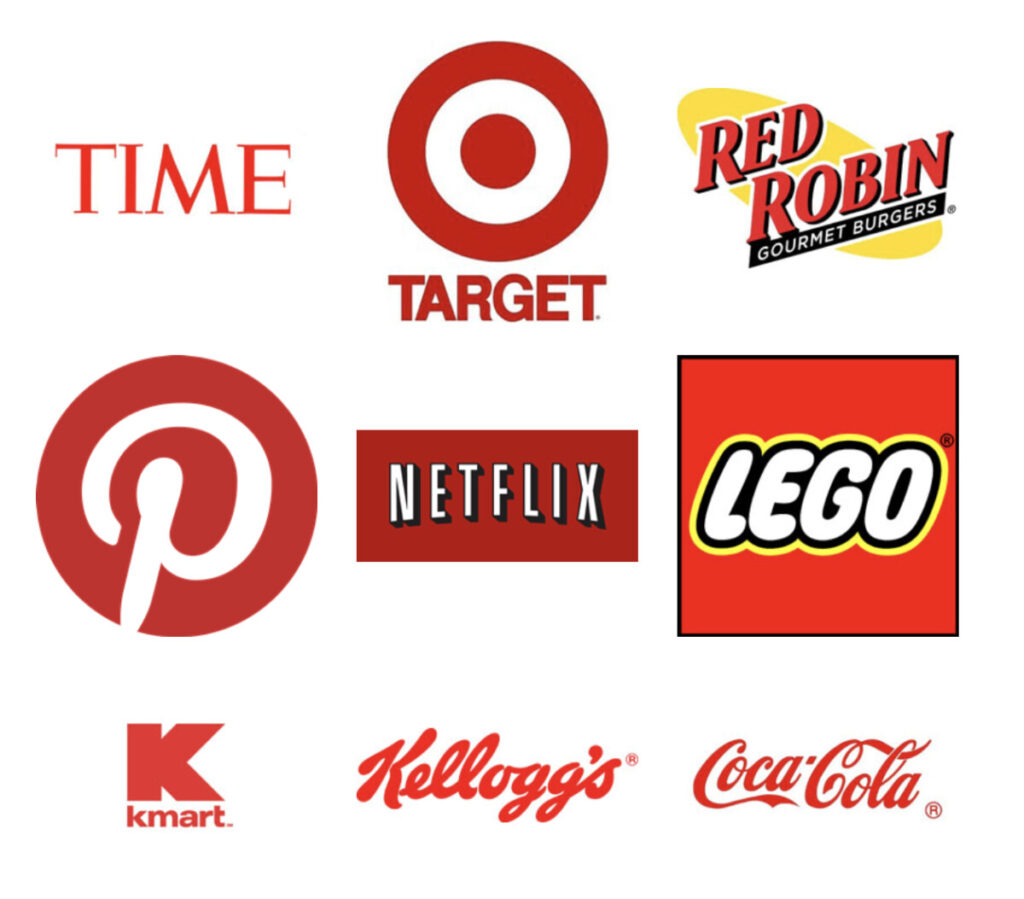
Red is for energy, passion and danger
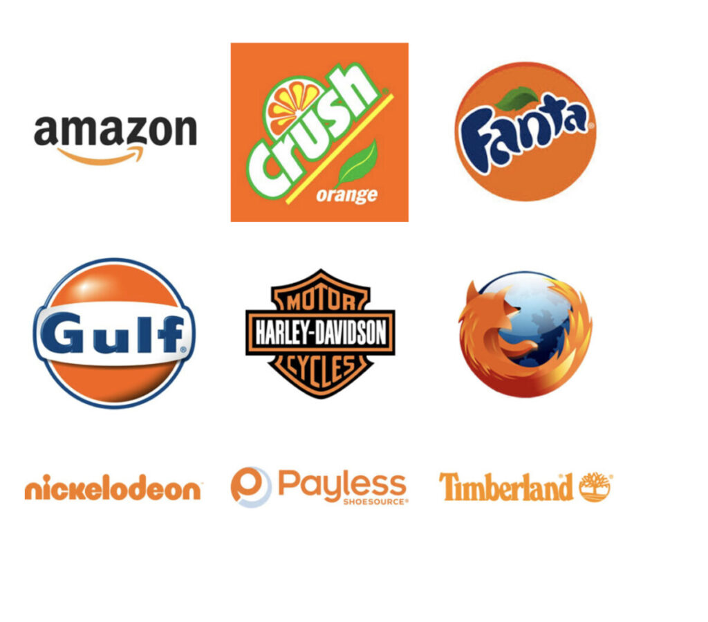
Orange is for creativity, youth and enthusiasm
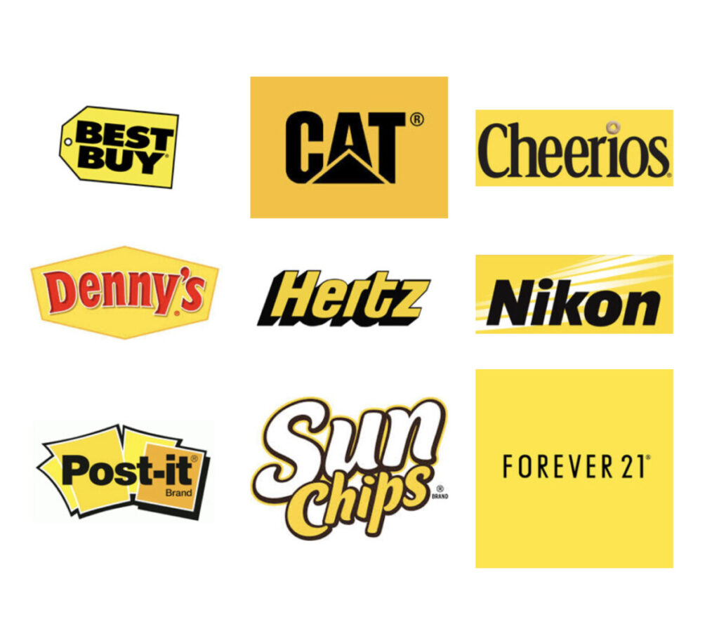
Yellow is for happiness, hope and spontaneity
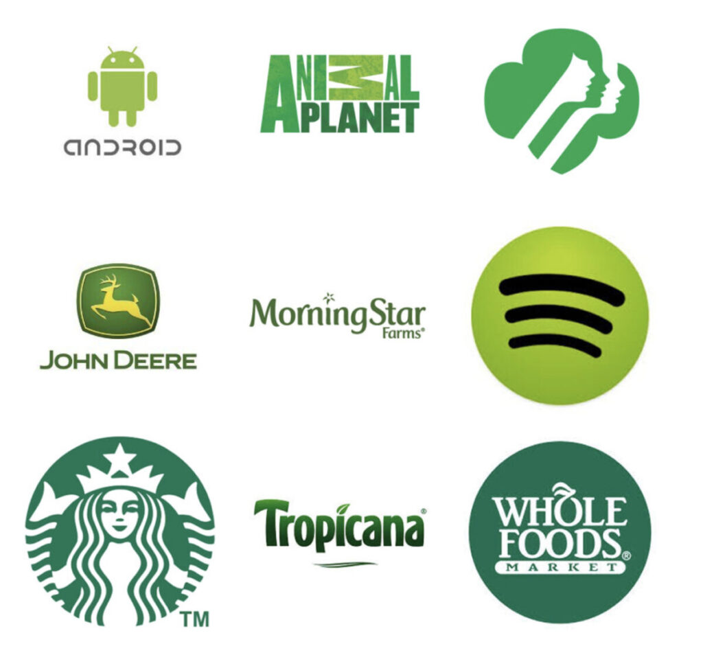
Green is for nature, growth and harmony—but also wealth and stability
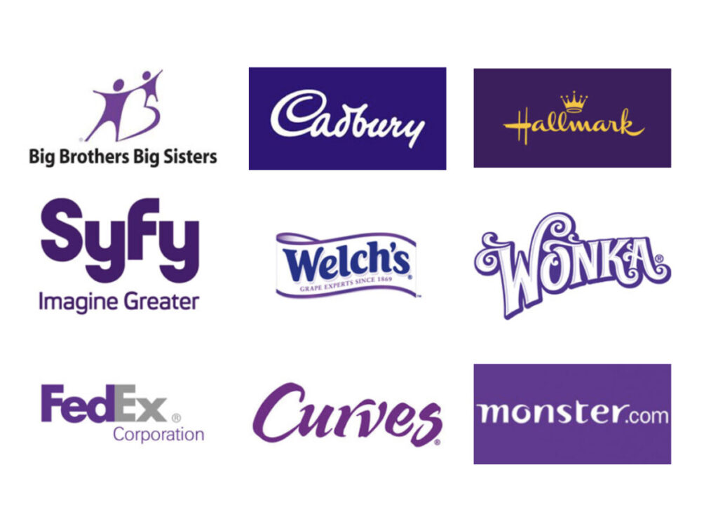
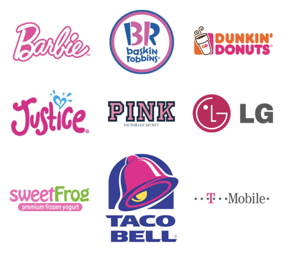
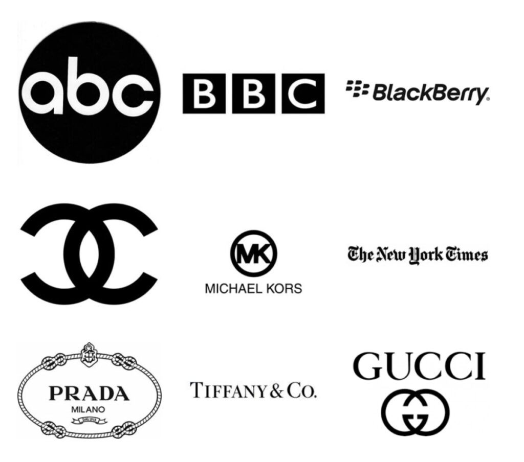
Red attracts attention and evokes strong emotions, universally seen as representative of romance. Causes increased heart rate and appetite, as well as a sense of urgency.Orange is associated with playfulness and enthusiasm. Activate brain activity, can also be seen as aggressive. Its friendliness and mental stimulation makes it great for inspiring consumers to take action.Yellow is associated with happiness and optimism, like the classic “smiley face.” Cheerful and warm, which encourages communication. Green represents growth, and evokes a feeling of relaxation and healing. It is the color of healthy vegetation, so it reminds viewers of nature and health. It is also associated with money and wealth.Blue is associated with feelings of tranquility and security. It has also been proven that people are the most productive when they work in blue rooms. Purple is commonly associated with wealth and luxury. It is also representative of fantasy, mystery, and magic, and can evoke a feeling of wisdom and imagination. Pink is associated with femininity, and is generally used in logos for brands targeted to women. It is also associated with sweetness, and is seen in logos for sweet foods like ice cream and donuts. Black is seen as a serious, no-frills color, and can evoke a feeling of sophistication. Although it might look plain, it is often used for luxury products because of its sense of elegance and glamour.