Tag: Reading Response #5

Reading Response 5 – BV

Typography, merging art/ science and Grid all somehow work together to create the new evolution of the international style of the typography movement in the Bauhuas during the 1920-s to 1940s to the new Swiss Typography embraced by European Modernism in the early 1950s. Designers such as Jan Tschichold and the reading “The Principles of the New Typography “, Karl Gerstner in “Designing Programmes’’, and designer Joseph Muller-Brockman “Grid and design Philosophy all objectively have in common structure and development.  The New typography was a part of the Avant-Garde movement since it was rejecting traditional arrangements and functional structure. Muller’s emphasis on grid usage may create art more organized and legible.

During the New Typography era, Jan Tschichold’s poster on the right shows a great example of all three design systems. Clarity and freedom of art, Design, and Grid. The 1927 “Die Frau Ohne Namen” posters consist of all three philosophies, the layout of the images all align with the concept of the two  focal points, one on the upper right of the poster and the other on the bottom right. The type, as well as most of the images lean towards an upright position while the train and bottom type lead towards the second focal point. The abstract shape  (circle) ties into both focal points as a center of attention. This is where the grid system comes in and how the overall subject is placed, giving it Hierarchy and a clean design.


Reading Response 5- SL

Typography is defined as “the style and appearance of printed manner.” This definition is similar to what Jan Tschichold thought typography should be. He was a German typographer who was swayed by the New Typography that was emerging when he attended the Bauhaus Exhibition in Weimar. The art was influenced by De Stijl and constructivism, which is more about the art being built and the horizontal/vertical axis. Tschichold became interested in this new typography and became an advocate for it. He even wrote his seminal book “The New Typography”. He wrote in his book, “The essence of the New Typography is clarity. This puts it into deliberate opposition to the old typography whose aim was ‘beauty’ and whose clarity did not attain the high level we require today.” He realized that typography has another path other than beauty, which it was in the times before. Typography needed clarity and simplicity because the new age demands it, since they didn’t have the “high level” we require today. Tschichold also believed that the pseudo-Constructivists’ ways were not up to par with what the new typography was all about. He claims their ideas are “diametrically opposed to the essence of the New Typography.” He goes on to say the only way to achieve a typography that is acceptable in this new era is if the form follows the function, which means the text should follow the purpose. The purpose is to be clear and give a direct expression. Karl Gerstner, who was a Swiss designer who was almost the opposite of what Jan Tschichold thought typography should look like. Karl Gerstner created a grid from the ideology of Fritz Zwicky. He claims “As the work proceeds, of course, they are to be refined as desired.” Lastly, there is Josef Muller-Brockmann who created a grid, just like Jan Tschichold. He wanted to captivate the new world of media. He believed in order to approach this grid design, it needs to be done systematically, directly and integrate factors that are all essential to the sociopolitical environment. Ultimately, they all believed that the designs should be adequate in the current time period, because it was time for reform regarding typography and new design methods. An example of contemporary design which is like what Jan Tschichold was portraying with the new design, is the newspaper designs. The newspaper typography design has clarity and focuses on that more than the beauty. Newspapers have the concept of form following function because the text follows the purpose, which is to get the important news around the area out to the public.

Reading response 5 EH

To make an effective design, one needs to be a method to the madness, that can present ideas effectively, serve its function while all being aesthetically pleasing.

The field of animation can be a great example of Josef Mullergrid’s philosophy.

The challenge artists are left with, how to make a character look interesting while being limited to the clothing of that current time.

Artists are asking themselves questions to make a sound creative decision.

What color should the character’s clothes be? or the personality and key feature.

Reading Response 5 – JD

Jan Tschichold, “The Principles of the New Typography” pg35-38, Karl Gerstner, Designing Programmes pg55-61, Joseph Muller-Brockman, “Grid and Design Philosophy” pg62-63 from Graphic Design Theory: Readings From the Field by Helen Armstrong.

                                                      Reading Response 5


        Many designers have their own way of approaching design. Whether it is using text as a design piece, having only images in their design, or having a single illustration in the design. Design is something that can be different with each work depending on who is doing it. That’s what makes design interesting.


         We can also see the idea of different approaches to design in the reading. Where each designer has their own view of how design should be used. Jan Tschichold wanted to approach design with the idea of not just using text as decoration in a design. Wanting it to be used as something that is simple, easy to understand, and can communicate the message of the design with a minor issue. Jan wanted text too, not to have different fonts, be different sizes, or have a design going around it. He did not want this because, as I understand, it would make it hard for the viewer to understand the text or focus on it. Karl Gerstner believed design should be approached more systematically. He wanted design too to follow a sort of formula so that designers would have trouble with what they were designing. The system would help them with many parts, or they design processes so they could focus on how they would put it together. This system would help them decide what fonts to use, the flow of the text, or how close their words should be. Finally, Joseph Muller’s approach was to use grids to help organize the design. Joseph believed that using a grid helps to bring an understanding of what the designer is doing. That grids help them design to organize the work and give them control over the space they are using for the design.


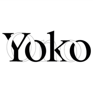
       The piece I chose below represents the approach of all three designers, and I will explain how. For one, this design has simple use of typography. The type is both the same font, size and is very easy to understand. This represents the typography Jan wanted, as I stated before. The text carries some choices used in the chart created by Karl. Such as the use of san-serif font, the text going from left to right and the text being combined. I saw all these design ideas in the chart that Karl created for design. Finally, their design shows the use of a grid because of both texts being on the same line with neither falling below the other. This is a representation of what Joseph wanted in designing an organization and clarity in the design. As shown and stated, design can come in many different shapes and sizes, but its goal is always the same. That goal is to help the design express their message in their own way.


Annotation Links

Rephasing: The criteria are rough.

Question: The importance of “combined” is shown in example b 14: 

Definition of morphological box

Reading Response 5 – NV

Most designs have different meanings for pictures, like magazine posters. Every artist has a unique vision. Does it mean they broke the rules? Many orders make a difference. It could be possible to create new designs that are so difficult to create. Some rules have elements that could bring balance. Even the grid guide on how to create a design would make a simple structure.
Every artist has a meaning of typography and mostly designs, therefore could not break the rules. Every artist who creates their rules for themselves to make a simple design and even topography can make the reader clear the creative process is to be reduced to an act of selection. designing means picking out determining elements and combining them. Seeing in these terms, designing calls for a method. Gerstner can make it possible to create a design and show us what the design looks like.
Jan Tschichold in 1923 he was 21 years old he was a German topographer the Bauhaus exhibit Tatian and we are more measured and influenced design by the Stijl showing examples creating new topography what change him for a decade he put classical training of typography and wrote a book in 1928 the new Apollo Griffey which is a made an idea “The New Typography” an experiment to create impossible making newspapers in different fonts one design was not clear there were many kinds of types and sizes which makes the reader difficult to read the design was made from Munaher. Tschichold created a simple design topography that was built a few sizes and had five different fonts which were clear to read. Josef Muller Brockmann, who create an order graphic design into a grid of Swiss topography and create designs of elements irrotational and chaotic, brought them under tight measurements control. Spending time in his life in Zurich creating objectives timeless and method communication. The key was the grid miller broke man once said “working within the grid system means submitting to laws of universal validity.” Spring the principles of Swiss typography in graphic design in 1958 who was the founder and the graphic design magazine got promoted and Swiss magazine in musica Viva poster of buildup on the grid in four fields and two words musica Viva.
Karl Gerstner creator of rational symmetric graphic design as a pioneer of Swiss topography or chemistry he has trained to create designs of the art of science and create designs of the computer making simple structure designs more ideas to create fonts typography creating space even upside down even following the steps of the elements could create impossible basic components different typeface every design is a beauty not breaking the elements guide, the grid.
Those are the artist who had not created their own rules for themselves. They create how a graphic design should be created, a guide which is elements and grid could create a simple design and typography could make the reader understand of meaning in design.

Viewing Highlight
Loading...
Highlight
Close
Add Comment
Loading...
Cancel