https://www.youtube.com/watch?v=ZuVkulWWSVJ
COMD3504 - D063
Final Report outline
Is the chop-suey typeface racist ?
Intro- Talk about typography and the different types. Give an introduction about chop-suey.
P1- Who, where, when, why.
P2 – Is this typeface racist?
P3- What does the future have in store?
Conclusion- Wrap up essay. Take key points from each paragraph and write synopsis.
In today’s day and age, there are endless creations that are at the fingertips of humans. A single object such as a shovel has many tasks it can complete, such as shoveling snow, picking up garbage or sand. One can say the things the shovel (medium) can do would be the message. In the book ” Understanding Media: The Extensions of Man” Marshall McCluhan stresses the fact that the medium is the message. It is in what context the medium is used which determines the worth of it. In the reading, McCluhan claim, “Firearms are in themselves neither good nor bad; it is the way they are used that determines their value.” This is an example which puts into perspective what they are preaching. Firearms are not bad. It is the purpose that a person uses it, which dictates the side it falls into, whether it is positive or negative.
There is always going to be a good and bad purpose to any technological progressions humans develop. It is up to the individual to make that choice and face the outcome. Another claim the author made in the reading was “Many people would be disposed to say that it was not the machine, but what one did with the machine, that was its meaning or message.” The hazards technological progression might bring to an individual and society are endless because there is an abundance of things you can do. One may use technology to benefit themselves, which can hurt others as well.
Many fields can create new messages if they believe “medium is the message”, especially artists and designers, because they can find/make unique ways to use the medium to their advantage. The role they can play is up to them. It depends on the details such as the demographic and where they would place this to be acknowledged by the public. Designers can use their creative abilities to produce unique messages with mediums that are known and they’re able to have fun with it.
chrome-extension://bjfhmglciegochdpefhhlphglcehbmek/pdfjs/web/viewer.html?file=file%3A%2F%2F%2FUsers%2Fsonia%2FDownloads%2FMcLuhan_UnderstandingMedia_exc%2520(1).pdf
https://docs.google.com/document/d/16ppTYU6C_OSf6jHetG1e-QD2A9UOBL0S5F9bXh4pNec/edit?usp=sharing
Culture jamming is when an artist takes the symbol or logo for a company and uses it to counter what the company really is. It is sort of like an attack which makes viewers raise doubt towards the specific company. For example, the Mcdonalds logo is known for the slogan “I’m Lovin it” and when an individual spots the big yellow “M” they correlate the two. What culture jamming artists did to the Mcdonalds logo is turn the “M” upside down so that it is a “w” and put the slogan “I’m gaining it”, they went even further and put “Weight” to replace the name of the company. When viewing this “new ad” one would reconsider buying it because of the message it portrays.
In the 1950’s and 60’s there was a concept of underground vs mainstream which devalued many artistic things. The underground is defined to be a safe place for artists to create and not have it be used universally. Mainstream includes the big companies and the art that they use. The underground was basically the place where artists could be recognized for what they created because the mainstream or big corporations have not drowned them out. When the mainstream corporations use the underground art, it becomes devalued because it gets used so much and the original creator gets tuned out. In the end, the underground artist gets forgotten, but the corporation wouldn’t because they are now associated with the art.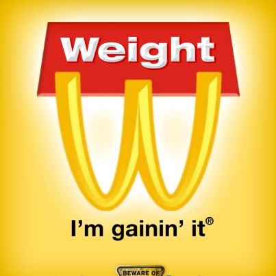
In commercial design, there is not much diversity regarding the recognition of designers. Most of the designers students learn about are white European men. In the reading by Madeleine Morley, she poses the question “What would happen if we made graphic design history more equitable, including designers from more than just European and -rarely- Asian decent?” If graphic design history was more fair, there would be so much more inspiration and knowledge to be gained. It would also shine a light on new perspectives that could have brought endless possibilities. By having designs that are produced from creators who have experienced many similar things, it is kind of unamusing since it lacks diversity. There are many other different designers who have gone through their own mess, which can be relatable or inspiring to a certain group that’s not recognized as much. Some examples would be African American, women and LGBTQ members. By acknowledging different people, there’s a higher risk of getting others to be involved, which is what one would want in the design field. In the reading by Silas Munro, he states “… created typefaces like Carrie, a Sans serif that honors women’s suffrage movement in Argentina, and Stonewall to recognize the LGBTQ 1969 riots…” In design there’s much more that meet the eye than just art, its history. He is honoring the struggles that these people have gone through to get to where they want to be. In the next twenty years, I think there will be more distinct recognition of people and movements. There will be more historical connections with design, which would help spread awareness.
Technology played a big role in graphic design when it first emerged because it allowed designers to be more efficient. The reading claimed that “Designers are looking beyond successful business and aesthetic practices to the broader effects of the culture they helped create.” Having the accessibility to technology allows graphic designers to play a deeper role in society. They can tackle other topics such as ones that fall into the social and political changes. The reading states, “Designers are actively engaging their societies politically and culturally, increasingly thinking globally inside a tightly networked world. As more and more designers, enabled by technology, produce both form and content, issues like sustainability and social justice are moving to the forefront.” (page 11) Designers are able to bring these issues that affect society into light because of technological advances. However, designers should be careful on what they give out to their clients and the public because they “run the risk of being creatively sidelined by it.” (page 11) If a designer gives up all his tricks of the trade, nobody will need his services in the long run because everything will be available for anyone to use. In conclusion, technology has played an impactful role in shaping design and the role design has on society. Design allows artists to reach another demographic once they bring in social justices.
Typography is defined as “the style and appearance of printed manner.” This definition is similar to what Jan Tschichold thought typography should be. He was a German typographer who was swayed by the New Typography that was emerging when he attended the Bauhaus Exhibition in Weimar. The art was influenced by De Stijl and constructivism, which is more about the art being built and the horizontal/vertical axis. Tschichold became interested in this new typography and became an advocate for it. He even wrote his seminal book “The New Typography”. He wrote in his book, “The essence of the New Typography is clarity. This puts it into deliberate opposition to the old typography whose aim was ‘beauty’ and whose clarity did not attain the high level we require today.” He realized that typography has another path other than beauty, which it was in the times before. Typography needed clarity and simplicity because the new age demands it, since they didn’t have the “high level” we require today. Tschichold also believed that the pseudo-Constructivists’ ways were not up to par with what the new typography was all about. He claims their ideas are “diametrically opposed to the essence of the New Typography.” He goes on to say the only way to achieve a typography that is acceptable in this new era is if the form follows the function, which means the text should follow the purpose. The purpose is to be clear and give a direct expression. Karl Gerstner, who was a Swiss designer who was almost the opposite of what Jan Tschichold thought typography should look like. Karl Gerstner created a grid from the ideology of Fritz Zwicky. He claims “As the work proceeds, of course, they are to be refined as desired.” Lastly, there is Josef Muller-Brockmann who created a grid, just like Jan Tschichold. He wanted to captivate the new world of media. He believed in order to approach this grid design, it needs to be done systematically, directly and integrate factors that are all essential to the sociopolitical environment. Ultimately, they all believed that the designs should be adequate in the current time period, because it was time for reform regarding typography and new design methods. An example of contemporary design which is like what Jan Tschichold was portraying with the new design, is the newspaper designs. The newspaper typography design has clarity and focuses on that more than the beauty. Newspapers have the concept of form following function because the text follows the purpose, which is to get the important news around the area out to the public.
Language is a very complex communicating tool that unites humans. Symbols are another communicating tool that can become complex. There are many things you can do when you combine symbols and language. Signs are a great example, especially to get a certain point across, whether it be direct or indirectly. Signs, according to Ferdinand de Saussure have two elements to their makeup, the signifier and the signified. The signifier is the part “of the communication that carried the message … the thing signified was that which was communicated by that sound…” An example of this would be the apple in Adam and Eve, which was mentioned in “This Means This, This Means That: A User’s Guide to Semiotics”. The apple is not just a regular apple in this story, it is meant to represent “temptation”. The visual aspect of this story would be the painting that is shown on page three. The signifier is employed in the visual because you see the apple, the signified takes a little more interpretation, because the artist incorporated the snake, which tempts Adam and Eve, from this one can infer that the apple they are holding is not going to be good for them. I believe visual designs, such as the Adam and Eve painting can accomplish things that make the viewer have a deeper connection. The connection can be from the mood the painter gave off in the painting and the colors that were used. Another visual design that accomplishes things language alone cannot are the Inuit maps. These maps are visually appealing and tactile because they carved the map out of wood so that it was in a way 3D. The accomplishments that the Inuit map has over language is that they were able to use these maps in the dark because they were 3 dimensional. The maps also floated, were weatherproof and can survive any temperature. A contemporary visual design that succeeds more than language is braille. Braille is a visual design for people who are not blind because it shows that a location has accessibility, it accomplishes more than language itself because visually impaired people cannot see language, they can only feel it.
According to El Lissitzky they envisioned a future that involves a potential international hieroglyph book. (Page 27/ #3). Essentially, El Lissitzky claims the letter book lacks the advantage of being unbound by language barriers. That is to say, El Lissitzky claims that technology will advance to where books will contain patterns that will be akin to a universal language. The only conundrum would be that an individual must learn this theoretical pattern for themselves. (Page 27/ #3). El Lissitzky expects that, “By reading, our children are already acquiring a new plastic language … they will surely also create another book” (Page 30/#6). The belief here is that, with the passage of time, people will grow and find other ways to use the technology available to them. Technology that could be used in ways previously unthinkable. However, this raises one potentially problematic issue. What of the inventions that need no change? What would befall those items, it could be disastrous. Yet there is no mention of that.
In the case of Filippo Tommaso Marinetti, he demands the immediate future must include the creation of high speed racing cars, men hurling themselves into orbit, and “demolish museums and libraries, fight morality, feminism and all opportunist and utilitarian cowardice” (Page 3). In fact, Filippo Tommaso Marinetti deems museums and libraries detestable. These sanctuaries of knowledge have no place in the future envisioned by Filippo Tommaso Marinetti. It seems that technology will be at the helm of shaping this future as well. Considering, Standing on the world’s summit we launch once again our insolent challenge to the stars!” (Page 4). This could be interpreted as Filippo Tommaso Marinetti casting away the negative dissenters of his ideals. His logic entails that none will matter if he is among the stars. It were to be as if he were in the heavens, therefore those who will try to oppose him are equal to opposing a god.(page 4)
The Bauhaus was a school in Germany that operated from 1919 to 1933. It was created by German Architect Walter Gropius. The goal of the school was to teach and produce young artists in different fields. They focused on the relationship between art and technology and what it could become. The Bauhaus wanted individuals to study art, and it was assumed that they would understand it and become artists in whatever field they choose. “The academy trained a myriad of minor talents in drawing and painting, of whom scarcely one in a thousand became a genuine architect or painter,…”. The academy’s way gave false hope to people. In reality, they were severing a very important tie for the students, which was their connection to their community. “It shut off the artist from the world of industry and handicraft, and thus brought about his complete isolation from the community.”
Typography is a service art which was changed throughout its time. “The essence of the New Typography is clarity. This puts it into deliberate opposition to the old typography whose aim was ‘beauty’ and whose clarity did not attain the high level we require today. “Back then, typography was used as a beauty asset to make things look good, but now it’s used to clarify a message. I believe new art needs typography and the role it is playing now is acceptable to its purpose because in this day and age there’s so much interpretation and assumptions one can make about an art piece, by having some sort of typography it can help push the viewer in the right direction.
© 2024 COMD3504 Communication Design Theory Spring 2022
Theme by Anders Noren — Up ↑
The OpenLab is an open-source, digital platform designed to support teaching and learning at City Tech (New York City College of Technology), and to promote student and faculty engagement in the intellectual and social life of the college community.


Recent Comments