Is it Good or Just Great?

Great Kills

I live in Great Kills on Staten Island. I can neither defend nor deny the opinions many New Yorkers have about my borough, but I do have to say I enjoy living in the most rural part of the city. My neighborhood is full of many competing businesses trying to win over the different members of the community. We have a main road that runs through the center of town called Amboy Road. This is where most people find themselves if they need something to eat, have to go grocery shopping or just need to grab something from the liquor store. 

The entire town is filled with tons of delis, pizzerias and basic services like optometrists and financial assistants. My neighborhood seems to have everything one could possibly need, and I feel that shows in the photos I was able to take. Most stores have neon lights that compliment one another rather than clutter or outshine the ones around it. I selected the picture above specifically for this reason. I feel that it best represents the wide variety of services my neighborhood has to offer. It truly showcases that my community is very well rounded. 

Some of the other photos in my journal showcase the sometimes lack of diversity within my neighborhood. The abundance of pizzerias and Italian restaurants constantly remind you of how rich of a history Italian-Americans have in my neighborhood. Working in the area and walking around town constantly reminds me that there just aren’t as many people of color in my neighborhood as there are at the schools I’ve gone to or the internships I’ve been a part of. The lack of diversity is one of the reasons I plan on leaving the borough eventually. 

(I also included this photo of my dog peeing on the welcome sign to my neighborhood because it sums up how most teenagers feel about Great Kills growing up.)

great Killa dog


El Restaurante – Winson


To begin with, my neighborhood is very diverse filled with different type of cultures. It would consist of Asians, Native Americans, Mexicans, Italians, Jewish, and Arabs. One of my favorite spots is this image above of a Mexican restaurant.

This image uses a couple of different fonts but the font that stands out the most is the Rosewood STD regular font. This font Rosewood is based on Serif, Slab Serif, and Clarendon typefaces. The Rosewood font catches the audience’s attention from its bicolor and its flamboyant details within the words. The italics and boldness of the font also helps catches the attention of customers. The owner of the restaurant added flag of Mexico to shows its culture and theme. Even though there are many other type of typography in my neighborhood, this restaurant shows its usage of their creative unique font to catch attention compared to others.


Type in Astoria

The neighborhood I live in, Astoria is very diverse and multicultural. It has become very popular with the millennial generation because of the various cultures present in the area. Astoria has people from many different parts of the world residing here. The different types of typography in the area also shows how diverse Astoria has become.

The diversity of Astoria can also be seen in the foods found in the area. Each culture has its own cuisine and it is a huge reason why so many people visit this neighborhood. Along with the food, Astoria also has a very energetic nightlife which is popular among the younger generation.

The typography seen around my neighborhood further displays diversity. An example of this is the graffiti shown in the photo. This shows how the artistic side of this neighborhood is displayed. The typography in the area also shows the different types of businesses example; laundromats, banks, deli’s, restaurants, liquor stores and groceries. I believe that the photos of the bank and real estate company show the business side of the neighborhood and also I believe the laundromats and barbershops show the small business side of  the neighborhood. Finally the photos taken of street signs show how accessible my neighborhood is for drivers.

Typography in Main street

photo of Mi Tea
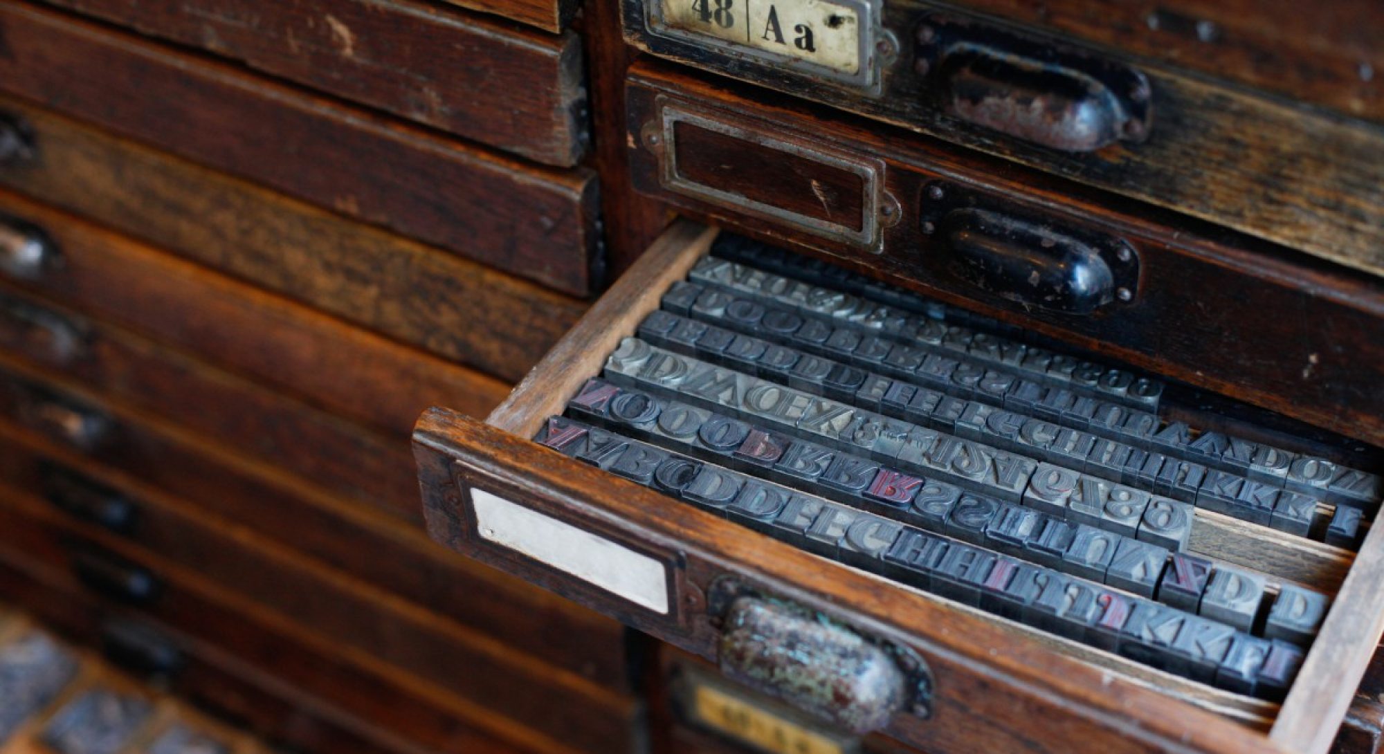
In my neighborhood, the typography of the street is very plentiful. Most of the store on the street are food and drinks. I took the photo of typography of the stores, notice board, and restaurants.

Most of the typography is in Sans-serif. The Picture of typography I choose is in San-serif. I choose this to represent for my neighborhood because it is in San-serif and that was my favorite store for buying drinks. the design of the sign is not monotonous as other stores, it looks like written by markers.

The Typography Elements of East New York

There are many businesses in East New york that use different types of typefaces to appeal to the people passing by their stores. The most frequent typeface that i saw was San Serif but the typography presented in the Duane reade sign above is very unique.  The “Duane” in the Duane reade sign is bolded compared to the “reade” in the name. Duane also seems to have a Sans Serif typeface while reade has a serif typeface. I feel like the use of Sans Serif in this sign shows a very direct and serious tone of the store along with the black and white colors. Even though the “reade” in the sign isnt bolded the contrast of the “Duane” in the name being bolded mkes the sign very noticeable to me. Another thing that makes the sign noticeable is the straight black background, The store takes up the corner of the block so the black background goes all the way around.

The Typography of East Flatbush

There are many small businesses running down Nostrand Ave so I decided to stroll down that part of my neighborhood expecting to find many different types of fonts to capture. Strolling down the long Avenue I noticed that most businesses opted to use Sans Serif typefaces for their awnings, and I feel it’s due to it being very straightforward, clean, and legible.  Some newer businesses tried out fancy and unique typefaces but sometimes fell short as they weren’t the most straightforward and sometimes just not legible at all. Another thing I noticed is that mostly beauty stores and hair salons generally chose script or curvy fonts to represent their business, maybe to seem more classy and fresh. As I approached near Brooklyn College in the junction, I saw that a lot of the businesses on a certain strip of the block had very big and bold, clear cut fonts, also pertaining to the Sans Serif family, and I feel it’s because they want to be immediately seen and understood; There’s a ton of stores and competition in the area, so being straightforward and to the point help people find what they need quickly, especially in such a high traffic area regardless of how potentially boring and even unappealing the fonts can be. My featured picture is of a childcare center; I found this to be the most creative and appealing font that conveyed their message. They’re fun and playful and are definitely aimed towards children, and I also thought it was cool that they put legs under the ‘2’ to convey the idea of ‘leaping to success’.

Typography in Myrtle Ave.


In my neighborhood, the typography in the signs I see are very diverse, used for different stores and forms of transportation. I took pictures of typographic signs that were from stores, restaurants, street signs and also on the wall. The typography in Brooklyn is very diverse and this is a good representation of how my community is overall, because it is very diverse with different groups of people coming into the neighborhood.

There are a lot of signs where I live, for examples there are street signs and one way sign streets for cars, and these signs use a sans serif typeface. That way, people who are walking on the street or drivers can be able to see more clearly where they are at. There are also sans serif typefaces on the public transportation sites, specifically on the trains and the buses. They appear when they gives the names on a certain stops, disclaimers on the train cars and also on the advertisements that appear on top of the cars as well. I also witness a lot of serif typefaces on the signs for the restaurants that I took pictures of. The strokes are rather thick and the serifs themselves can be either presented as thin or somewhat blocky as well. I believe that the restaurants and stores have their typefaces large so that it could be more attention grabbing to people to come eat their food. They provide such a big presentation in order to appear visually appealing to the upcoming customers who would want to buy at their restaurants. There is also another small restaurant that has a script typeface, and I like this one a lot because it is very unique and pretty. Although this restaurant is small, I do enjoy the typeface as it gives a unique flow than the other stores that I have seen.


Utica Ave Finest – Michael

Utica Avenue is one of the most famous road(s) in East New York, with many Fast Foods and other business places with different varieties for all ages. Typography can be seen all around with all five types of family displayed and with a lot of different designs.

In the image above, it’s the logo for the White Caste restaurant and I chose the image because I like the the design of the logo. The type gives out a Old style and Century extended combination. The fonts are really unique and the spacing is not too much or too little, however in my opinion the letter C and a seems to be touching and a little bit of Kerning would make it just perfect. It is readable, however in some cases it could be difficult because some people might not be able to read it at night due to the fact there is not a lot of Bold letters. Overall this is a really nice logo.

In addition, on Utica Ave they have Nail salons, Gas stations and many more that display the five types of families in Typography, so if you’re ever in the neighborhood take some time, explore and enjoy type at it’s finest.

Corona the Place of Refined Types – Maisha

Typography is presented in the photo above, with almost several of fonts used to convey the audience’s attention that draws them to the stores. Dunkin Donuts and Check Cash place has a San serif type family. To differ the round san serifs and equally spaced bold font allows people to read easily and straightforward. In Checks Cash, tall modern san serif bold typeface creates a more modern approach as well as drawing attention of older audiences. Not only is it a modern approach, but more assertive in a bold text. In the second sign, the Liquor and Wine has a casual script type family with few less swatches and creates a more legible font for the older audience as well. The third sign has a mixture of old style and modern with no san serif to connotate the old fashion style they have with a mixture of modernization.

The more fonts I saw in my neighborhood, had the ideal 5 family type there, where it creates a welcoming sign to all ages. Nail salons and Spa’s had more of script and curvy fonts to make you feel more approachable to the store. As for kids stores, there are more fonts that have bolder round color type face to attract the attention of younger kids. I had saw very few old style serif fonts, where all stores had seemingly transitioned into the modern style with no san serif and with either kerning to fit all the writing in one space or to create a flowy type where people can read easily.