
I choose this Paula Scher piece because I like how her letters are spread out to match the ballerinas. It is a bit unorganized with the letters moving up/down, and different sizes despite having the letters all capitalized, and she … Read More
Prof. M. Brown | COMD1127 - E038 | Fall 2022
I choose this Paula Scher piece because I like how her letters are spread out to match the ballerinas. It is a bit unorganized with the letters moving up/down, and different sizes despite having the letters all capitalized, and she … Read More
Paula Sher explains expressive typography to be able to show a spirit of a place and brand by simply the lettering and how its designed from the line weight to the color chosen. One thing that she said that stood … Read More
A place where we talk about type
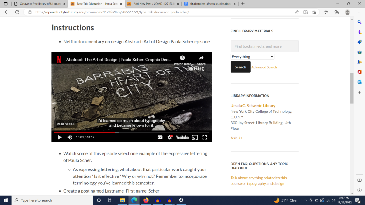
Discussion, comments, critiques, opinions on type Throughout the semester typographic works related to projects and assignments will be posted. Students will comment in live synchronous class discussions to try and identify or … Read More

© 2024 COMD1127-E038 Type & Media, Fa2022
Theme by Anders Noren — Up ↑
The OpenLab is an open-source, digital platform designed to support teaching and learning at City Tech (New York City College of Technology), and to promote student and faculty engagement in the intellectual and social life of the college community.

