Class Info
- Date: Thursday, November 17, 2022
- Meeting Info: 6:00pm – 8:30pm, Room P114
- Quiz #2 – Tuesday, November 22, 2022
Topic
- Intro to Project 3 | Part 1. Pet Peeves Poster
- We will design a series of posters for an art exhibit
- We will design Social Media Posts to advertise the exhibit.
- This is the last project for the semester, and will incorporate all the previously typographic information discussed in class (typeface selection, alignment, tracking, kerning learning, color and typography, the grid, visual hierarchy).
- How are all these elements considered to create a comprehensive design?
- Visual Hierarchy: Giving levels of importance to the difference elements that are part of a design.
- Examine this PDF with Visual Hierarchy Progression. Every page uses the exact same text, but the hierarchy changes once we start applying different principles.
- A basic change in type size can make a difference in the way the viewer looks at the design
Objectives
- Learn about visual hierarchy and how these design principles can improve or change the way we see and read.
- space
- type size
- spacial zones
- color/reverse
- alignment
- added elements (lines, icons, etc)
- variations in type (font weights)
- dynamic compositions (diagonals)
- others
Activities
Watch – The Parts of a Grid
Watch – Typographic Hierarchy Explained
Watch – Typography: Creating Hierarchy
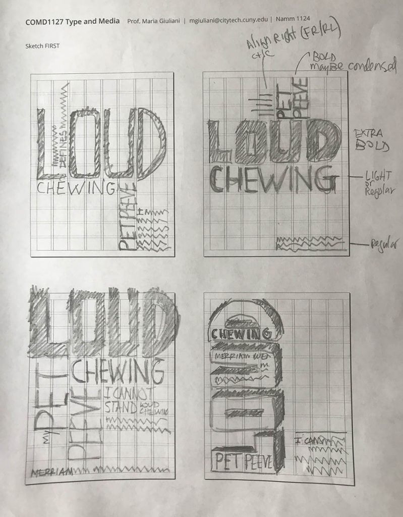
- Sketch – When sketching consider the following:
- Use type only
- TWO typefaces max (but with extensive families is ok)
- Black and White
- Follow the grid
- Emphasize your visual hierarchy
- Emphasize contrast with scale (something must be BIG, something must be small)
- Must consider and apply what was previously covered in class: Type selection and variations, alignment, word and letter spacing, line height, expression, etc.
- Look at sample below
- Content:
- The words: My Pet Peeve Exhibit
- Title of your Pet Peeve (different for everybody)
- Your personal text: 1 to 3 sentences explaining your pet peeve
- Content:
- Complete sketches started during class
- Sketch. Here is a PDF with the printed grid. It will help you to determine where and how to place content. As well as to start thinking about typographical style.
- Save sketches as jpegs
- Lastname_firstname_sketches_posters
- PLACE the jpg in Google Drive
- DUE Next class – Bring completed sketches, saved as jpegs, and post as instructed above
To-Do After Class
Create NEW Document:
THIS is the SIZE of your posters
- 2-page document
- Size 11 x 14 inches
- 3 pica margin all around
- Create columns and rows:
- GO to LAYOUT>CREATE GUIDES>ADD the rows and gutter> OPTIONS>from margin
- 8 columns / 1 pica gutter
- 12 horizontal rows / 1 pica gutter
- GO to LAYOUT>CREATE GUIDES>ADD the rows and gutter> OPTIONS>from margin
- Have file READY before class


Leave a Reply