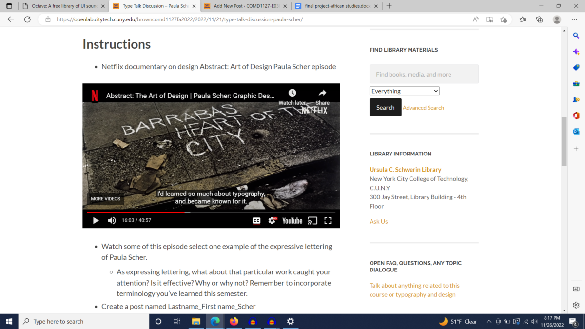
Paula Sher explains expressive typography to be able to show a spirit of a place and brand by simply the lettering and how its designed from the line weight to the color chosen. One thing that she said that stood out to me was typography design is most the time the ability to synthesis lots of information and turn it into a conclusion. I really love what she did with the highline design. It was a simple H, with two lines in the middle to make it look like a railroad. She took all the information of construction, railroads, and tourism and created a logo you can identify the highline with. I chose this work because the spirit of the typograpghy matches the image of city sidewalk. The line weight chosen is lightweight and symbolizes the chalk you would draw on a sidewalk. I think the alignment of it plastered on the sidewalk like that is also very effective.


Leave a Reply