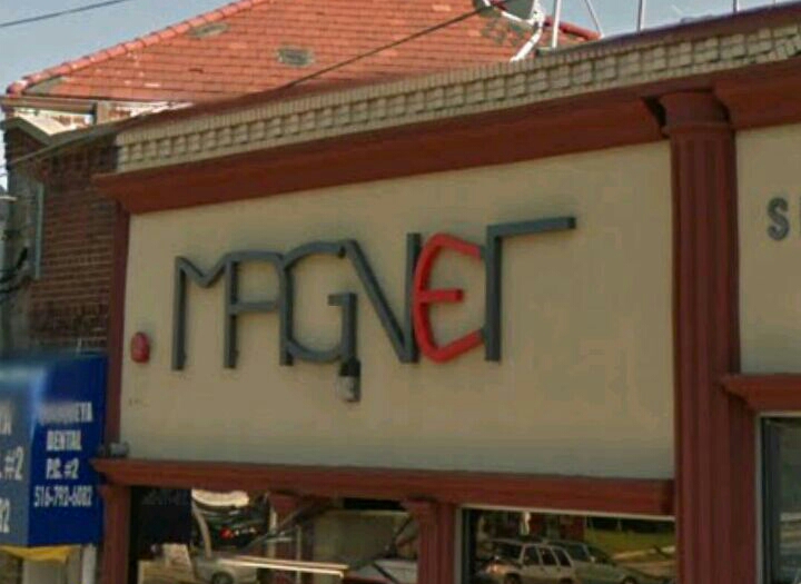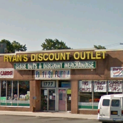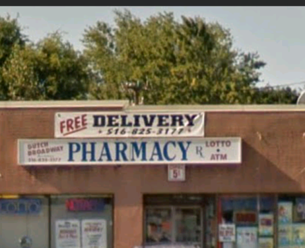
I live in a town named a Elmont. When people first hear the name Elmont they usually respond “I’ve never heard of place”. Elmont is the town in which I live in and is located in Long Island. There are many different things that help describe a neighborhood or even tell the story of one. They could be told through the people who live there, pictures, and the many different stores located in the area. Athough all these elements play a drastic role in what a neighborhood is about and what it has to offer, one significant element that a lot of people might overlook, is the art of typography. Typography is the style, appearance, or arrangement of characters to make words more visble and to help express feeling or mood. In my neighborhood I came across certain style of text that would describe it as a quiet and friendly town. Through the typography you can see how family oriented, and simple the town is. I would describe the designe and use of the letter forms and shapes as bold but simples. When a paticular store is trying to get the attention of the community you will notice the bold face type that stands out from the rest. Also the type styles on the front of lounges and sports bars give a different vibe in the sence that the type is a bit softer with bolder colors to still show that it is the environment to relax and have fun. In addition to that some are more masculine while other type styles are feminine depending on what the store might be looking to attract.