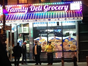
Third Avenue in the Bronx has always been a commercial place. I have lived here for 12 years and there always seem to be something new. The typography in the neighborhood varies depending on what it is about, but for the most part everything looks colorful with bright lights. While walking through Third Avenue one can notice the extravagant type almost to catch peoples attention since it is a commercial place. On the other hand while walking on the other side of Third Avenue one can see the church, schools, bodegas, and the type starts to get simple. The colors on the commercial side are very vibrant, attracting, and eye catching. At night all the neon lights are turned on making the type stand out and illuminate the streets. The stores signs have different kind of types like bold, italic, script. The type seems professional such as the Mc Donalds, Walgreens, Rite Aid, etc. On the other side of Third Avenue one can see that the colors are consistent and formal. The type is simple, dull and for the most part everything is in regular type. The type looks professional, however I saw a couple of signs that looked like they were handmade and therefore did not look well done. I can say that they type in my neighborhood is not boring but very noticeable and interesting, one that catches peoples attention.


