All posts by Sharlene

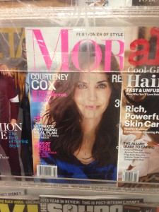
modern
This is a magazine that I found in the train station. It is a Modern typeface because it has a very high contrast between thick and thin strokes, the hairline is unbracketed, The serif is also very thin. This typeface is used a lot in magazines as design.
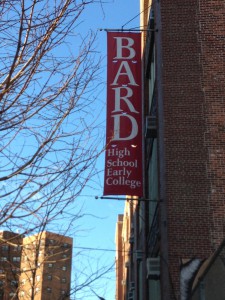
old style
This typeface I found in the lower east side of Manhattan, Which is a high school banner. This Typeface is Old style. It is old style because it has wedge shaped seif and It has great contrast between thick and thin strokes. I think that this type face is used because it is easy to ready but to also draw the viewer’s attention.
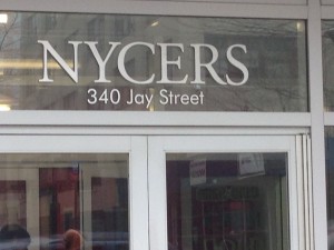
I found this on the jay street subway station. It is a san serif font. It has no serifs which indicates that it is san serif, but it also has low contrast. Most signs and posters in the subway use this font. I believe they use this font because the subway doesn’t have paragraphs of type just a few word, so they use this font as a design but to also make it easier to read for the reader.
This is a sneaker store that I found in Queens. This typeface is a slab-serif. The letters are blocky and big. It has rectangular serifs with the same thickness as the rest of the strokes. I think that this typeface is used because they wanted more of a design look to the company’s name and to catch the eye much quicker.
This I found in Jay street and it is a transitional font. It has great stress between thick and thin strokes. The head serifs are horizontal and it has a bracketed oblique serif. I believe this was used to attract people .


typography in manhattan

In my neighborhood, typography is used daily. You will see it on a daily basis. Typography is used to advertise a lot and it shows that my neighborhood is very busy. It advertises albums, movies, shows, clothing, merchandise and much more. There is also a lot of graffiti in my neighborhood, which also shows typography. The graffiti presents that there are some talented creative people within the neighborhood but also to get known.  There are many posters of bands in my neighborhood as well. Which brings people together to listen to bands at a restaurant. There are also posters that advertise parties. Even the restaurants in my neighborhood would show typography with their menus, and the billboards that they leave outside. My neighborhood also has random pictures with random typographic lettering. There are different styles to the lettering in my neighborhood. There is normal use typography and also fancy, decorative, design type of typography. Since my neighborhood is busy. Basically what the typography in my neighborhood shows, is that my neighborhood is a working community that is also very urbanized.

IMG_0969 IMG_0962 IMG_0980 IMG_0984 IMG_0987