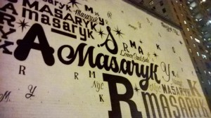
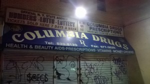
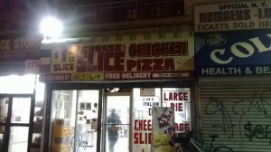
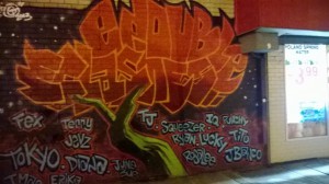
The text in my neighborhood is variant. There are few similar and distinctive styles. On public areas, like market and stores the type of their brand names appears to be bolder than the other words around them. Yet most signs and graffiti have a focus to the center, where the type grows in size towards the center, and shrinks towards the sides, making it easier to read the main signs, main words, main idea. Though a part of the neighborhood are the elderly, the size of font also creates visibility.
Most of the type are not just words but mostly labels. What I mean by labels is the names of people and categories of the isles in store. Though with both signs and graffiti, each one has their own style distinctive to the other, if it is being bold or light, large or small, or having the variety of many. 
From most type, it is crowded. Most of the type is squished with saying most it can largely in one space. Though signs may overlap another, people know that of what is in store that matters.
Yet there’s the color and symbolism in each to advertise or show a glare of interest that can cause one to stare and read what is up front, demonstrating that every one and every place has their own display on type.


