
Logo History
Some people may not be familiar with this brand called Nasty Gal which is a fashion brand selling vintage high-end pieces but also mid-range selling price. Sophia Amoruso is the founder of the company a woman who started her company from the ground up. When Sophia was 22 years old she created the brand by being an eBay seller in 2006. Its original name in the beginning was Nasty Gal Vintage; she grew her support for the company through a Myspace page. The brand was built through social media and word of mouth from satisfied customers.
The first logo for Nasty Gal was a sans serif typeface in gray text. This text can be considered heavy in weight having no counterparts which in addition leaves no room for any contrast with figure-ground. The font is very display-like it was used for the beginning process of the company in their social media journey the logo for the brand looked like this.

This was the first logo design for the company when they launched on Myspace and Ebay in 2006
Officially leaning away from being just an eBay seller Sophia Amoruso began her own website in 2008 calling it NastyGalVintage.com. The company expanded to be a heavy competitor they were now branching out beyond their competition like other eBay seller. They were now taking on big competitors such as Asos and TopShop, Nasty gal reportedly generated $100 million in sales annually. During the time after the company first launched The founder, Sophia was attending showrooms finding the most exclusive vintage pieces she could sell in huge quantities without being overly expensive. Once the company started to building up a reputation and publicity for the brand itself grew the logo had evolved.
The current logo since 2008 is more refined in my opinion than the first logo it has more structure. This typeface appears to be hand drawn it gives a more delicate feminine energy to the brand. During the era of the vintage fashion was coming back into a style they were constituent with the elegant feeling of a very delicate hand done type. The vintages piece at Nasty Gal needs the hand done typeface to bring the feminine persona to the company also the classical style people think of when it comes to the word vintage. I feel like the current logo is the better fit for the brand than heavy bubble letters display font, even though both share the similarity of being a san serif font.
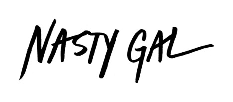
Current logo deign for the company
References
Websites:
http://fashionista.com/2013/08/nasty-gals-sophia-amorusa-on-staying-cool-while-you-get-big
https://www.nytimes.com/2016/11/11/fashion/nasty-gal-sophia-amoruso-bankruptcy.html?_r=0
http://www.glossy.co/ecommerce/timeline-of-how-nasty-gal-arrived-at-bankruptcy
Book:
Amoruso, Sophia. #Girlboss. NY, NY: Portfolio/Penguin, Putnam, 2014. Print.

