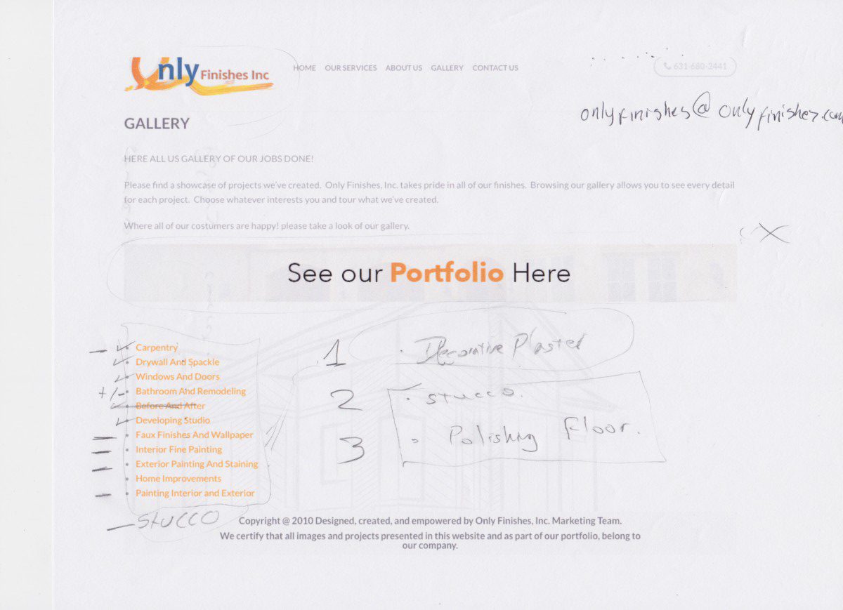
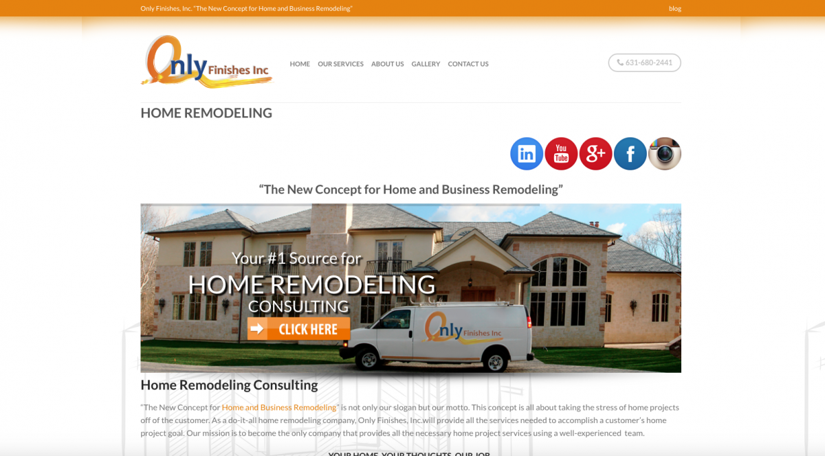
I have been trying to find an album plugin, so I can display properly the pictures that they have of their previews works organized. For example: I want to have all the pictures of their floors in a separate album than the windows one. Thus, the clients can go to the album directly to see what they’re looking for. Until now, I just have found some plugins that don’t that display the photos in thumbnails all together. So far , these are the plugins that I have tried: Gallery Bank, Photo albums and Flickr Album Gallery.
Journal 7
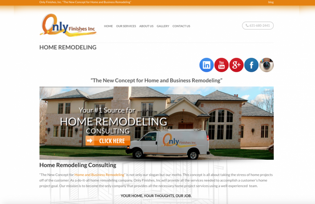
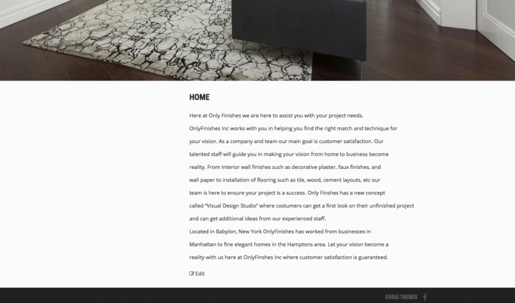
I haven’t attended an event with my company. So, I guess that I’m going to talk about the latest update with regards to my internship. I’ve been correcting the grammar errors in the websites’ company. Last week , Julian ( the owner ) told me to change the text that he already had in Only Finishes to a new text that explained better their services.
Before
My Experience In Here Are All The Black People
I went with a friend to an event that was called “Here Are All The Black People”.It was held in Times Center in Manhattan, NY. This event is geared towards students, new graduates, or those whose are starting out in their careers. It seeks to showcase their new ideas to the best agencies and creative leaders in the industry.
I went during the afternoon and got to attend a conference that a group of professionals in the field were giving. They were talking about their experiences reviewing portfolios and the work that they had encountered so far. Also, they were saying that the ideas presented in the portfolios were not bad at all, but they were incomplete. In addition, some speakers were talking about how portfolios should stand out from the crowd. Finally, they discussed their experiences in the field.
Then we decided to go to the first floor where there a workshop for portfolio Advisement was being held. This was the reason why I came to this event. As soon as I arrived to the place, I asked for the Wi-Fi password and proceeded to enter the room. Everything was very organized; on entering, there were moderators who were in charge of telling people which table to pass. There were many tables located in the room and each of them had two seats: one for the advisor and the other for the interested. So, I went to one of them who was sat a teacher from the School of Visual Arts. I passed her my iPhone with my online portfolio. I opened it, and she started to navigate through it. She asked exactly what subject I wanted advise for since she did not have that much knowledge about web design. I told her that I wanted her opinion with regard to the layout of my websites. She looked at them for a while and told me that there was not doubt that I had skills to make websites, but with regard to the layouts, I should put a personal touch on them.
This experience was very enriching, but I must say that I would have liked it if they had spent more time with my portfolio. Also, I think that there must have been more specialists in web design.
Journal 6
I don’t want to sound cocky, but I have done a really great job in my internship. The reason of why I believe this is because I started from almost 0, since the previous website that they had was very confusing and lacking in design. The information they had was repetitive and sometimes they did not update it to what they were currently working. Moreover, my entry in the company gave them another idea of how they should represent themselves as the professional company that they are. Also, some of my suggestions for increasing their marketing have been considered for future use.
Journal 5
I can say that I collaborate in my internship when Julian (the owner) asked me to help him to write some short biographies of him and some of his employees. I actually had to come out with the text, based on the information that he had previously given to me.
At the beginning, I didn’t know what to say or the style of writing that I should do, so I had to start to look at some designers’ biographies online and guide me through these ones. Actually, I’m still working on it. But, so far he has liked the approach that I have given to it.
Trip to Cooper Hewitt Museum
On November 14th, we made a trip to the Cooper Hewitt Museum, NY.
To my amazement, I saw many interesting things such as the drawings located on the second floor, especially the following:
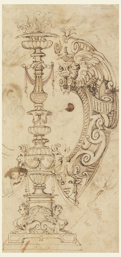
Drawing, Study for Candelabrum Motif and Strapwork Escutcheon, ca. 1560; Designed by Unknown (Italian); Italy; pen and brown ink, black chalk, brush and violet watercolor on off-white laid paper; H x W: 26.2 × 15.1 cm (10 5/16 × 5 15/16 in.); Museum purchase through gift of various donors and from Eleanor G. Hewitt Fund; 1938-88-2923
I am amazed by all the details this one has. I like how classic and majestic the drawing is. Also, The quality of the paper in which it was drawn was nice, since it has not torn apart. Moreover, the ink that he/she used must be very fine because it has not even bled from the drawing. Overall, it is a fine piece of art that reminds of me Da Vinci’s drawings.
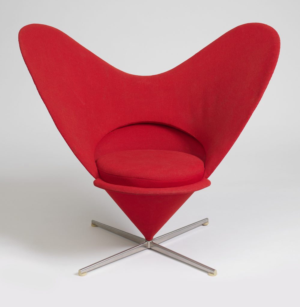
HEART CONE CHAIR, 1959
This is a chair. It was designed by Verner Panton and manufactured by Vitra AG. It is dated 1959. Its medium is steel, stainless steel, molded plastic, woven wool upholstery. It is a part of the Product Design and Decorative Arts department.
It is credited Promised gift of George R. Kravis II.
Where should I start? I love this heart shaped chair, especially, the curves, the color, how symmetric it is, but at the same time it is not rigid as a square, and overall how modern it appears to me, even though it is from the 60’s. Every time I see this type of chairs, it gives me the impression of seeing something avant-garde, perhaps it is because I really like furniture design and you do not see it very often. I just wished that I could sit there, but of course it was not allowed.
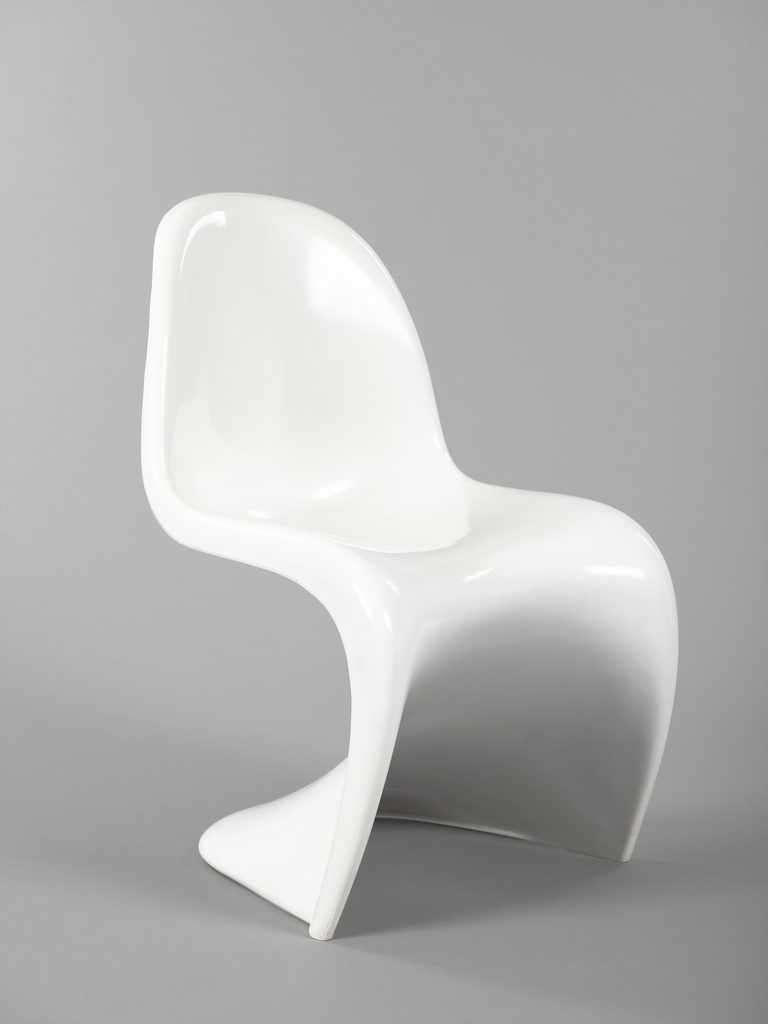
PANTON STACKING SIDE CHAIR, DESIGNED 1960, MANUFACTURED 1972
This is a Stacking side chair. It was designed by Verner Panton and manufactured by Vitra AG and produced by Herman Miller, Inc.. It is dated designed 1960, manufactured 1972 and we acquired it in 1977. Its medium is injection molded luran s thermoplastic. It is a part of the Product Design and Decorative Arts department.
This object was featured in our Object of the Day series in a post titled New Material, New Form.
This object was donated by Robert Blaich. It is credited Gift of Robert Blaich.
This chair I have seen a lot in some buildings in Manhattan. It looks very futuristic despite having been designed in the 60’s. The set of curves with the shadows and the lights are entrancing. Actually, it brings to mind the amorphous forms of the Lava lamp. This chair was the first one, which was made in one piece of plastic rather than being made of assembled parts. Also, it didn’t use wood or metals for its support. Definitely, I think that the 60’s marked history in terms of design. The best designers made their contributions at this time period.
The power of Pop-Ups- Webinar
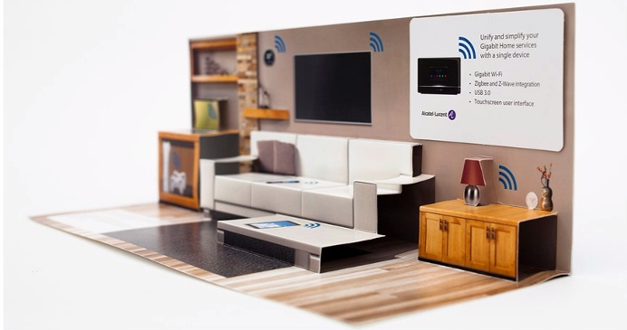
Mr. Ian gives us an induction about the world of pop ups. It caught my attention that he started as a graphic designer, and in the course of his career he converted to a paper engineer as he calls himself.
He has been researching in various parts of the world about this art. It’s not just randomly folding paper. You have to know the mechanism, different qualities of papers, etc. Therefore, he has gathered a lot of knowledge becoming a true expert.
I like how colorful and interactive the book becomes a, when pop up is added to it. Contrary to what you might think ,pop-ups are used in various subjects not only in children’s books.
Journal 4
Let me start by saying that besides an internship this a real life experience that I am having because I am responsible for everything that will be done with regards to this website. I certainly will not have anyone to turn in in case of a problem, which might be true in a design agency. Therefore in the context of y internship, I would have to solve it by myself base on my acquired knowledge and trial and error.
I have learned so many things since day one. And by day one I mean, the day I met him. We met in a restaurant close to my house because the original place that we were going be was a café place, but it was full, so that was my first lesson: you always have to have a plan B. Luckily, we had a restaurant close, so we could sit down and talk. At the end, it was a better choice since we were there to talk a lot, which might have bothered someone in the café since it is a much quieter place. Time past and I started him to show the improvements that I would do to his page based on the research that I had done previously. It wasn’t bad at all, but I noticed that besides the research that you do, you have to become a saleswoman in order to sell your idea. Another thing that I learned was that you have to be realistic as well as practical. Even though the client wants a lot things to be done, you always have to be honest with what you can and cannot do.
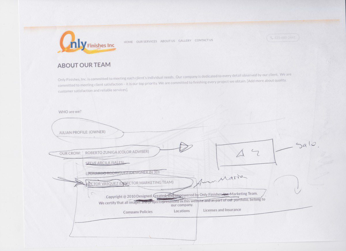
Some notes taken during the meeting:
Journal 3 My Ideal Work Environment
My work environment is the best one because sometimes I work from home while at other times, we meet in person and discuss the advancement that we have had so far. At Other times, we speak by cellphone, so we can catch up on details. My boss is a busy person, so we have to use these methods to communicate.
Journal 2 My Role In Only Finishes
My role in the company is that of web designer. There was a previous website that the company had, but the owner saw the need for reorganizing and redesigning it. I got this internship through a friend. He was the one who introduced Julian to me. Then, I called him and we spoke for a half an hour over the phone. We set an appointment to meet in person that weekend. So, we spoke for hours about his company’s website, and I told him my point of view and explained my plan of work.
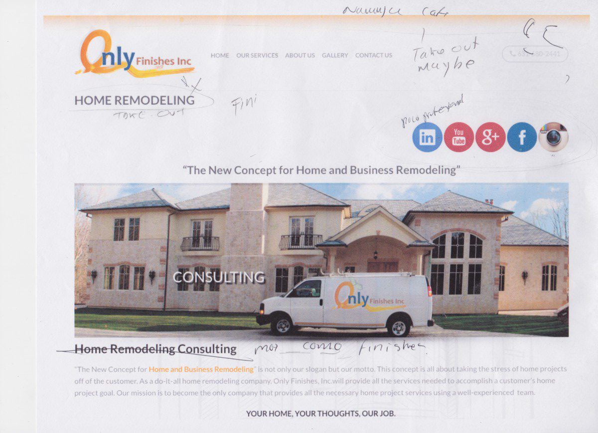
This is the company’s previous website:
