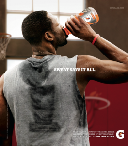
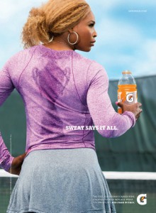
The intended message that Gary Land is conveying is that Gatorade fuels you and helps you perform to your best ability. The denotation of both photos is that when playing a sport you tend to sweat and give it your all, and how Gatorade is suppose to help quench your thirst and replenish you. In contrast the image doesn’t really convey to buy Gatorade or give you the feeling of wanting to buy the product. The connotation of the photos is that Gatorade is there to replenish you when you need it most. It is the drink of champions as we can see how the sweat creates the trophies for each sport. Gary Land uses a lot of key elements to create the same feel for both photos. The photos are back lit, create color contrast, have selective focus, and appear to be eye level view. Even though both people play different sports and area male and female, the cohesive use of the visual elements creates the same feeling in both ads. I feel these photos are mirrors because they are trying to connect to you emotionally. We all know drinking Gatorade wont make you sweat a trophy design on your shirt. The metaphor that they are using appeals to the audience they are targeting and creates the want for the product.
Category Archives: HW1: Ad Campaign Analysis
MIkhail Reid Mirror & Window
In the first picture Mirror is taken place by the women looking at her reflection of her daughter, which is in the vehicle. The photo has an overall dramatic feel to it, just by the way the mother looking at the daughter with disappointment. The lighting also gives that dramatic feel which comes from side; shadows casts to side with mostly light tones.
The second picture also show mirror which show emotion of the child, and it shows the distance of the two children from each other in the garage showing depth. The first child seems to be eager to look for someone.


