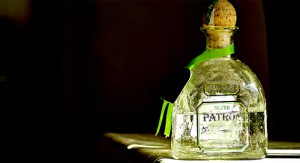
On the final shoot. I got to do exactly what I wanted and that was to shoot on black plexiglass. The only thing I wish I didnt get was camera problems. I was given a really old camera so I had to learn how to set it up. Then I was having issues with the lighting but that was an easy fix. Then the camera wouldnt focus so I had to use manual. Which was harder because wut looked clear to my eye, was blurry on screen. All in after all the problems I had, I got some of my best shots on the last day. The plexiglass did exactly what I was hoping for and they were my favorite shots. Towards the end I started working with gels and got a beautiful green colored photo. I got the silhouettes I was looking for but not to the extent of what I wanted. My weakness was lighting and trying to figure out the right aperture. I feel that took the most time for me to figure out and costed me most of my shooting time. My strength I honestly can not think of because I felt like I needed help in every aspect except for setting up the objects. But I can say majority of my best was from the final shoot because I had so much trial and error. So I already knew what I was looking for and didnt have to jump so many hurdles.
Author Archives: Tera Cunningham
Second Shoot
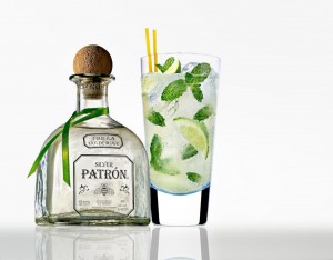
The second shoot was ok. I didn’t get different variations like I’d hope for because I was modeling for Peter, Khyriel, and Kelly but the shots I did get were nice and would work for an advertisement. I bought in a shot glass and limes and didnt get to play with them the way I wanted to. Next class I wont be modeling for anyone and I will focus on my work. For the next shoot I’m going to revert back to just the bottle and martini glass and do silhouettes because on the first shoot I started getting nice shots like that but ran out of time. I want to work with plexiglass because I notice that it gives a nice reflection of the glass and the bottle.
First Shoot-Tera Cunningham
The first shoot went ok I guess. I forgot to bring most of my props because I was rushing out but I will have the salt, lime and shot glass next class. I only wish that I got better lighting from the beginning rather than towards the middle/end of my shoot. I was thankful that Matthew was giving me some ideas on how to get the mood that I wanted. I want to shoot on plexiglass next class because I noticed in most patron advertising u get that nice reflection of the bottle on the bottom and would like to incorporate that into my next idea. Also next time I will be using my own filtered water rather than the schools tap water because it produced too many bubbles in the glass and made it look murky. I’m even going to bring and mix juice to make it look like its an actual cocktail in the glass to add variety to what I’m trying to achieve. Also Professor Michals suggested that I try strobe lighting for the next shoot. To see how they will come out.
Final Project- Tera Cunningham
Topic: Define what you intend to communicate. What would be the intended use?Is it for an advertising campaign, a public service announcement, an editorial piece, a narrative, a design driven study?
My topic is alcohol, preferably Patron Tequila. The intended use would be to make an advertising campaign using the photos I shoot. I could also make an editorial piece which leans more towards my major in graphic design but I wanted to expand and try something different. But I might still make an editorial version just for fun if need be.
Subject Matter: Literally what will you shoot?
I plan to shoot a bottle of patron and a martini glass filled with water. I will have garnishes such as salt, lime, and a shot glass.
Style: What will it look like? How will you use photographic style to communicate emotion and point of view? Find at least one example and include at least one image with your description.
Since its going to be used for advertising purposes its important for the product label to be seen and legible. Only 3 out of 6 will be well lit. But the other 3 I want it to be darker and look more dynamic.
Lighting: how will you light your project?
My project will be back lit with continuous light.
Props: What will you add to the scene to bring out your intended meaning? What purpose will it serve in your portfolio? Do you want to highlight your conceptual thinking, your design sense, your lighting skills?
I will add props so that its more to play around with than just a bottle. The purpose it will serve is to help give me more advertising rather than publications and product branding. I would like to highlight all three because as a designer who needs stock images to make the ads or graphics, I find it great to say hey I took these photos and understood what type of lighting and angle I was going for. Anyone can find a image on google and take it and make something out of it but to say hey I took this made it from scratch is all the more rewarding and makes me more qualified for future jobs.
Tera Cunningham RR5 Poetry
In the poem by E.E. Cummings “she being Brand” the tone is more happy and and excited to be “driving something new”. The play on words obviously shows that he is talking about more than just a car. In example he says “I went right to it flooded- the- carburetor cranked her up, slipped the clutch (and then somehow got into reverse she kicked what the hell)” It shows that he isn’t really talking about a car. He is talking about being intimate with a woman for the first time. The line suggests that he was too rough or fast and hurt her so she pulled away. The action of driving the car is a metaphor for having sex with a woman.
In the poem “Coming Home Detroit, 1968” by Phillip Levine the tone is more serious, kind of sad. Levine talks about the car factories in Detroit and how they paint the colors of the sky with their smoke. In example he states “A winter Tuesday, the city pouring fire, Ford Rouge sulfurs the sun, Cadillac, Lincoln, Chevy gray.” They are all companies that are in Detroit. The companies are all emitting different color smoke into the sky. The poem talks about the racially divided city riot that has happened. How people lost a lot and still have lingering memories and it is with them everyday. A quote to support this is “You stop and wonder what came off, recall the snowstorm where you lost it all.” Both poets use cars to get their feelings across whether its happy like E.E. Cummings or a sad memory like Phillip Levine.
Tera Cunningham RR4-Susan Sontag and Plato’s Cave
The allegory of Plato’s Cave is that photography now has given us a more broader aspect of how we look at things. The cave represents our world and how set we as people are in our ways. Photography has opened our eyes to see things in a different light. Something that is known as garbage can be photographed and made to look dynamic. Susan Sontag says “To collect a photograph is to collect the world.” meaning being able to take pictures everywhere gives you a feeling of having the world at your fingertips. Photography has rules and guidelines, it’s not just snap and go. There are different genres and styles. Photography can change allegory because different people can look at a photo and get a different feel to it. You can change the light and it can give you a different mood whether it is happy or sad. In short photography is a second pair of eyes.
Tera Cunningham Mirrors & Windows Response
Mirrors is more of an eviction of emotion from the photo. It is more intimate and your personal view of things. Where as Window is more of a realist way of looking at things. It shows that there is a world out there with different views other than your own. The Crewdson photo is a mirror and the Winogrand is a window. Crewdson is a mirror because it evokes emotion. It shows more feelings and gives a more intimate view with the viewer. From the anger on the mothers face to the shock on the daugheters face. There is body language from the half naked girl standing with her head hung low in sadness or disappointment. The Winogrand is a window because it shows things in everyday life. It doesn’t give off emotion, it’s showing you children in a drive way. It makes you think about why the kids are outside, what were they doing, it has interesting scenery in the background. Theres no just one point of focus like the Crewdson. In the Crewdson the lighting is frontlit where as the Winogrand is diffused light. The tone in the Crewdson is high key and the Winogrand is high contrast.


