Author Archives: Josh Rojas

Second Shoot – Josh Rojas

The second shoot was an improvement, after experimenting with different setups I finally found one I could expand on. I used the black plexiglass instead of the wood table , it gave the drum more life with the reflection underneath. I also started experimenting with some motion blur to show the model in action. Foe the next shoot I would like to get a few more angles with the setup from last week. I plan on using some of the color gels to make the shot lively and add another light for the model.

First Shoot – Josh Rojas

What Worked:

– Dramatic Lighting

– Model interaction with drum

– Quick setup time

–  Shot composition

Didn’t Work:

-Lighting on the drum

-Getting a full shot of the drum

Next Shoot:

– Position the model differently

– Try new lighting effects

-Experiment with color gels

-Try new back drop


Final Project – Josh Rojas

DRUM_Magazine_Cover 20 years of drumming

For my final project i will be advertising drum products or shooting for a cover on a magazine. I would like to give drumming products a much more interesting look and have them appeal to people who don’t know about drumming or drums. If a go for the magazine cover I want the emotion to be fun and passion. If I shoot the products I want to give some type of mystery. I think I can go with various light setups , I would like to try and shoot myself for the cover since i play drums and can give a much more natural look to the photo.

Josh Rojas Poetry RR5

Both poets took very different approaches to describe their driving experiences, in “she being Brand Brand” e.e. Cummings spoke about the joys of driving and having that first time experience with a car , Phillip Levine spoke on the effects that were taking place due to Detroit being a car produces city. Both poems take place in an area that is important to the poet. e.e. Cummings poem is much more descriptive than Phillip Levine’s when it comes to what it takes to get the car running and what parts are moving. “Coming Home , Detroit” driving experience is more aligned with the scenic view , the places and people he sees. I think the two points being expressed are “freedom’ and “destruction” .

RR4- Josh Rojas

The allegory of Plato’s cave is that we view things entirely different through pictures and real life. We can only see so much with our eyes but with photography a whole world is opened up allowing us to create new things and seeing places we have been to. In the reading Susan Sontag speaks about how viewing images changes our perception of the world, the more images we take in the more our ideas change. Photography allows us to create a library  in our head of what we think the world is.

Josh Rojas Differentiation

In the article it speaks about how no brand is truly different but what separates each ad for the brand is the image attached to the brand. In the Chanel No. 5 ad, they decided to use a model Catherine Deneuve; she is in no way related to the product but her face being used causes the viewer to attach certain qualities to the product. The company Babe took a different approach and went with a tomboy style, they still used a famous model but took her out of the typical setting you would find in perfume ads. I agree with the author of this article I think images sell the brand not just the name. Strong images are key when building a brand, if you consistently release ads with great images and concepts people will then attach great qualities to your brand .

Josh Rojas HW1: Ad Campaign Analysis

722_12780 722_12784

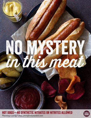
I chose the Whole foods Market campaign shot by Charles Schiller. In this campaign the purpose is to show potential customers that the food being sold at Whole Foods is held to a high standard and healthy. I think the photos and text are very straightforward using clever text and clean photography. The shots taken by Charles make it feel as if these meals were at your home. I think anyone can relate to these images with the various food selections shown it can relate to all cultures. Not using people in the photos was very key in this ad campaign.

Charles shot all of the meals with an over the top view; I think this was done to make it seem first person. Every shot taken is very color but not because of the text used but the food colors make the shots very interesting to look at. I think this campaign is very simple but works anything over the top may have taken away from the message Whole Foods wants to give. The photos are cropped very nicely, everything is tight and nothing in the shot feels like it’s missing.

The photos in this campaign are both windows and mirrors. Almost everyone can relate to these images if they’ve ever eaten a meal. Although everyone’s meal may not look like this Whole Foods is trying to show you the possibility. Whole Foods is all about holding their products to the highest standard, what really brings the campaign together are the text overlay. Nothing in the campaign is unrealistic for anyone to achieve so that’s why I think it is both a mirror and window.

Josh Rojas Mirrors and Windows

COMD Advanced Photography


Josh Rojas


1/28/15


The Szarkowski’s Mirrors and Windows thesis is comparing the way a person views a certain idea versus the way it actually it is in the real world. Both of the photos are set in some type of suburban area. The main focus of the photos is children although there is a large age gap. The first photo is very detailed I think every thing placed in the picture has a purpose. The background is very dark but the car lights are pointing at the girl on the lawn. The second photo is very dull and empty but the child in white draws your attention. The artist may be trying to depict how they feel about growing about in the suburbs versus the way the world views it. The first photo is the mirror and the second is the window. The first photo shows a lot more emotion in the faces of the subjects the second doesn’t show much emotion but shows this is what it is.