Scavenger Hunt

11

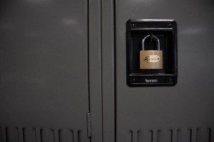
This photo has is a great composition that has a fantastic rule of thirds and is at eye level. The black box on the locker is contrast to the gold lock color and the vertical lines on the side of the locker lead your eyes down and box in the lock.

Posted in Uncategorized | Leave a comment

LL1

My goals for the campaign are to showcase the cars speed, while also showing the electric cord and how it is the most important feature of the car. I selected Clint Clemons as my favorite photographer out of the three guys because he focuses on the important parts of a composition. Most of his works have great vibrant color blurs that outline the cars. The photographer also captures great angles of view with the subject and the photographer has most of his photos blurry showing a sense of motion with the vehicle being still which would help me get the speed I am looking for. The photographer brings a great sense of understanding that he will bring to the the brand.

Posted in LL1-Composition | Leave a comment

LL6

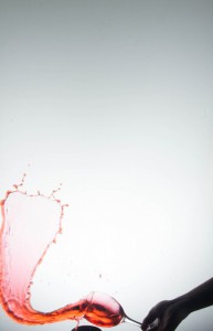
IMG_8851

This is my best picture of the splash water assignment, because I love the gradient color of the water and It reminds me of a waterfall. Most of our picture didn’t have to much fall off effect but it would have been even better with an all white background.

Posted in LL6-Splash Photography | Leave a comment

LL5

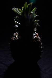
IMG_9675

This picture I believe is the best composition of the negative campaign of pineapples because the picture has a feeling of being dark and mysterious. The picture has high contrast between the light and the object. The silouette shows that it is a pineapple and you can’t see all the details. The diffuse light also sets the mood of the dark and eerie photograph.

Posted in LL5-Still Life: Creating Mood | Leave a comment

DIY Studio

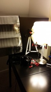
20141027_192055

This is my DIY Studio which was not to difficult to find a table because I knew that my vanity folded down to make a table. I really wanted a bigger table just in case I had a big subject, but this worked out fine. The lighting was very difficult because I just had my bedroom lamp which was fine, but I needed a lamp that was flexible or at least an adjustable light stand. The clips I got were fine the kept the screen on the light to help not have the direct light on the objects.For the black background I used a foam board, and for the white background I used printing paper and a white box, which are not in the picture but I used them whenever I needed them. Also, I brought a car screen as a fill for the objects in the earlier assignments it worked and overall it was a great studio.

Posted in Uncategorized | Leave a comment

LL3

IMG_3694

This is my favorite picture because the side light has a great and even tone on my face. The light highlights the facial features very nice and clean. The facial expression gives the composition a little bit of excitement or laughter.

Posted in LL3-Portrait Lighting | Leave a comment

The Gallery Trip

We got to experience many beautiful exhibits, some being collective works and others dealing with strictly one photographer.  Even though a couple of them happened to be closed it was enjoyable. My favorite three would have to be: The Rectangular square exhibit at SepiaEye on 547w 27th st – This exhibit did not have just one photographer but instead a collective of many different works that followed the theme of Rectangular Squares by 16 artists. Along with framed pictures with borders there were also printed books with similar photographs on a table. The subject matter varied from people to buildings to random objects but all followed a rectangular theme. My favorite piece was Beatrice Pediconi, Seven, 2014. This was my favorite because of cool colors and beautiful symmetry. It gives me a sense of mystery. After reading the Gallery press I realized that they intended use of squares / rectangles was to impose a sense of strength, which i did feel when i viewed these images.

2nd) The Stephen Shore at the 303 Gallery located at 507 w 24th st

The photos in Stephen Shore’s exhibit consisted of  portraits and landscapes in the areas of Ukraine , Israel and the USA. My favorite image in his collection would have to be Wolf Street, Philadelphia, Pennsylvania. Although the subject matter was quite ordinary the way it’s framed makes it so much more interesting. The image is at eye level and perfectly symmetrical despite displaying numerous buildings. In his portraits Shore broadcasts numerous individuals including Holocaust survivors. His work focuses on portraying different cultures, he does it this by photographing not only the individuals but their surroundings including their homes giving them more depth. When i look at these photos I cant help but feel a bit melancholy but also a sense of compassion. When we know his intent, his work becomes much more meaningful.

3rd) The classic images exhibit by Ansel adams

This exhibit features landscape photography from photographer Ansel Adams. A majority of his photographs were taken in the mid 1900’s . I believe the time frame and the fact that Adams was an environmentalist gives us insight into his work.  He uses  existing lighting  to capture his images. His images are usually very sharp with everything in sight being in focus. A majority of his photographs also follow the rule of thirds despite being stricly landscape. I believe he focuses on portraying nature as beautiful and mysterious. I also noticed a handful of his work included tree photography. His images made me feel a sense of Power because of his use of contrast.

Posted in Uncategorized | Leave a comment

GALLERY

`On our adventurous trip through lower manhattan we visited many memorable exhibits. My favorite three are:

  1. Photographer: Ansel Adams: Classic Images, Robert Mann Gallery, 525 west 26th street
    1. What stood out most to me in this gallery was the beautiful variety in landscape photography.The exhibit consisted of a majority of Black and White nature shots with High contrast. My favorite image in the exhibit would have to be Moonrise, Hernandez, New Mexico. The image itself consists of  Several Visual Elements including the town of Hernandez, the almost pitch black like sky, the pastel clouds that spans across the image and then way in the back a  small round moon. I believe the way the eye level photograph is divided into two halves, one half including the elements and the other half showing nothing but a dark sky makes this photograph appear a bit mysterious but adventurous. In the press release it mentions that Adams was an environmentalist even working with famous clubs such as The Sierra Club and The Wilderness society. Upon reading up on his interest in nature it became clear why his work revolves around portraying the outside world. He seeks to illuminate the beauty of nature by experimenting with lighting. I believe he favors images with a sharp focus, high contrast and a relatively good exposure. The direct lighting in his images is what creates the high contrast. When i look at his images i can’t help but to feel calm yet adventurous. The open land in most of his photographs evokes a message of going on a journey. If i didnt read the press release i couldn’t understand why this photographer had such an interest in landscape photography.


2.Sepia Eye, Rectangular Squares, 547 W. 27th Street, #608 (group exhibition)


This particular gallery consists of a variety of photographers/photographs sharing the theme of rectangular squares.  This exhibit stood out to me because of the strong emphasis on geometry. These images were carefully framed and included borders. I believe this exhibit came off as very real, meaning it captured subjects doing everyday thing. Some portrayed all the geometry surrounding us. From people doing everyday tasks to the landscape photography that managed to capture everyday surroundings so elegantly, I believe this exhibit was successful. Most of these images manage to fill its rectangular frame giving a sense of fullness but yet containment because of the borders. If i did not read the press release I would not have known the reason behind their geometry based photography is that “The square, itself an ancient symbol of stability”.

3.The New York Times Magazine Photographs, Aperture Foundation,

547 West 27th Street, 4th fl.


This exhibit was also a group exhibit that I believe focused on capturing many different lifestyles. The importance in this exhibit was emotion. Whether the photo was evoking a message of power,sadness,happiness, etc it was done so beautifully.  The images had a way of making you feel as if you were there with that person witnessing everything going on around them. I believe the photographers attempts were very clear in this exhibit without reading the press release. The lighting adjusted in each image whether it side light, back light or diffused lighting.

Posted in Uncategorized | Leave a comment

DIY Home Studio

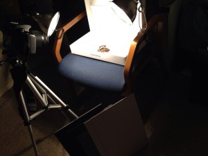
IMG_5500

Well this is my DIY studio, specifically; this is my second one after having one complete failure. My first try on the home studio was not working as I wanted to work, in addition, I did not have a really good light source and a tripod in order to make my shoots. In this version of my home studio I used a computer box and I also have different cut outs of foam-core and presentation board of different colors. I placed on a chair in the middle of my room, because I really did not have a dedicated space for it, but at end I figured how to place the clamp lights and the tripod and the camera. It’s a little low and I feel uncomfortable at the beginning, but after I just started using the timer in the camera to avoid crouching in every shot. I plan to use it in the future for any projects that required product shot, its perfect for it and can play around with the lighting and the contrast using the camera settings.

Posted in Uncategorized | Leave a comment

LL4

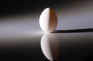
This was my favorite image from the shoot in class. This image gives a perfect sense of balance. I also like how we managed to capture the shadow as well. This is also a good eye level angle.I also enjoy the gradient feel this image presents. 15525397198_b1be0aad8f_k

Posted in Uncategorized | Leave a comment