

Communication Design 1
Spring 2023
Prof: Hoda Ramy
Creative Process
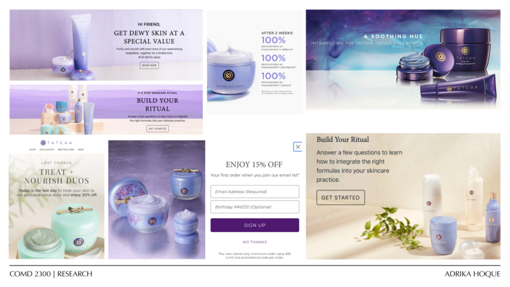
Tatcha is a luxury Japanese beauty and skincare brand promoting pure, kind to skin ingredients. They are primarily sold via online at their website or at Sephora. The existing ads include a soft feminine and ethereal design. The brands color palette primarily consists of shades of pastel purple alongside soft natural tones. Tatcha feels luxurious in their marketing and gives an air of affluence. The primary audience for their products are higher income earning women aged 25 – 34.
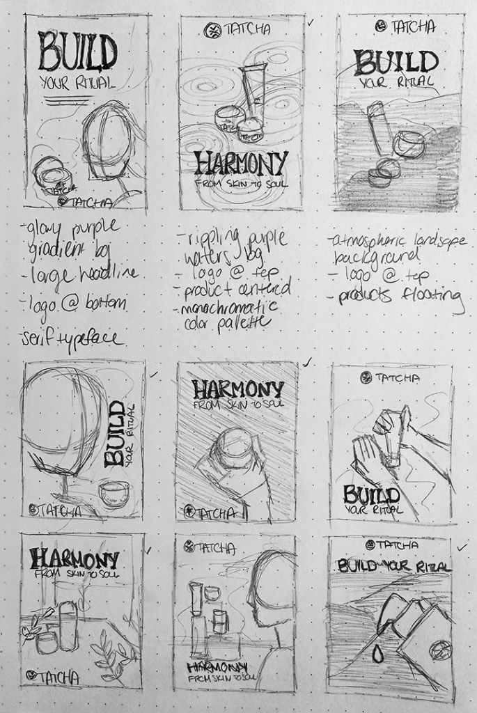
I started off this assignment researching current marketing material and brand presentation. The advertisements are glowy and give the impression of luxury. It also consists of neutral tones coupled with thinner serif typefaces in monochromatic purple hues. With the research, I was able to create refined thumbnail sketches that I then turned into digital sketches.
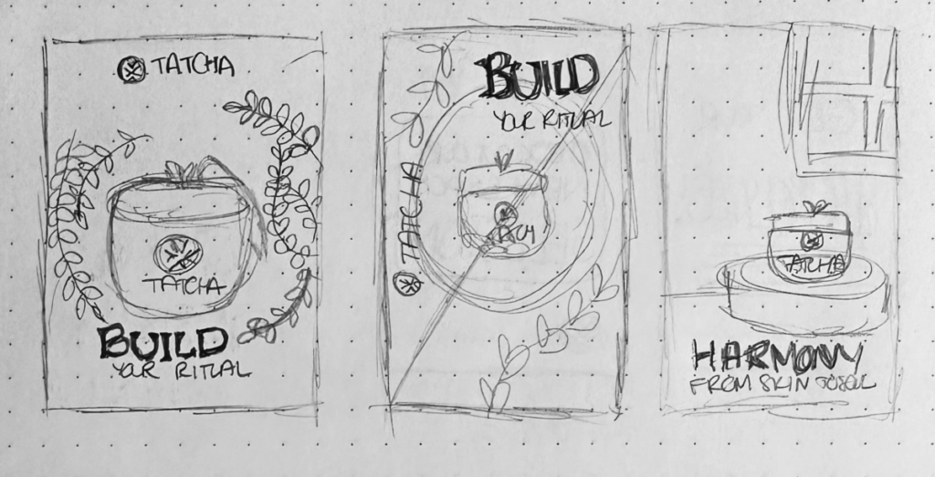
The initial digital sketches had good compositions but needed some refining and tweaking. They fell a little flat and like they were floating in space. The second drafts and the final had better dimensionality and perspective to the ads and overall came out looking magazine ready.
Discovery & Concept Development
Design Development