The Sketches
For the Visual Quote project, we were required to pick a quote from a movie, quote or song and visually enhance the quote for an 8.5 x 5.5” postcard. Two concepts had to have typography and one concept could include a picture. The quote I chose is from the BBC sci-fi television series Doctor Who which shows the space adventures of a Time Lord named The Doctor and his companions. The quote is, “Demons run when a good man goes to war” from season 6 when Matt Smith played The Doctor.
After researching the TV show, there were a couple elements that stood out to me as uncharacteristically Doctor Who. TARDIS blue was an instantly recognizable shade as it was the spaceship used by The Doctor and remained a pivotal part of the show throughout the years. The exact Pantone shade was 2955C and so I knew I had to include it in my designs throughout. I also knew I wanted to include simplified graphics of the villains from the show as the “demons” from the quote as well as imagery of the TARDIS itself.

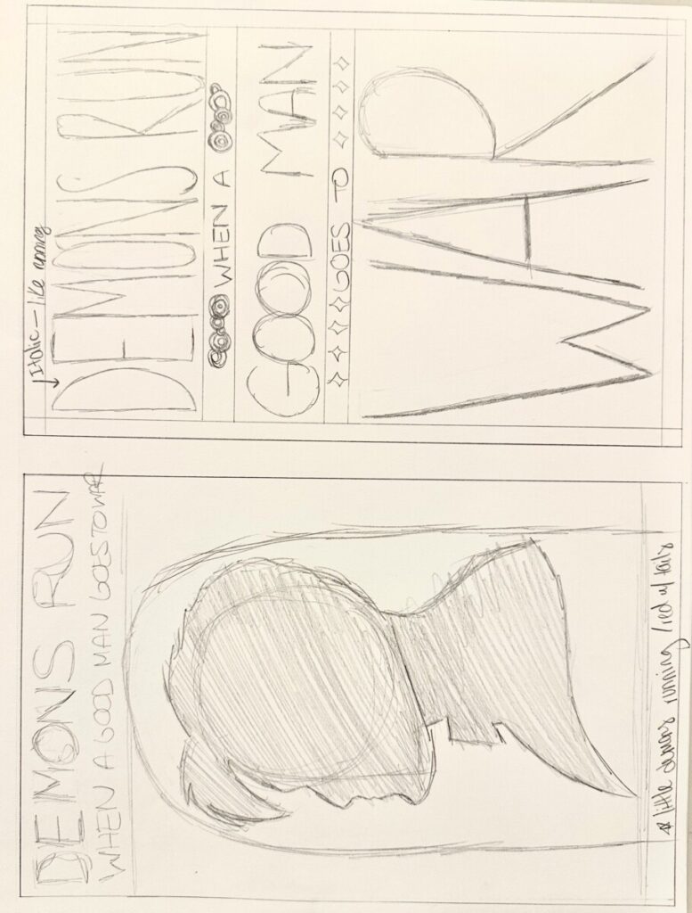
Concept #1 Draft

The first concept I developed played with contrasting typography in a grid like manner meant to represent the TARDIS which is in the shape of a police box from the 1900s. I used the typeface Gastromond to emphasize “demons run”, “good man”, and “war” and the typeface DIN Condensed Bold for “when a” and “goes to”. These typefaces were chosen as opposites of each other as a serif and sans serif and the smaller words turned into outlines to differentiate the two even more. The background is TARDIS blue with white text to match the TARDIS from the show. The graphical elements include the Gallifreyan circles which is the Time Lord’s language from the show and the stars are for the space adventures in each episode. Little demons running away were illustrated instead of including recognizable villains from the show as I thought there was a lot of complex elements already.
Concept #2 Draft
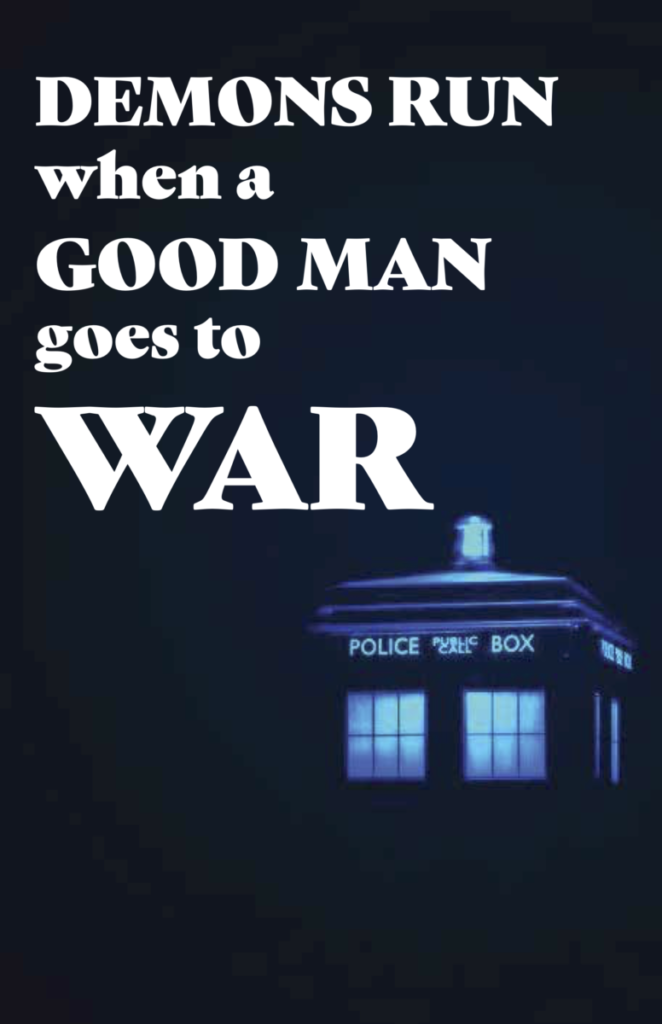
The second concept utilized a photograph and typography to create a more moody and dramatic composition. The typeface is all Gastromond but there is still emphasis on the larger words being all caps and with the smaller words also being lower case. The text is aligned to the left to create a visually pleasing composition. The photograph used creates a monochromatic tonal blue to the entire piece that distinguishes itself well from the text. The imagery plays off the quote and brings a dark atmosphere to this concept.
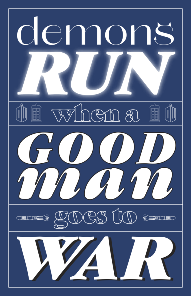
Concept #3 Draft

The last concept is my personal favorite and plays with typography again as well as includes somewhat complex graphic illustrations. This time, the text is blue with a white background and uses the negative space. Larger words are all caps with a fill and smaller words are outlined and lower case. The visual interest in this composition mainly comes from the silhouette and the mementos from the show. Three villains are depicted under the words demons run and The Doctor’s screwdriver that serves as his main weapon is shown above war. This concept is lighter while still retaining the serious atmosphere.
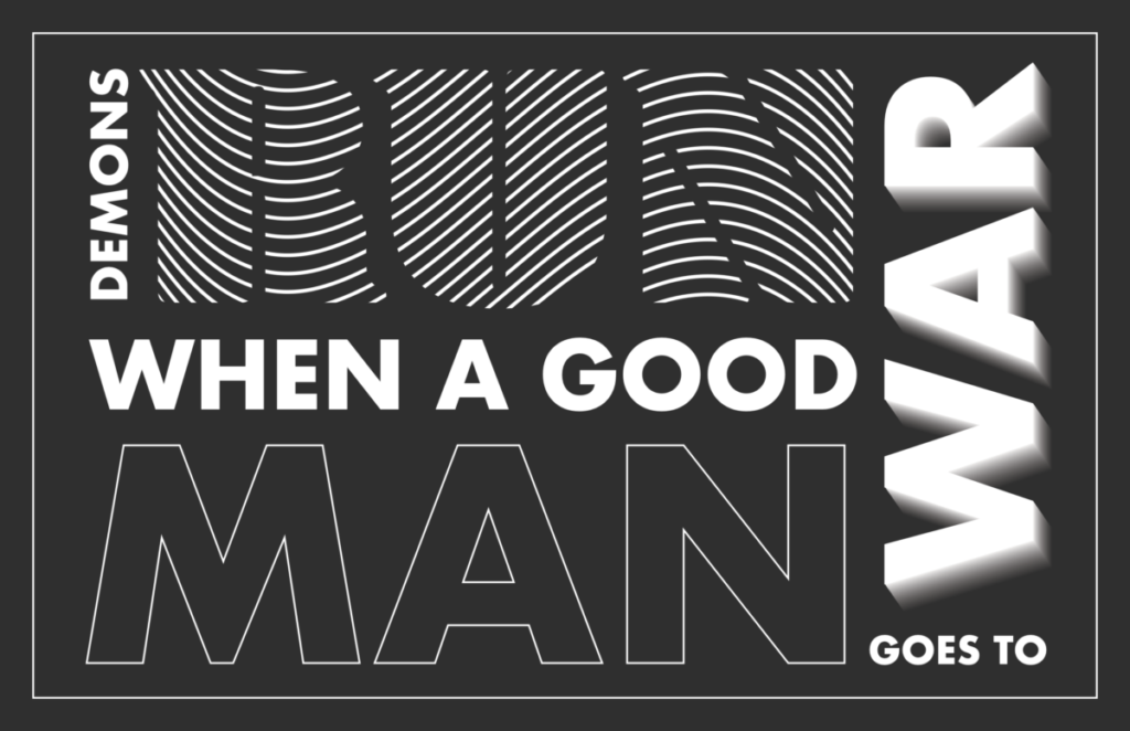
Final Concepts


Final Thoughts
Designing and visually enhancing a quote was both a challenging but rewarding project. There was a large degree of freedom to be able to play around with whatever concept we chose but it was also difficult to narrow down the concepts I liked most. Overall, I’m glad I stuck with a small color palette and typeface as I think it makes all the postcards look cohesive as a unit. I thoroughly enjoyed the design process from the sketches to the finished compositions and hope to further refine my typographic and design skills.




Comments
[…] good example of the potential is the Visual Quote Project post (created in her first year at City Tech) in which Adrika shows her work with different concept […]